Glenn
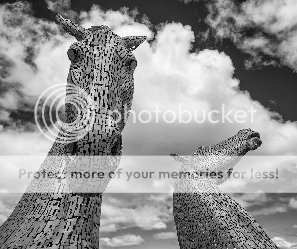
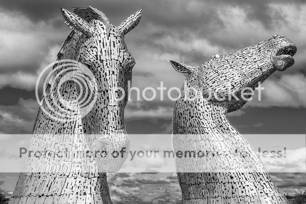
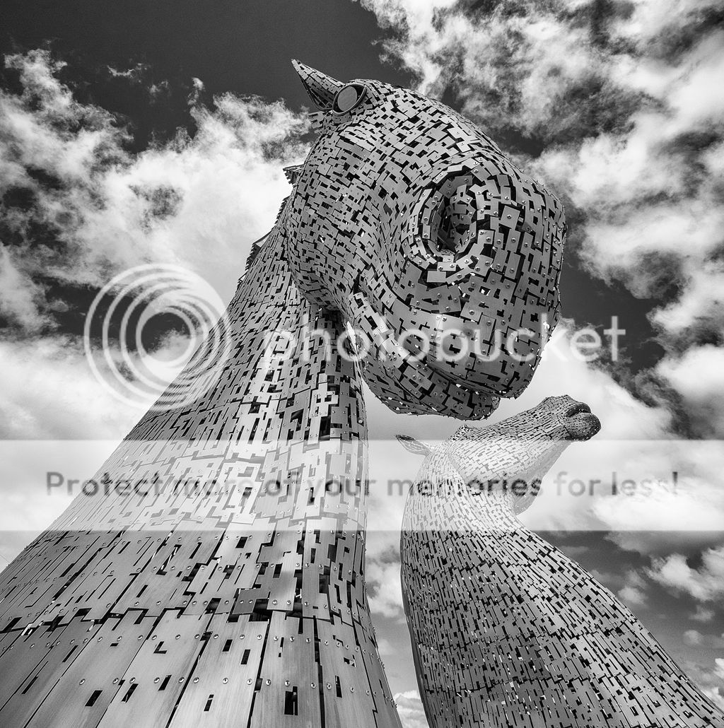
i like no. 1 and 2 but no.3 for me makes the head on the first horse look way to big, the neck to thin. On the 2nd horse the neck area now looks very straight. I may be in the minority with my thoughts though. I do like the others.
I like #3 with the exagerrated effect of the wide angle lens.
Good contrast, B&W etc and no harm in making something appear different to what it is. There is enough 'catalogue shots' out there for a lifetime of boredom.
This site uses cookies to help personalise content, tailor your experience and to keep you logged in if you register.
By continuing to use this site, you are consenting to our use of cookies.


") ?
?