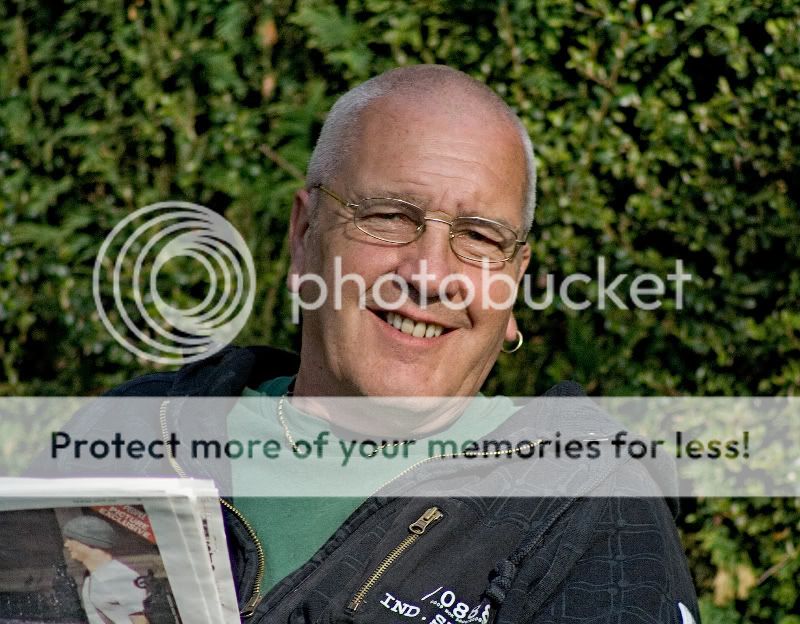
My neighbour, Phil, always spends the early evenings reading a newspaper on the bench in his front garden surrounded by his horde of doting hounds. His wife complains that she hasnt got any natural photos of him so I grabbed this one for her yesterday. I liked the way the sunlight shone across his face and shoulders. Not quite candid as he clocked me just before I pressed the shutter but at least hes not looking uncomfortable or posed (to my eye at least what do you think? Constructive criticism would be much appreciated and thoroughly taken onboard so please be brutally frank).
I did a 2 pass lab sharpen on the RAW image before cropping, resizing for the forum and converting to Jpeg but not sure whether it might be a bit strong and unflattering. Just to put things into context, hes 68 years old and his skin is a little sallow and lined due to a recent course of chemotherapy.
Any ideas as to how I might improve the PP on this would be very welcome. It will be for print so ought I to do something in terms of CMYK? :shrug: I have the unedited original if anyone would like to see it and maybe show me how to do a proper job!


 The exif backs up my recollection and the shot was taken at 17:30h. I swear that this village exists in some kind of parallel universe: the sun does mad things (makes it look like noon at early evening) and don’t even get me started on weather and “micro-climates”. In the month of June, whilst places only 2 miles distant are sweltering, it might be snowing in the front garden here yet have bright sunshine just outside the back door. We also get the Northern Lights or something looky-likey throughout the year even though this is the midlands – go figure
  :bonk: