Rallying: Arty Borders

Messages
693
Name
Ross Angus Williams
Edit My Images
Yes
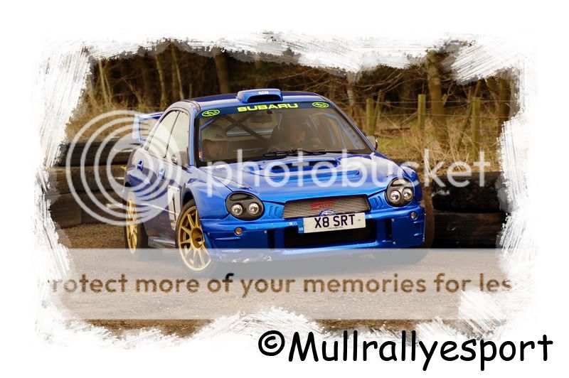
Picked up a photography mag the other week which had a cd with it containing 50 arty borders so me and Ryan S have been playing about with the borders on our rallying pictures.

Here are my offerings:

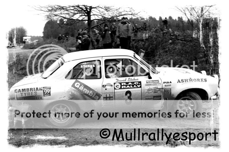
David Stokes on the RAC last year
stokes-1.jpg


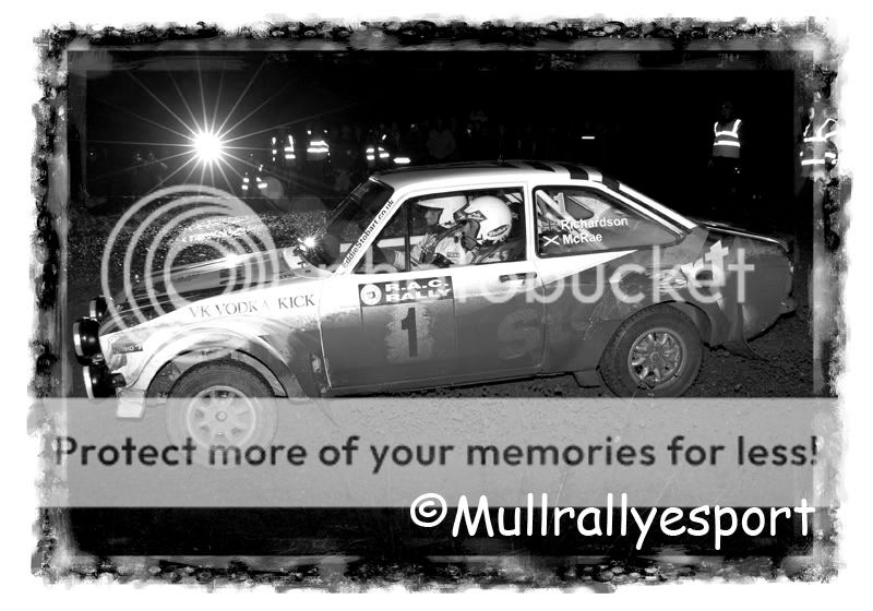
Jimmy McRae on the RAC last year
mcrae-1.jpg


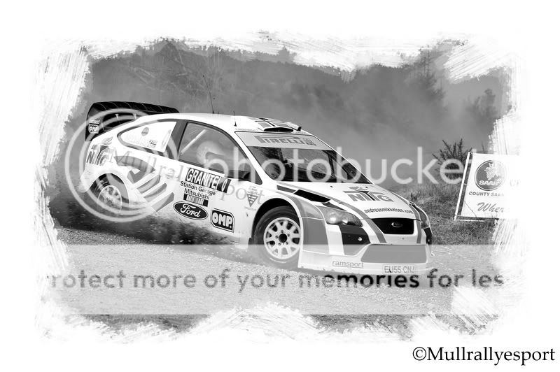
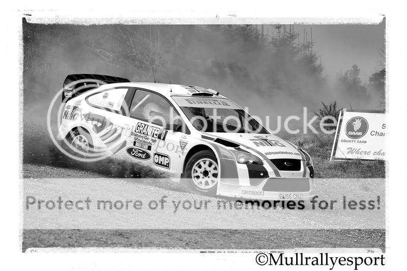
Kevin Proctor at Charterhall end of March this year
charterhall.jpg


Any feedback would be great and I am sure Ryan will be along soon to out shine these efforts:D
 
Those borders don't do anything for me but I like the photos, esp the apparently simultaneous flash opposite you in #2.
 
Love them all, but your missing the best one of all! ;)
 
Last one for me, really focuses the eye onto the Scooby (y)
 
#1 - needs just a tiny bit of room either side of the car

#2 - better;)

#3 - Not a fan of that modern rubbish, but I like the framing and overall effect :)
 
I had an eval copy of some sooper-dooper framing plugin thing for Photoshop a while back. It had millions of frames but to be honest when I looked at them I thought them all a little twee really....

I also didn't like the fact that it basically wanted to overlay the frame inside the area of my photo - which is fine when you are playing with a non-full frame image, but because all of mine are perfectly framed out of the camera (hahahaha I wish!) i couldn't see the point?
 
Thanks everyone for the comments, I will post the shot Ryan is on about maybe later.

TBH I prefer them without the borders. IMO it doesn't add to the image, but it detracts from it.

Interesting comment, didn't think the borders would detract from the original pictures.
 
The last one is my choice. If there was a sort of muddy tyre mark border, maybe it would work.

The car on the last is much smaller in the frame than the other car, so I think that is why that one is the best of the three.

Hope you don't mind me having a contrary opinion.
 
TBH I prefer them without the borders. IMO it doesn't add to the image, but it detracts from it.

i agree with andrewc!

the second border is dreadfu:puke:l, the first for me has the effect of excessively crowding an already tightly cropped image (although the border itself is the best of the three). the last border simply detracts from the photo itself, although it doesnt crowd the car as the first one does due to the smaller size of the car in the picture

my opinions of course :)
 
Last edited:
The last one is my choice. If there was a sort of muddy tyre mark border, maybe it would work.

The car on the last is much smaller in the frame than the other car, so I think that is why that one is the best of the three.

Hope you don't mind me having a contrary opinion.

Maybe the first two pictures were not the best to use for this:thinking:.

I value any feedback good or bad.

Here is the picture Ryan is on about
granite.jpg


And a different border
mikkelsen.jpg
 
i agree with andrewc!

...and I agree with whitewash agreeing with andrew.

The shots are great and the borders are nowhere near the quality of the images. So the overall effect of each shot is less than it would be without them. IMO. :)
 
Back
Top