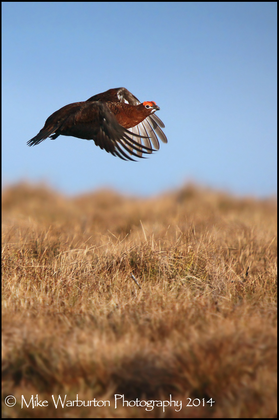
Red Grouse in flight

A really nice image, I feel there is too much wasted space, How does this look?

grouse.jpg


Just my thoughts :) ( Are remove image if you wish )
 
Think I prefer the first to the second! The second one doesn't look quite right since you can just about make out the ground and there's a few parts almost in focus but the rest isn't.
 
Cheers for the input guys but I find Joes crop a little tight but Stevens seems bang on to me.
I originally cropped it that way because I liked the focus gradation giving some depth.Looking at Stevens crop though some could certainly do with coming off the bottom and still retain the effect I wanted. ;)
 
I think it's a very nice shot and both the original and Steve's crop work well depending upon how you see the end usage.

If I was going to print one large and stick it on my wall, then the original has loads of interest and the bird would look great in the frame. For web type use though, maybe the smaller crops might be better to show more of the bird/

How helpful was that? :thinking:
 
Nice bird - most of the time, (now) I much prefer 2 x 3 - landscape as I think the when the bid is longer than wider, (if you see what I mean), it is more pleasing as somehow portrait makes the main part of the image look smaller when the aforementioned is the case. - portrait works when you have an "upright" bird

So I would also go for a landscape and keep the background as OOF as possible, providing you can get the composition correct.

I think Joe's crop maybe too tight for some on here!

Mike "the experts" may be able to do a little more with PP
 
Back
Top