Scrapped

Messages
2,079
Edit My Images
Yes
scrappy.jpg


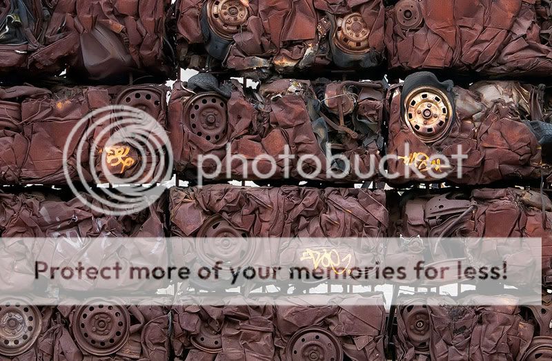
I really liked the texture and shapes on this shot.. Processed to bring out the shapes, colours and textures more and cropped to give a cramped/squashed feel.

MUCH better on the large link so please click away. Being on black also helps a lot...

http://www.flickr.com/photos/46180527@N03/7050974919/

Thanks for looking and comments would be great.
 
its great wall art although I would clone out the spray painitng......I really like it!!
Dave
 
This is a nice Ida and a good shot,but crushed might have been a better title ;-)
 
Really like this one.

Have you tired it as a B&W or split tone?
Id like to see that.

If you don't mind I might give it a go. and post up the result.
 
I really rather like this (y) and I'd keep the graffiti in personally (y) agree that Crushed would make a better title (y)

was this in birmingham?

That's just how cars normally look in Brumie land mate :naughty:

Matt
MWHCVT
 
Nice texture - keep the graffiti, it breaks up the repetitiveness nicely.

Alan
 
I like it...and I like the graffiti being there. It makes for a nice contrast.
 
The contrast between brown and the yellow graffiti gives the image a subject as opposed to being a background. Lovely concept. Wish my local scrap yards did something similar!
 
Oh I like this, a real abstract feel to it, I agree about keeping the graffiti.

And it does look best against your flickr black bacground.
 
Sorry for the second post but I keep revisited it.

This is one of the best shots I've seen in years.
 
Dave in Wales - that's a massive compliment mate and very much appreciated. Thanks.
Surrey Weddings - thanks for the advice and comments and glad you like the shot. will have a play when I get a chance as have to do a mono version so will play with it then.
 
Very kool shot, cant help but wonder what a high contrast B+W would look like too :)
 
I rather like this. Love the framing and very different. I also think the graffiti adds to the shot. Great find :clap:

Just looked at it on your flickr and looks even better with the black background (y)
 
Back
Top