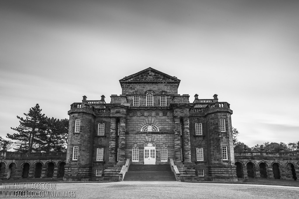
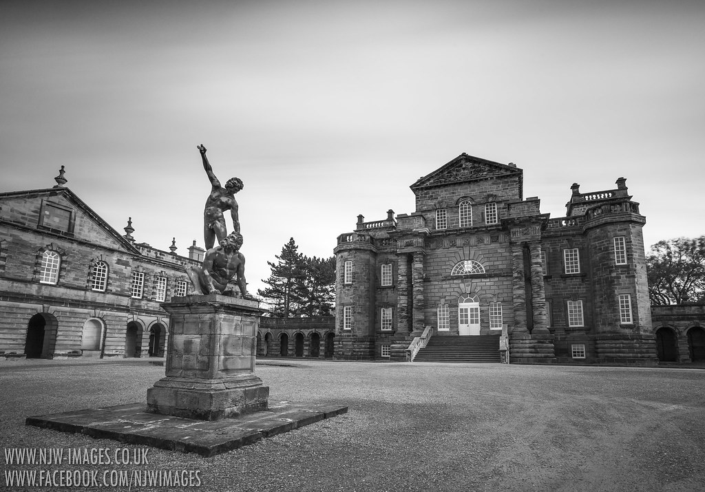
I particularly like the second shot. It's well composed drawing the eye into the image with a good B&W conversion. I think they would all look better if the verticals were corrected though.
These are couple of minor suggestions mainly relating to the second shot but may be worth considering.
The gravel in the bottom RH corner could do with a bit of a clean up, I found this a bit of a distraction.
I don't really like the blurred clouds they may have looked better with crisp clouds.
If you decide to go back, I would consider the following again in relation to shot 2.
As the building layout appears symmetrical I may have tried a shot with the same composition as shot 2 from the other side of the drive so that the statue was pointing into the frame, which may not have made a difference but the figures would have been pointing and looking towards the building.
A slight change in camera position to the right would have allowed you to separate the statue from the RH corner of the LH building if that makes sense.
All minor points really except the vertical correction.


")