

- Messages
- 5,635
- Name
- Shaheed
- Edit My Images
- No
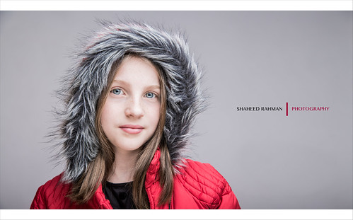
Just playing with an older image and thought I'd process it slightly differently.

In the Hood by Sir SR, on Flickr
Thanks
S
In the Hood by Sir SR, on Flickr
Thanks
S
 )
)
 When you posted the set this is from, I thought they looked technically perfect and also a little different (not sure how to describe it..... but you have a 'style').