

- Messages
- 1,353
- Name
- Neil
- Edit My Images
- No
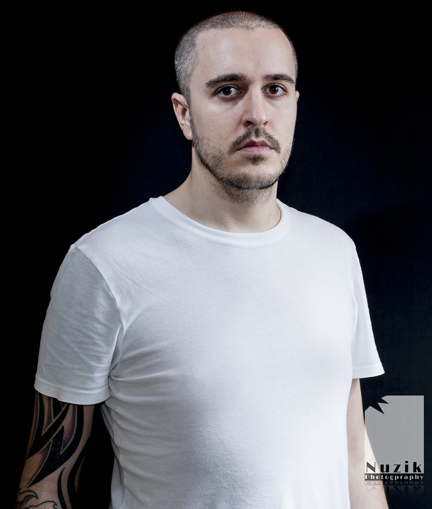
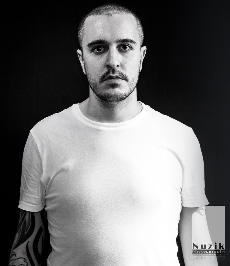
Took this today trying out my light stands and strobes. Right pain in the bum to get them both to work kept stopping getting annoyed and wanted to hit someone .Feel free to critique
1
 nuzik 7 by nuzik, on Flickr
2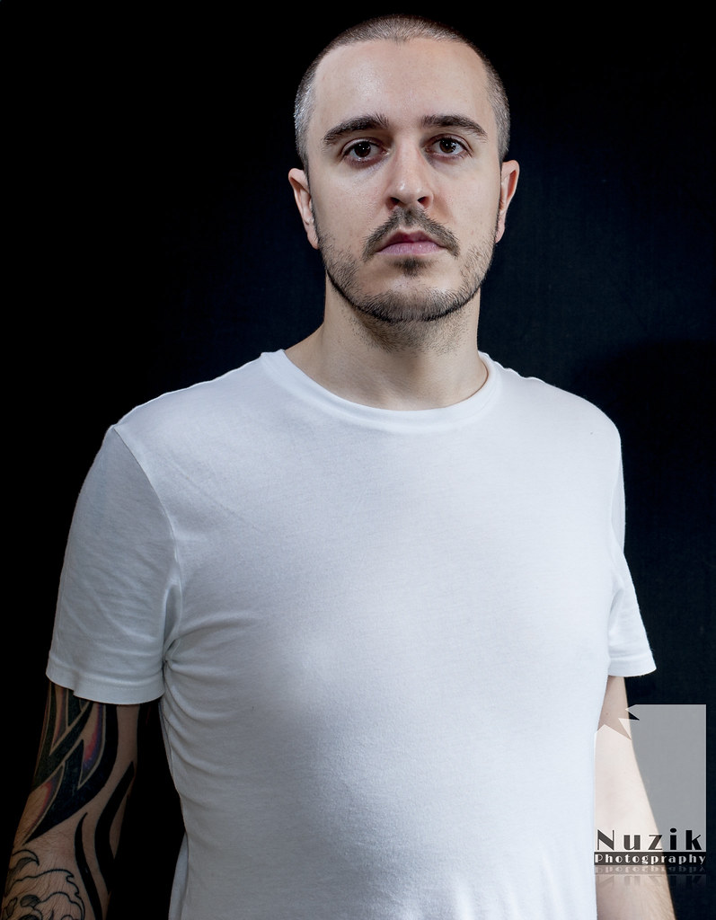 nuzik 6 by nuzik, on Flickr
3
 nuzik 5 by nuzik, on Flickr
4
 nuzik 4 by nuzik, on Flickr
5
 nuzik 3 by nuzik, on Flickr
6
 nuzik 2 by nuzik, on Flickr
7
 nuzik 1 by nuzik, on Flickr
8
 nuzik 8 by nuzik, on Flickr
1
nuzik 7 by nuzik, on Flickr2
nuzik 6 by nuzik, on Flickr3
nuzik 5 by nuzik, on Flickr4
nuzik 4 by nuzik, on Flickr5
nuzik 3 by nuzik, on Flickr6
nuzik 2 by nuzik, on Flickr7
nuzik 1 by nuzik, on Flickr8
nuzik 8 by nuzik, on Flickr
Last edited:
") so feel free to disagree with me
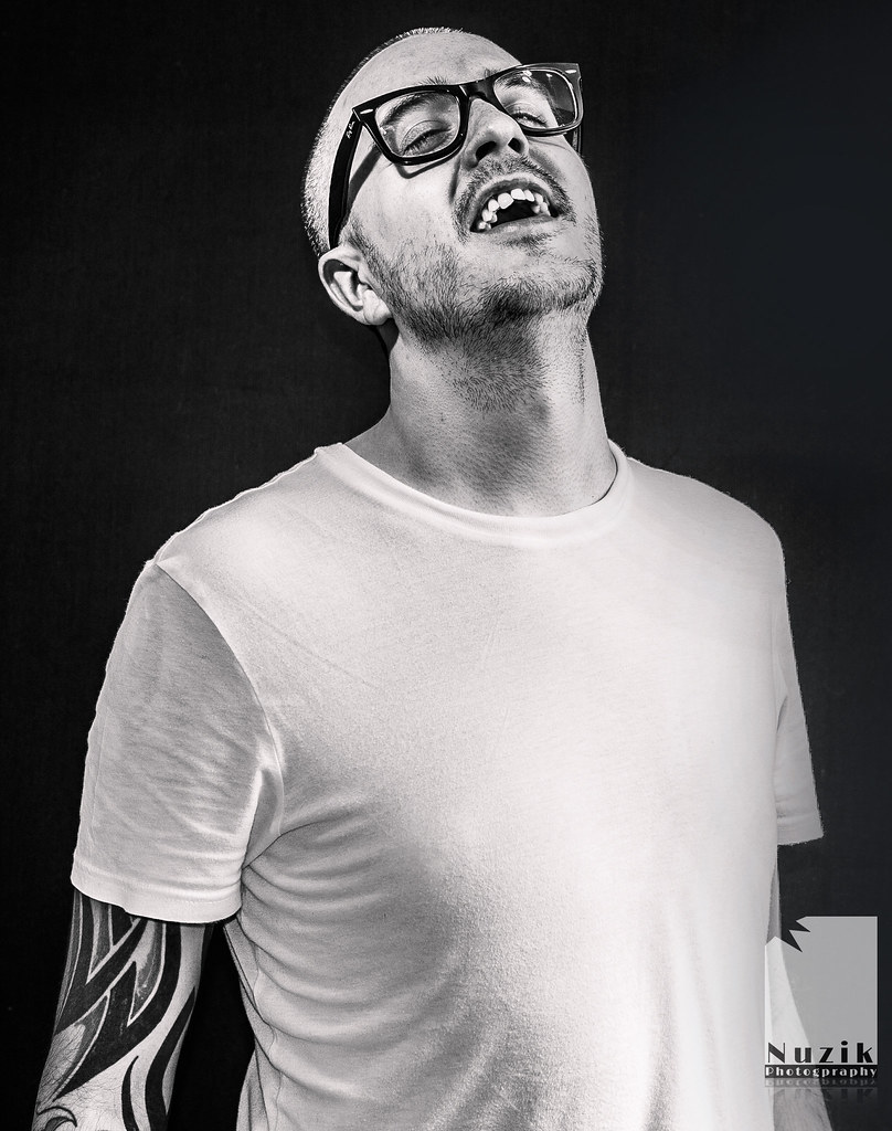
so feel free to disagree with me  Lighting could also be a bit more even with some front facing light to help with your eye shadows
  day2 13
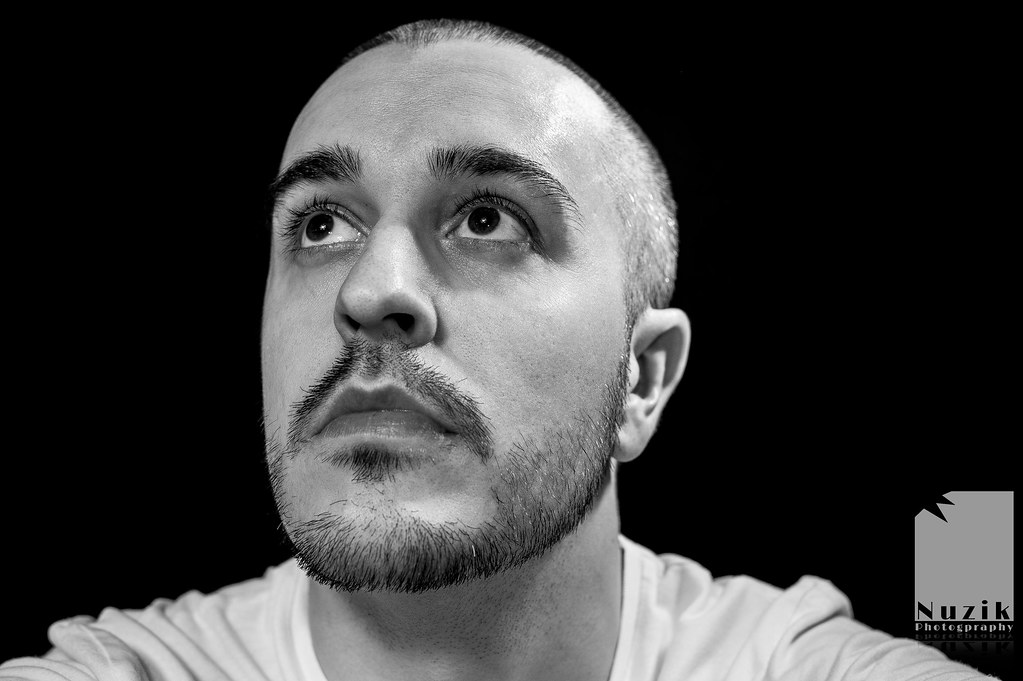 day2 10
 day2 9
 day2 8