You are using an out of date browser. It may not display this or other websites correctly.
You should upgrade or use an alternative browser.
You should upgrade or use an alternative browser.
weekly susiejb 52 /2014 Support
- Thread starter susiejb
- Start date
- Messages
- 7,548
- Name
- susie
- Edit My Images
- Yes
Hi Susie, Shape, really like the splash pic you have done really well without a separate flash
number, works for me as a theme, both are nice pics but the second one for me just edges it, excellent
Thanks Allan .... I don't think I will try the water splash again until I get a seperate flash, it's too annoying trying to get it right !!!!!
Glad you like the plant pics, I really enjoyed doing those.
- Messages
- 8,398
- Name
- Lynne
- Edit My Images
- Yes
Hi Susie
Your Daisy for Fresh....I like the 1st one for the detail but not sure about the clipped petals......I like the 2nd one for the addition of the clouds & water.......
Shape.....water droplets are addictive & frustrating in equal measure.......my choice would be the shot with the marbling ink...it's different , you've caught the droplet well
The fly eating plant shots........superb....keep looking at them & the detail is great.....love them & no crit to offer
Your Daisy for Fresh....I like the 1st one for the detail but not sure about the clipped petals......I like the 2nd one for the addition of the clouds & water.......
Shape.....water droplets are addictive & frustrating in equal measure.......my choice would be the shot with the marbling ink...it's different , you've caught the droplet well

The fly eating plant shots........superb....keep looking at them & the detail is great.....love them & no crit to offer

- Messages
- 7,548
- Name
- susie
- Edit My Images
- Yes
I'm not familiar with these plants susie. Do the insects get stuck to the sticky droplets?
Whatever, you've caught some cracking images.
Hi d00d...glad you popped in
Hi Susie
Your Daisy for Fresh....I like the 1st one for the detail but not sure about the clipped petals......I like the 2nd one for the addition of the clouds & water.......
Shape.....water droplets are addictive & frustrating in equal measure.......my choice would be the shot with the marbling ink...it's different , you've caught the droplet well
The fly eating plant shots........superb....keep looking at them & the detail is great.....love them & no crit to offer
Thanks for looking Lynne and taking the time to comment, I really enjoyed doing the water droplets but as you say they can be very frustrating indeed, I think my favourite of the three weeks is the plant shots...something very fascinating about them....really pleased that you liked them.
- Messages
- 4,834
- Name
- Alan
- Edit My Images
- Yes
Hi Susie
Looking at the last 2 week's shots it seems to me that you are really getting something out of the Challenge by extending your horizons to shots that you may not have taken ordinarily
Water drop shots are not my favourite subject but you have done really well with these - all of them illustrate the genre well - that one with the milk and ink is quite original idea. Foe me #2 because of the explosive impact that it gives
Number - on theme and some good detail and nice colour - #2 just edges it as a bit more detail and smashing green g/g
- Messages
- 7,548
- Name
- susie
- Edit My Images
- Yes
Shape #2 for me. Really looks like it's exploding.
Numbers...great idea#1 for me, the bright cheerful BG contrasts well with the soon to be eaten fly.
Cheers.
Thanks for looking Andy
Hi Susie - Numbers - both are good great detail
Craig
Thanks Craig ..much appreciated
Hi Susie
Looking at the last 2 week's shots it seems to me that you are really getting something out of the Challenge by extending your horizons to shots that you may not have taken ordinarily
Water drop shots are not my favourite subject but you have done really well with these - all of them illustrate the genre well - that one with the milk and ink is quite original idea. Foe me #2 because of the explosive impact that it gives
Number - on theme and some good detail and nice colour - #2 just edges it as a bit more detail and smashing green g/g
Yes you are right Alan ...I do love the challenge...it makes me think really hard to try and get something original for the theme, but I am also trying to look very objectively at my photo's too. I hope I am improving...I am certainly learning a lot...although I obviously have along way to go yet...I shall be here 'till the end...and next year too
- Messages
- 4,834
- Name
- Alan
- Edit My Images
- Yes
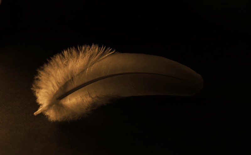
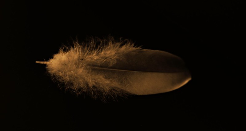
Strong - good subject, certainly on theme. I really like the lighting, very northern European style of art still life colours which impress me.
For me #1 is best as the curve adds to the comp and the lighting of the b/g graduates from left to right and there is a translucency to the lhs of the feather - maybe just a very small additional touch of light at the rhs but overall super shot
For me #1 is best as the curve adds to the comp and the lighting of the b/g graduates from left to right and there is a translucency to the lhs of the feather - maybe just a very small additional touch of light at the rhs but overall super shot
- Messages
- 7,548
- Name
- susie
- Edit My Images
- Yes
Strong - good subject, certainly on theme. I really like the lighting, very northern European style of art still life colours which impress me.
For me #1 is best as the curve adds to the comp and the lighting of the b/g graduates from left to right and there is a translucency to the lhs of the feather - maybe just a very small additional touch of light at the rhs but overall super shot
Thanks Alan ...that's very encouraging as I wasn't too sure about them. It was so much harder than I thought to get the lighting right ...it was either too bright, or not bright enough. I'm quite taken with this effect ... they were going to be mono, but I find this one gives a much softer feel. I added a really tiny sunglow to give them a final lift.
Last edited:
- Messages
- 7,548
- Name
- susie
- Edit My Images
- Yes
Hi Susie, nice idea though a touch more light would be nice, they are just lacking a little detail don't really have a preference for which one
I like the curve in 1 but the fluffy end section in 2
Hi Allan ...thank you for looking ... much appreciated
- Messages
- 1,159
- Name
- Simon
- Edit My Images
- Yes
Numbers - I love macro shots and these are no exception. It fits the theme, sort of  but great shots and I love the bokeh too. I should have got a raynox instead of extension tubes...
Strong - I'm interested in the colour you've achieved here and how - they're very clear, they look dim but not at the same time. Nice textures in the feathers.
Strong - I'm interested in the colour you've achieved here and how - they're very clear, they look dim but not at the same time. Nice textures in the feathers.
Last edited:
- Messages
- 7,548
- Name
- susie
- Edit My Images
- Yes
Nice, creative intepreation there.
The tones work well and the light does too...but I'd like a little more light on the RHS and perhaps a little wider DOF.
Cheers.
Thanks Andy ....yes I should have tried to get a little more light in ...it's annoying now !!
- Messages
- 7,548
- Name
- susie
- Edit My Images
- Yes
Numbers - I love macro shots and these are no exception. It fits the theme, sort ofbut great shots and I love the bokeh too. I should have got a raynox instead of extension tubes...
Strong - I'm interested in the colour you've achieved here and how - they're very clear, they look dim but not at the same time. Nice textures in the feathers.
Hi Simon ...thanks for looking ... I must say I'm very pleased with the Raynox as it's wasn't too expensive but it does do a pretty good job.
The effect on the feather ...I don't have Photoshop, so for that one I used a programme called PicMonkey, selecting Daguerreotype, and then the one they call Plumbe, in the same programme I added a very tiny Sunglow. I just tend to mess about until I get something I like
Last edited:
- Messages
- 9,095
- Name
- Mandy
- Edit My Images
- Yes
Strong - I like the idea behind this shot nice take for the theme, looks a little dark to me.
- Messages
- 7,548
- Name
- susie
- Edit My Images
- Yes
Strong - I like the idea behind this shot nice take for the theme, looks a little dark to me.
Thanks for taking the time to comment Mandy .... Yes I really must try not to make my shots quite so dark.
- Messages
- 8,398
- Name
- Lynne
- Edit My Images
- Yes
Hi Susie
I also prefer the 1st shot for the curve in the feather , darkness has been mentioned.....possibly use a reflector or tin foil to bounce the light from the lhs back on to the rhs ?
I also prefer the 1st shot for the curve in the feather , darkness has been mentioned.....possibly use a reflector or tin foil to bounce the light from the lhs back on to the rhs ?
- Messages
- 7,548
- Name
- susie
- Edit My Images
- Yes
Hi Susie
I also prefer the 1st shot for the curve in the feather , darkness has been mentioned.....possibly use a reflector or tin foil to bounce the light from the lhs back on to the rhs ?
Thanks for looking Lynne and for the handy hint
Hi Susie, great idea that works well for the theme. I think 2nd image for me, good detail through the length of the feather, although the composition with the curve in the 1st adds to the imageLighting's good in both and it suits the processing

Thank Phil...glad you liked them.
lovely pair of images.
Ta d00d
very nice images and love the lighting
Thanks for taking the time to look Colin.
HI Susie Strong a good take on the theme I quite like the darkness and the curve
Craig
Thanks Craig ... I appreciate that you took the time to look and comment
- Messages
- 1,409
- Name
- Elaine
- Edit My Images
- Yes
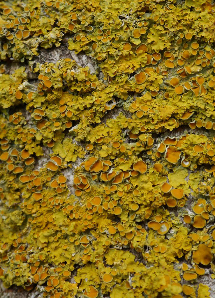
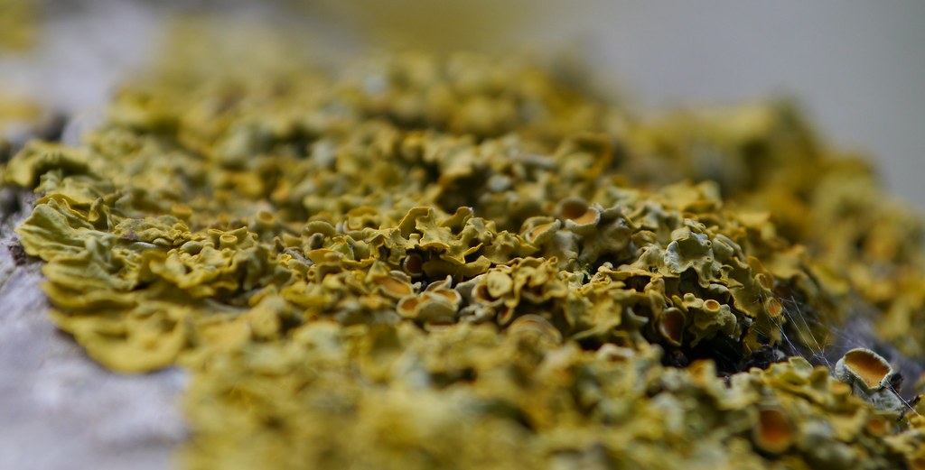
Great shots Susie. I like the contrasting colours in the first one, but I think I prefer #2 because the angle gives it a kind of landscape quality, almost like looking at a miniature forest.
- Messages
- 7,548
- Name
- susie
- Edit My Images
- Yes
Hi Susie,
strong ...I like no 1 best lovely shot
Texture... no 1 again, Lichen makes such lovely patterns
Thanks for looking and commenting Judi
Hi Susie, I like number 2 more because of the shallow dof. (I am a stickler for them!). Great texture.
Hi Simon, I thought I would try a different angle, glad you like it.
Great shots Susie. I like the contrasting colours in the first one, but I think I prefer #2 because the angle gives it a kind of landscape quality, almost like looking at a miniature forest.
Thanks Elaine...yes I think they both show different aspects, I took quite a few but felt these two showed it off the best.
Textures, yeah, on theme and lovely detail and muted greens. I feel it needs something to focus on, IYSWIM.
Cheers.
Thanks for looking Andy, I do know what you mean, the problem was if I added in any of the tree itself I lost the close up of the lichen...I've mulled it over to think of a solution but haven't come up with one yet !
Hi Susie, I have done a few pics of lichen it is fascinating stuff, of the two the first one works for me the colour is excellent
Thanks Allan...I always think it's like a little fairytale world when you really look into it.
- Messages
- 261
- Name
- Richard
- Edit My Images
- Yes
Susie - Strong, no 1 is a cracking shot and I love the monotone effect.
Texture no 2 is my preference just because of the limited dof. Both good shots though.
Texture no 2 is my preference just because of the limited dof. Both good shots though.
- Messages
- 7,548
- Name
- susie
- Edit My Images
- Yes
Susie - Strong, no 1 is a cracking shot and I love the monotone effect.
Texture no 2 is my preference just because of the limited dof. Both good shots though.
Thank you Richard ...much appreciated comments, I wish now that I had tried a few more angled shots as they do seem to really emphasize the texture in more detail.
- Messages
- 7,548
- Name
- susie
- Edit My Images
- Yes
Hi Susie, your 2nd Lichen shot for me, the close up detail, colours and shallow dof all work well
Hi Phil...thank you for looking, I almost didn't put that one on but I'm glad I did now
- Messages
- 9,095
- Name
- Mandy
- Edit My Images
- Yes
Texture - nice take for the theme, I will go with the first image for composition and can see all the textures on the lichen better.
- Messages
- 8,398
- Name
- Lynne
- Edit My Images
- Yes
Hi ay
you've caught the colors & textures & detail really in the 1st image but I kinda prefer the more acute angle of the 2nd as it holds my eye longer ...just maybe needs a little more light to pull out the finer details ?
you've caught the colors & textures & detail really in the 1st image


