

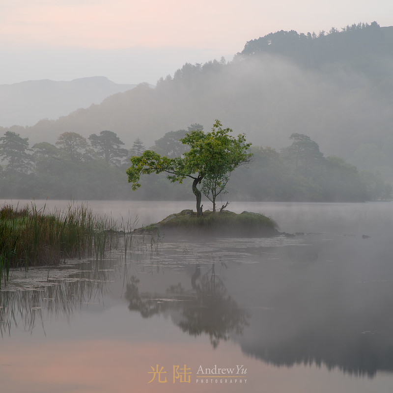
A beautiful morning with subtle mist around and pink sky made this pastel image of the tree for me. I opted for a square crop as I thought it suited the overall feel of the image as well.
Mornings like this have a great calming effect too
Thanks for looking,
andy
Mornings like this have a great calming effect too
Thanks for looking,
andy
 - exceptionally effective rendering of an idyllic scene
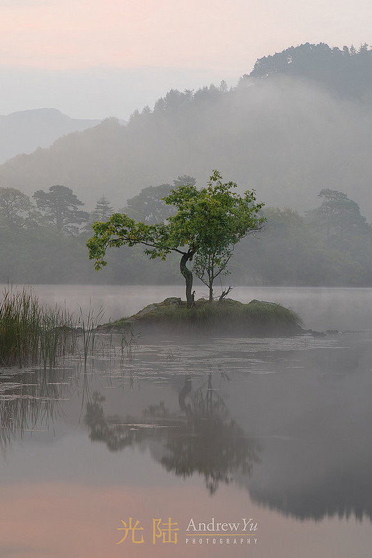
") but those are my eyes! cheers though
but those are my eyes! cheers though well captured