Tower Bridge Re-edit.

Messages
6,508
Edit My Images
Yes
I have just been having a dabble with an image I took before Christmas and would be interested in what you think.

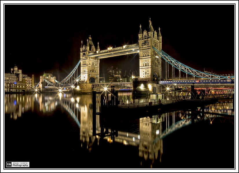
Some of you might have seen the original shot of tower bridge that I did which is this one.

Original
original.jpg


I have done a little tinkering with the image and here is version two.

Re-Edit
original.jpg


Which do you think is the better shot/edit and if you have the time I would be interesting in hearing why.

Regards

Nigel
 
Last edited:
That's a great pic Nigel (y) I'm no expert but the 2nd one just grabs me a little more than the original. Can't give a technical account of why but it just catches the eye more. Being a Londoner now living in Dundee this is a real taste of home!! Thanks. (y)
 
It's a tough one Nigel...I like the reflections in the first one better and the bridge in the second one better. For me, the intensity in the reflections of the second make it just too busy for me below the right hand side of the bridge. For me, the second looks just a smidge over processed (not technically, but to the eye). That probably made no sense lol !
 
I prefer the 2nd and like what you've done in the editing process. It has better colours, especially the blues and blacks and just stands out more. The bridge itself looks less bland in the 2nd with a tiny bit more colour in the brickwork.

Great original pic though.
 
I have had a few visits back and fore here and decided to stick with first impressions, the newly editted one for me.

The sharpness, colours and detail in 2 is like the shot you tried to take whereas the 1st when compared side by side is like the attempt you had and failed if that makes any sort of sense?

Without a doubt the 2nd is the one i would be proudest of (y)
 
I like the 2nd one better too, mainly for the intensity of the blacks.
But what . . . is that blackish square at the bottom of the right tower? A blob on the sensor? It really catches my eye and spoils what is otherwise a superb shot.
 
Wow, they are fantastic!
Second one slightly edges it for me, though both are cracking (y)
 
Both great shots (y)
The second just has the edge for me as the colours are more define and the black is darker.
The only thing that is a bit strange is the red 'mist' that seems to follow the line of the bridge. Which I can't see in the original.
 
Both excellent, slightly prefer No2 - not qualified to give technical input - sorry
 
2nd one for me... only things that puts me off is the blue on the bridge supports to the right seem very bright.
 
Back
Top