- Messages
- 18,233
- Name
- David
- Edit My Images
- Yes
Mainly error, but managed 2 i liked. The one of Lily is slightly soft, but decided to go with it anyway.
What say you?
#1
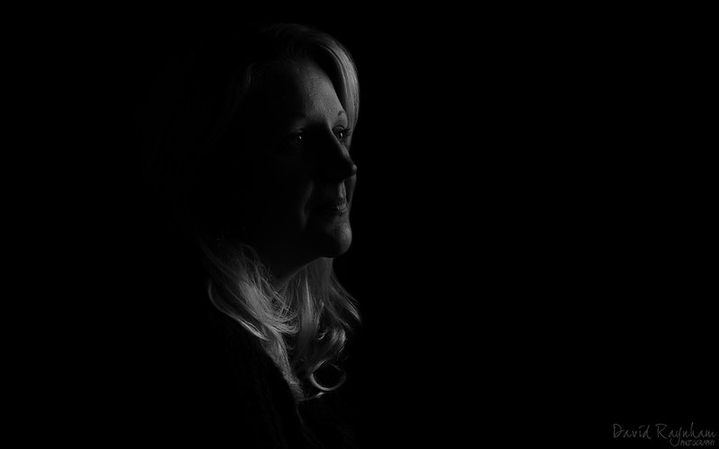
Laura - Low Key by David Raynham, on Flickr
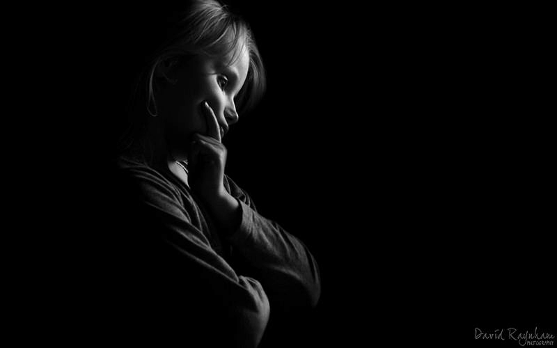
#2

Lily - Low Key by David Raynham, on Flickr
Any pointers?
C+C welcome.
David.")
What say you?
#1
Laura - Low Key by David Raynham, on Flickr
#2
Lily - Low Key by David Raynham, on Flickr
Any pointers?
C+C welcome.
David.