D
You are using an out of date browser. It may not display this or other websites correctly.
You should upgrade or use an alternative browser.
You should upgrade or use an alternative browser.
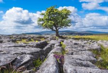
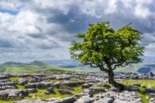
Two Images, Same Day. Which Composition Do you prefer?
OP
Deleted member 97794
Guest
Yes, it is a much more balanced image IMO.second
The second image for me as well.
It's a combination of several aspects which lead me to prefer this;
It's a combination of several aspects which lead me to prefer this;
- The Tree is more prominent (and also positioned on a 'third', horizontally)
- The Higher viewpoint shows the 'pattern' of rocks / grass better
- The mid-ground hills are more visible, and are in sunlight
- The cloudy sky is more interesting (compared to the block of blue at the top of the first image)
OP
Deleted member 97794
Guest
Great analysis! Thank you!The second image for me as well.
It's a combination of several aspects which lead me to prefer this;
- The Tree is more prominent (and also positioned on a 'third', horizontally)
- The Higher viewpoint shows the 'pattern' of rocks / grass better
- The mid-ground hills are more visible, and are in sunlight
- The cloudy sky is more interesting (compared to the block of blue at the top of the first image)
I just wish I could do the same when I'm stood looking at a scene with camera in hand...Great analysis! Thank you!

- Messages
- 1,614
- Name
- David
- Edit My Images
- No
I think the first image has merit in that the lead in lines from the limestone pavement but I would avoid having the tree right in the middle. I have been to this spot but only in the winter so no leaves on the tree. When I went there was a dark stormy sky but still sunlight on the tree. Clearly both images are attractive. Why do you need to choose between them?
Dave
Dave
OP
Deleted member 97794
Guest
You know how it is... I don't think she believes me when I tell her how good that image is, because my opinion is not exactly independent. You nailed all the critical improvements over my image.I just wish I could do the same when I'm stood looking at a scene with camera in hand...
OP
Deleted member 97794
Guest
My next post directly below yours probably answers that question Dave.Why do you need to choose between them?
Dave
Nod
Tootles
- Messages
- 45,574
- Name
- Nod (UK)
- Edit My Images
- Yes
Can only add that I prefer the second but would prefer it flipped so the tree is on the left side of the frame rather than the right. Possibly because I read left to right, MY preference (even for stationary objects!) is for the largest/tallest part of the subject to be on the left. However, I do appreciate that that's not how the scene looks!
A possible option of reframing the tree on the left is probably scuppered by the fact that that would lose the pair of hillocks in the middle distance.
I'd be happy with either though, TBH.
A possible option of reframing the tree on the left is probably scuppered by the fact that that would lose the pair of hillocks in the middle distance.
I'd be happy with either though, TBH.
- Messages
- 3,252
- Name
- stuart
- Edit My Images
- Yes
I prefer the first .....I couldn't really care about "rules" thirds and leading lines etc . If I like a shot I just like it . To me the first shot is just a picture of a tree .....a nice tree but just a tree . Where as the second I have a lot more to look at and I think the rocks texture and shape is just as interesting to look at than the tree . I definitely feel "more inside" the first image . It's definitely the one I would choose as a 4ft canvas on my wall
- Messages
- 4,697
- Name
- Jan
- Edit My Images
- No
2nd for me. Good leading lines in the 1st that do exactly what they're supposed to do and take my attention to the tree but then my eyes start bouncing all over the rocks. The 2nd is a peaceful and relaxed composition where I can look at the tree calmly then settle on the background hills. They both have merit- neither is right or wrong. They merely approach the same subject from different perspectives. If I was there I'd probably take both shots-the first because I felt I should and the 2nd because I wanted to. If one went on the wall it would be the 2nd
OP
Deleted member 97794
Guest
Yes, I've often thought I took my image following the usual rules of landscape photography, which is fine so long as you stay open minded. Some of my best images shouldn't work but they do.If I was there I'd probably take both shots-the first because I felt I should and the 2nd because I wanted to. If one went on the wall it would be the 2nd
- Messages
- 138
- Name
- Dan
- Edit My Images
- Yes
+1second
- Messages
- 3,346
- Name
- Simon
- Edit My Images
- Yes
Not much in it for me but second would probably get the nod as I like the thirds composition better and the higher viewpoint gives a better look at the background hills. That higher viewpoint also means the tree doesn't have as good a separation as it has in the first image and the leading line in teh first image is stronger. I guess a thirds composition and if possible a viewpoint that split the difference with a strong leading line and also gave a decent look at the hills beyond to the left and right of the tree and also put the tree on a third would be the sweet point for me.


