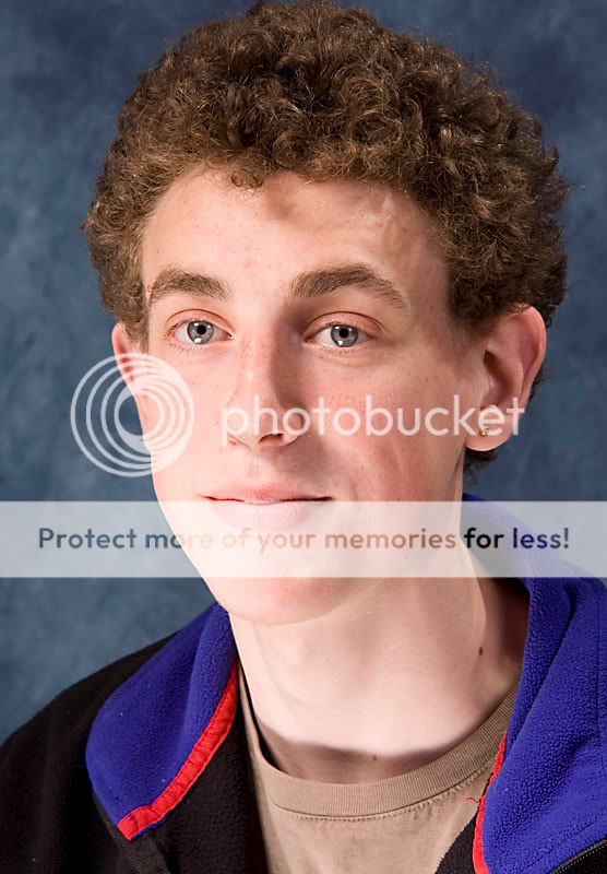
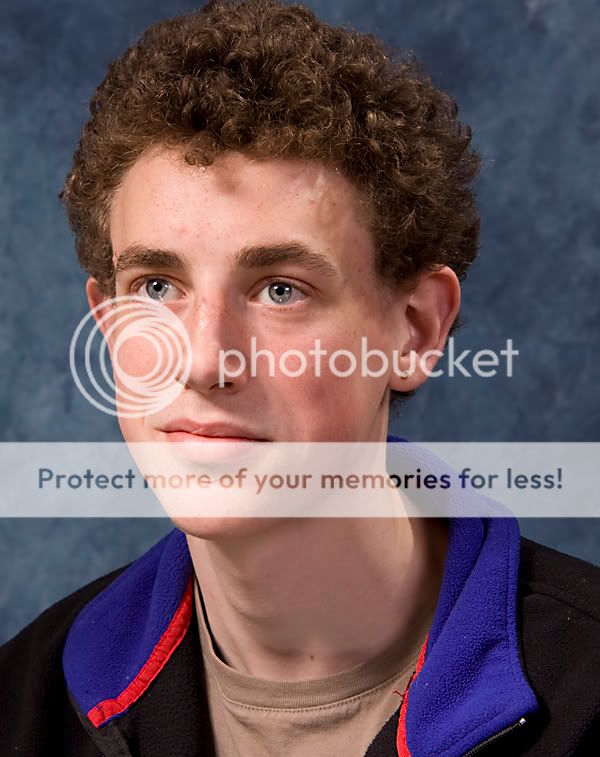
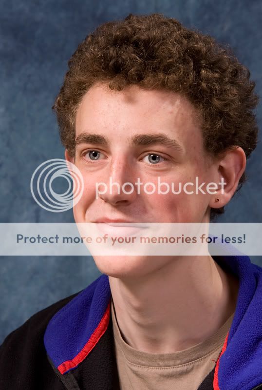
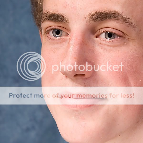
what do ya think 3

Messages
1,523
Name
chris
Edit My Images
Yes
1
whatdoyathink3b.jpg

2
whatdoyathink3c.jpg

3
whatdoyouthink3a.jpg

4
whatyathink3.jpg
 
No3 makes me grin, it looks like he is about to burst into giggles :)
 
I like 'em.

Have you sharpened these in PP 'cos they look a bit "edgey" to me. Nice, clear and good focus though. (y)
 
little pp on the eyes, too much ??
and took out some spots lol oh an a scar which i was told i "had too"
 
Personally, I think you need to be a bit more imaginative. There are so many more poses you can do, the list is honestly endless.

I dont want to sound harsh, just try something different other than run of the mill headshots :)
 
The lighting doesn't seem right to me, although I'm no expert. It looks as though you could use a reflector to lose the shadows under the subjects chin.
 
I'm no expert and still learning myself but it looks to me like your main light needs to be lowered a little and the hair/fill light on the right hand side needs to be moved to try and reduce the shadows from his hair. There also seem to be three keylights in his eyes!
 
Personally, I think you need to be a bit more imaginative. There are so many more poses you can do, the list is honestly endless.

I dont want to sound harsh, just try something different other than run of the mill headshots

like ??not that much i can do in the small space i have,

got any links or something betty
The lighting doesn't seem right to me, although I'm no expert. It looks as though you could use a reflector to lose the shadows under the subjects chin.
shadows went think pic 3 and 4 ??
I'm no expert and still learning myself but it looks to me like your main light needs to be lowered a little and the hair/fill light on the right hand side needs to be moved to try and reduce the shadows from his hair. There also seem to be three keylights in his eyes!

two lights and a reflector were used

cheers all anyway
 
Last edited:
The pose for 1) is good, the straight look into the camera is engaging. Unfortunatly the lighting did not work for that shot, too bright with the harsh shadow on his neck.

for the rest the lighting improves a lot, it would be nice to lose the shadow right in the middle of his forhead but the general effect is good, the shadows giving good definition to the planes in his face.

3) looks a bit red on my monitor
4) is my favorite, though i think it would be improved by looking straight into the lens.

I find the orange stripe on his top a bit distracting, and I am not a fan of the retro bacground... looks like my school photo from 1979 ;)
 
Hi Rockkeeper, I empathize with your lack of space as I have the same problem.
However, you might like to try my stop gap method.
I don't use brollies at all as they take up too much space and can't be placed far enough apart to prevent the triple highlights you have in the eyes.
I bounce one light from the white ceiling and another from a huge white card taped to the wall and a reflector held low by either myself or the subject.
Give it a go, I hope it works for you.
 
I find the orange stripe on his top a bit distracting, and I am not a fan of the retro bacground... looks like my school photo from 1979

it s red stripe on his top ??,
retro background hmmm well there that or i got white

cheers paul for tip
 
Back
Top