- Messages
- 20,926
- Name
- Steve
- Edit My Images
- Yes
Station Clock

Old house

Evening light on Cliffords Tower

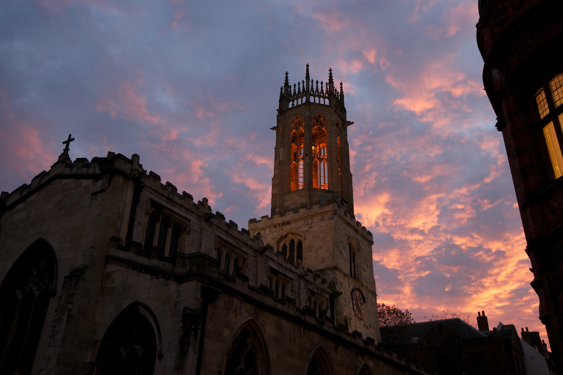
Fire in the Sky
Old house
Evening light on Cliffords Tower
Fire in the Sky
Last edited:

I had it set to the cloudy WB. Is your monitor ok as the lights not pink, more a warm orange. All of these were taken on the same cloud WBWith interesting pink light hitting the tower, maybe auto-white-balance did something funny.
(I don't know what files or settings you're using, see.)
Can you post a couple of crops from the "Clock"?