A couple from Anston Tropical house

Messages
8,398
Name
Lynne
Edit My Images
Yes
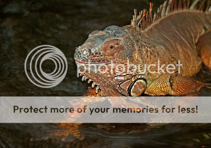
Visited this place over the christmas break .Still learning with the D80 , so appreciate feedback,thanks


Think this may look better if I crop that green thing out on the right ? Just cropped it & re-posted,much better I think


DSC_4147a1.jpg


I like the fact you can make out his legs under the water

DSC_4224a.jpg


thanks for looking
 
Last edited:
The detail in the butterfly is great.

Hope you don't mind but I had a play with the iguana? I won't post as you have edit crossed off but a slight crop off the r/h side and top and a very slight tweak of levels and contrast might be worth a try. The tweaks in levels and contrast really do bring out that gorgeous detail in his head.

Hi Staffitaxi

would love to see your version - will help give me ideas for the future.
How do I get rid of the cross in the edit box? Have looked on my profile page but cant see anything to change ? Thanks

Sorted,finally found the box I needed :)
 
Last edited:
Not a big fan of butterflies, especially when they flap about in your face. However I like the image you've taken. Colourful and sharp.
 
I very much like both of these images.

The butterfly looks great to my eye just like it is. I agree with Andrea about adjusting the light distribution/contrast of the second, but FWIW my preference would be a little milder. This version just had an extremely mild defog and very gentle Curves. Probably too mild for many tastes, and possibly you won't even see any difference at all*, but I don't think it hurts to have some alternatives to see what sort of changes make a difference to you and appeal to your tastes and preferences.

And also very much just FWIW, I prefer the original crop - can't pin down exactly why though.


Not my image - reworked - Lynne - PS2 Df4x30Cu rls4stin by gardenersassistant, on Flickr


* I use a technique of flicking back and forth between versions with one version exactly overlaying the other. This makes differences jump out. (You can get a similar effect by putting the versions into separate browser tabs and flicking between the tabs.) Sometimes though, differences that are visible doing this are not - at least to my eye - visible just casting my eye between versions on the same browser page.
 
Thanks for posting that Andrea . I can see what you mean , my version looked a little " washed out" I only have PSE 9 & very little idea how to use it - not seen contrast,defog or curves in it ?

This forum is begining to take over my life!
 
Thanks for posting that Andrea . I can see what you mean , my version looked a little " washed out" I only have PSE 9 & very little idea how to use it - not seen contrast,defog or curves in it ?

These may help for how to do contrast and curves in PSE9. As to why you might want to use them, you might find the Understanding Histograms, Part 1: Tones & Contrast link, the Using the "Levels" Tool in Photoshop link and the Using the "Curves" Tool in Photoshop link on this page useful (and maybe some other links on that page too). The last two are about Photoshop rather than PSE, but the principles are the same.

You won't (I imagine) find defog in the PSE menus. A defog uses unsharp mask, with a small Amount, a large Radius and a Threshold of zero. Another term used for "defog" is "clarify", which gives an idea of what it does. You may see references on line to using an Amount of 20% and a Radius of 60 pixels. It is a personal thing, but for my taste that is almost always much too much. For my own images I tend to use an Amount of 7% and a Radius of 30 pixels for starters, and then increase or decrease the Amount as seems appropriate for a particular image. As an example, for my mild rework of your image, I used an Amount of 4%.

This forum is begining to take over my life!

You are not alone.:)
 
Last edited:
That butterfly is stunning I have taken many at Butterfly farms over the years but nothing as good as that

Thats really kind of you,thank you:)

These may help for how to do contrast and curves in PSE9. As to why you might want to use them, you might find the Understanding Histograms, Part 1: Tones & Contrast link, the Using the "Levels" Tool in Photoshop link and the Using the "Curves" Tool in Photoshop link on this page useful (and maybe some other links on that page too). The last two are about Photoshop rather than PSE, but the principles are the same.

You won't (I imagine) find defog in the PSE menus. A defog uses unsharp mask, with a small Amount, a large Radius and a Threshold of zero. Another term used for "defog" is "clarify", which gives an idea of what it does. You may see references on line to using an Amount of 20% and a Radius of 60 pixels. It is a personal thing, but for my taste that is almost always much too much. For my own images I tend to use an Amount of 7% and a Radius of 30 pixels for starters, and then increase or decrease the Amount as seems appropriate for a particular image. As an example, for my mild rework of your image, I used an Amount of 4%.


You are not alone.:)

OMG, I'm already spending far too much time on here as it is ! Think I need to book a couple of days off work & take a proper look round PSE9 :eek:
Never thought I'd use editing but am begining to see the benefits of slight use so the picture I end up with is a truer representation of what my eye's actually saw. Thanks for the info & advice all :clap:
 
Back
Top