A Few Recent Mono Landscapes

Messages
253
Edit My Images
No
A few from the last couple of months, cc absolutely most welcome

Thanks for looking :)

#1 Skye Wind Farm
2383960304_cfb377b232.jpg

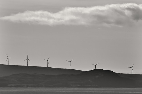
f/8 | 300mm | 1/400sec | ISO-100


#2 Elgol Jetty
2389479584_031f24dac5.jpg

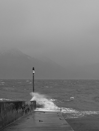
f/11 | 40mm | 1/20sec | ISO-100


#3 Elgol Shore
2390476820_45dce25249.jpg

f/11 | 10mm | 1/60sec | ISO-2oo | ND Grad


#4 Blackrock Cottage
2437055472_a3cfb10de9.jpg

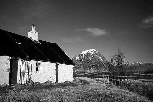
f/11 | 22mm | 1/60sec | ISO-2oo


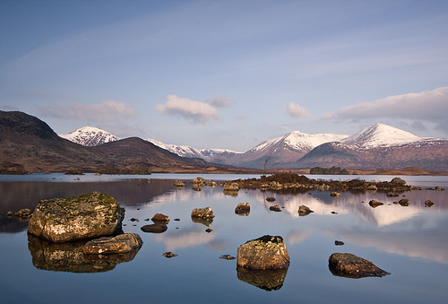
#5 Lochan na h-Achlaise
2474054809_3f6bb53101.jpg

f/11 | 22mm | 1/10sec | ISO-100
 
I like the last one a lot, but the others leave me cold - sorry!
 
Pretty good with 3,4 & 5 being the best of the bunch. As said some might be better in colour as there is not enough "mood" for the mono to come in to it's own. (y)
 
:LOL:

I like #1,
There's something about the wedges I like, that slope of the land with the complimentary opposite slope of clouds.
The land tones are a bit funny, maybe mist or something, dodgy processing ? I dunno, but I like how its put together, great spot(y)
 
I like the last one a lot, but the others leave me cold - sorry!
Thank you very much, no need to apologise, appreciate your honesty :)

The last one for me too
Thank you

needs colour
lol, touché :)

Pretty good with 3,4 & 5 being the best of the bunch. As said some might be better in colour as there is not enough "mood" for the mono to come in to it's own. (y)
Thanks for the comment, point noted re mood cheers

:LOL:

I like #1...
....maybe mist or something, dodgy processing
probably both! :D

Thanks very much
 
Now I love mono landscapes (I know, I'm odd!) and I really rather like these. The second one of the jetty perhaps get down a little lower to get more of the jetty in and make the white spray stand out a little more. Shooting later/earlier in the day also helps a lot with contrast which contributes a lot to mono.

Overall I like them, keep going! :)
 
They all have 'something' but No.2 stands out. It's simple, draws the eye in and captures a mood very well. There are millions of landscape images out there that are 'nice' but not so many that stand out from the crowd. No.2 does more than the others for me. JMO
 
4,3,5 for me in that order of ascending goodness. Not bad at all, at all, at all (y).
 
First and last for me. Can't really say why for #1 - I just like it. #2 would be excellent in colour or black and white, wonderful shot.
 
I feel they all work well, its a change to see such images in a different contrast.(y) up from me..
 
I like them all except no1. I think the windmills are too far away so don't stand out enough. No 2 stands out as my favourite I think it really captures the mood of a cold grey day and I like the way you managed to capture the spray. Good work (y)
 
Agree with oldfart.

#1 doesnt work for me - too hazy, but no atmosphere.
#2 the empty sky doesnt provide interest or counterpoint
#3 great!
#4 OK - suspect colour would be better
#5 nice, but again I think needs colour.

not that I'm saying that I could do as well, you understand
 
Nice set.

I really like #1. Love the scale of it. Would love to see it bigger...

And #5 - really nice reflections. Would interested if what the original colour shot was like?
 
Thank you for all the constructive comments folks, appreciate it

My personal preference for #5 is definitely a mono conversion but here's how #5 looked in colour straight out of the camera for the record (I've not done anything to it, i.e. shot RAW/neutral, no sharpening etc. as you can see the light was quite harsh when the shot was composed)

img1160jr4.jpg


However, I've got colour frames from that morning when the light was less harsh e.g.:

2413772915_bf89acb969.jpg
 
I like 4 & 5 from the original shots the best, but the last two i think are stunning! :clap: Its a beautiful part of the country you live in. My mum lives kinda near you, and so far i havn't made it up there with my camera, but can't wait till I do!
 
Like the last one. Very nice.
 
Theyre all greart shots, but the last mono and the two colour versions are my favourites of the set.
 
2nd colour one is excellent - i would think cropping a bit of the sky out would help (maybe just me, but making the horizon the top third??) but lovely image!
 
2,3 and 5 for me have really strong compositions and are well processed. The other two don't really do anything for me I'm afraid. The first shot inparticular needs more of a focal point imho. :)
 
The last mono for me, it's a stunner! (y)
 
I think I've commented on these elsewhere. I like 3, 4 & 5 very much (y)
 
Back
Top