

You are using an out of date browser. It may not display this or other websites correctly.
You should upgrade or use an alternative browser.
You should upgrade or use an alternative browser.
A little different....
- Thread starter neo2810
- Start date
OP
- Messages
- 1,443
- Edit My Images
- No
mint work neo, happy xmas/new year.
Cheers for the comments... Merry and happy back at you Mel
")
- Messages
- 6,457
- Name
- mark
- Edit My Images
- Yes
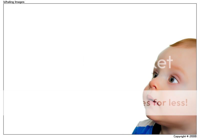
not sure if i like all that white in the first one, but i love the images.
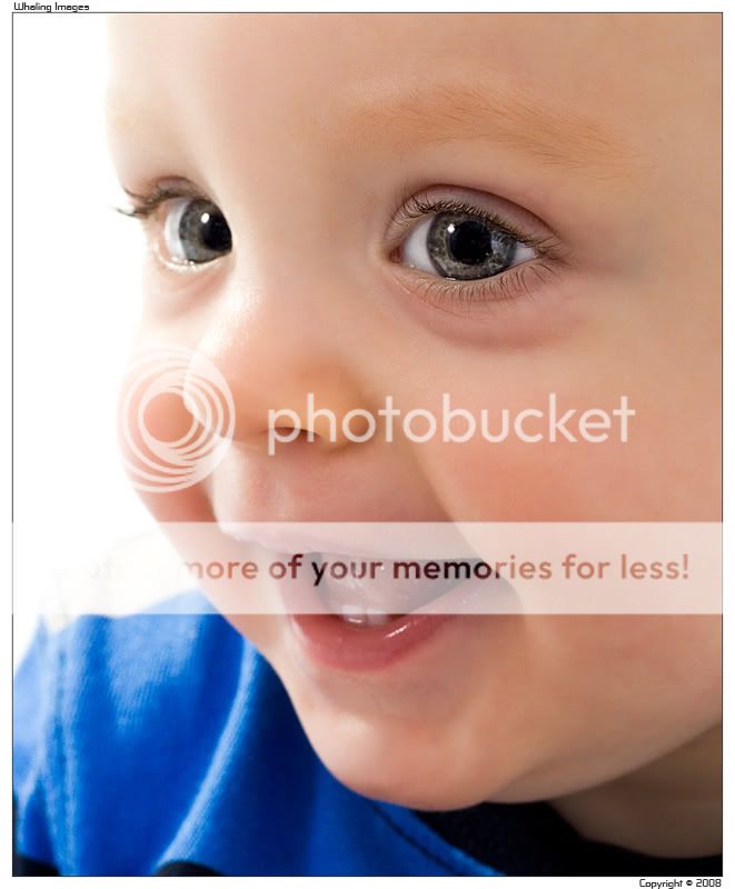
no.2 is excellent. that expression is something else. brill.
no.2 is excellent. that expression is something else. brill.
EdinburghGary
Reply not Report
- Messages
- 19,065
- Name
- Gary
- Edit My Images
- Yes
I prefer the 2nd, the 1st looks like he has had over processing applied to his skin?
Gary.
Gary.
OP
- Messages
- 1,443
- Edit My Images
- No
I prefer the 2nd, the 1st looks like he has had over processing applied to his skin?
Gary.
Lol... you're a right PP phobic aren't you Gary
Yes, that's because it has been touched up a fair bit, but at client request. I always go through the level of smoothing and mark removal that's wanted by the client before I do it, and this particular couple wanted the porcelian look. It's not totally my cup of tea either (I like SOME smoothing/healing, but not that much), but it works for some.
Thanks for the comment
- Messages
- 1,585
- Name
- dave
- Edit My Images
- Yes
really like them both!
i also love the negative space in the first however, works really well for me
i also love the negative space in the first however, works really well for me
- Messages
- 207
- Name
- Paul
- Edit My Images
- Yes
I love the first, negative space either works or it does not, here it works well for me!
As far as post processing the client is king, but I do find the blue tint in the skin by the eye (proberly a blood vein near the skin surface) a little detracting and would have proberbly removed that, but thats being picky.
As far as post processing the client is king, but I do find the blue tint in the skin by the eye (proberly a blood vein near the skin surface) a little detracting and would have proberbly removed that, but thats being picky.
- Messages
- 1,474
- Name
- Mike Whitmore
- Edit My Images
- Yes
I like them both, but the first one appears more editorial. What with the blank space and all. Nothing wrong with that though!
The second one is excellent, I've always found it difficult getting small children posed in exactly the right manner and that shot turned out very well
The second one is excellent, I've always found it difficult getting small children posed in exactly the right manner and that shot turned out very well
- Messages
- 1,523
- Name
- chris
- Edit My Images
- Yes
i like no1 as look like he/she looking up at your avatar too
OP
- Messages
- 1,443
- Edit My Images
- No
Thanks again chaps...
Yeah Paul, I agree the vein is a little distracting but it's much more prominent on the kid and I was conscious of removing ALL his natural features so I just toned it down. Didn't really come up at all so I've not had a need to change it.
Good point
I love the first, negative space either works or it does not, here it works well for me!
As far as post processing the client is king, but I do find the blue tint in the skin by the eye (proberly a blood vein near the skin surface) a little detracting and would have proberbly removed that, but thats being picky.
Yeah Paul, I agree the vein is a little distracting but it's much more prominent on the kid and I was conscious of removing ALL his natural features so I just toned it down. Didn't really come up at all so I've not had a need to change it.
Love number 1, the only thing I would say is that he appears to be staring at the 'Whaling Images' text.
Good point