

Hello
Im hoping for some help to make this shot come alive if possible. Seen similar images which blew me away contrasty, vivid colours and almost jumping off the page. Dunno if this shot is good enough, seems a little dark but if i brighten it up more areas blow out lol.
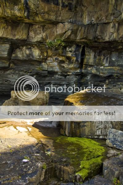
I really dont know what im doing to much when it comes to processing and improving an image but here i had a blown out section on the original to the left my processing was
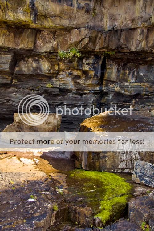
Reduce the exposure in raw file, so i recovered some detail and over laid this darker image over the top of the original, erased around the blown areas (middle left area + rear edge of central rock) to leave the darker highlights covering the blown ones. Then i used the burn tool on the greens to help them stand out a bit more, finished off using auto levels which brightened it up a little.
Is this along the right track
Here is the original taken from the raw
and the finished version i came up with
Cheers for any help folks, and feel free to play about with them
Im hoping for some help to make this shot come alive if possible. Seen similar images which blew me away contrasty, vivid colours and almost jumping off the page. Dunno if this shot is good enough, seems a little dark but if i brighten it up more areas blow out lol.
I really dont know what im doing to much when it comes to processing and improving an image but here i had a blown out section on the original to the left my processing was
Reduce the exposure in raw file, so i recovered some detail and over laid this darker image over the top of the original, erased around the blown areas (middle left area + rear edge of central rock) to leave the darker highlights covering the blown ones. Then i used the burn tool on the greens to help them stand out a bit more, finished off using auto levels which brightened it up a little.
Is this along the right track
Here is the original taken from the raw
and the finished version i came up with
Cheers for any help folks, and feel free to play about with them
")

