Critique B&W - Trent Bridge (2)

Messages
1,156
Name
Chris
Edit My Images
No
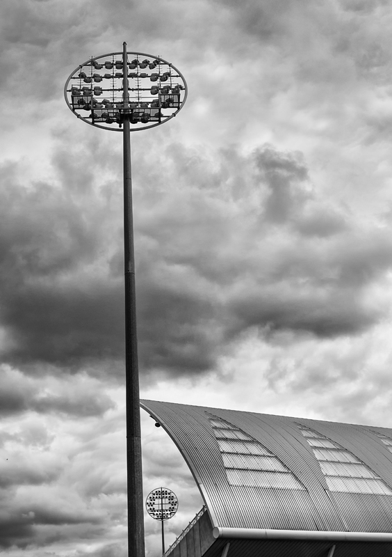
Right ..... still working on B&W conversions and with this one I am 95% there in knowing how to apply the technique and I will be running out of excuses if people make criticisms I agree with:)

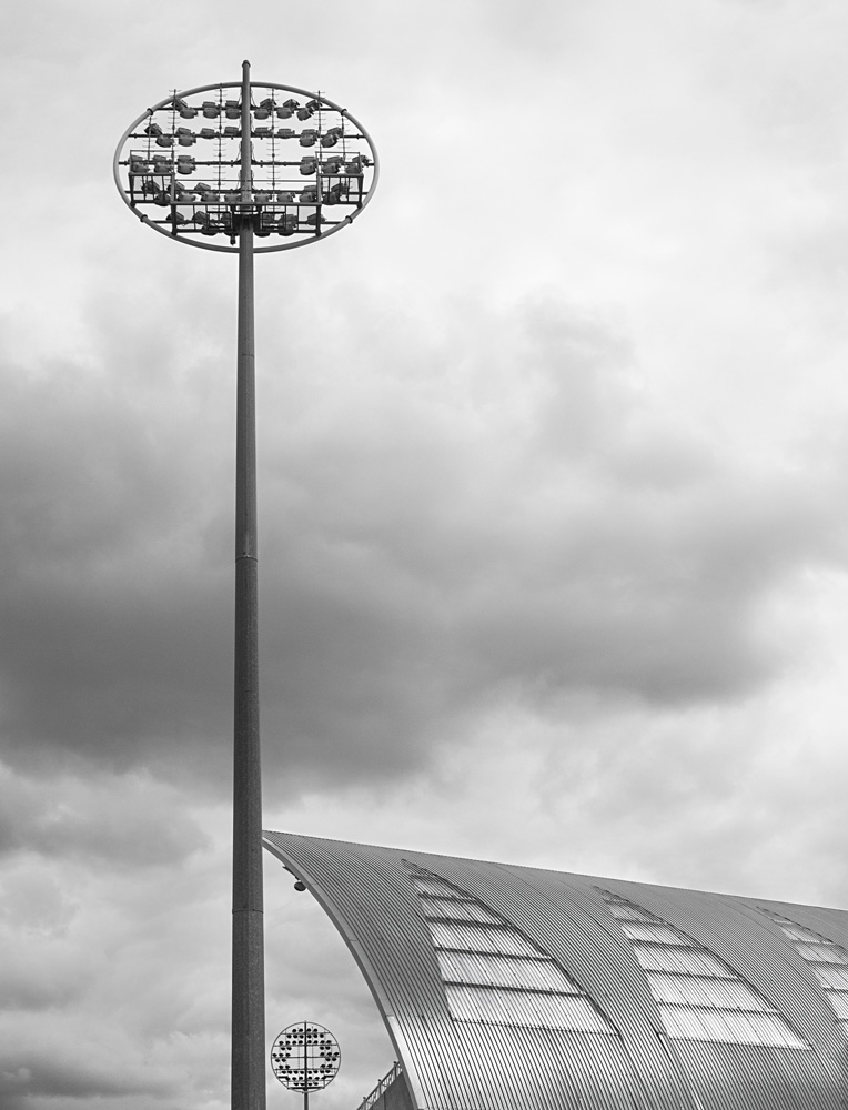
I took it with my RAW camera (so no excuses re starting point:)) and I am happy with the composition.

But - as always - happy to receive constructive criticism and comments


4459-1399113627-f5675ebb3f2df47d7116449f49483200.jpg
 
The sun's reflection on the stand is great - you've brought that out really well. The sky just seems a little flat and lets the image down, though I wonder if that's this monitor? If it were mine I might crank the contrast and/or drop exposure a bit, even at the risk of losing detail.
 
The sun's reflection on the stand is great - you've brought that out really well. The sky just seems a little flat and lets the image down, though I wonder if that's this monitor? If it were mine I might crank the contrast and/or drop exposure a bit, even at the risk of losing detail.

The sky isn't the best - I agree - can give it another go - thanks
 
This one probably goes too far but I did it just because I can:) (and it took me much less time than my first version in post 1:banana:)

4507-1399491302-2b5dba5ca243b4f7ccbd3f33a56d13e2.jpg
 
Now THAT is better! I like the crop you've chosen more too, except for the leaning tower/distortion, but as for B&W, on this rather bright monitor that looks great.
 
Now THAT is better! I like the crop you've chosen more too, except for the leaning tower/distortion, but as for B&W, on this rather bright monitor that looks great.

Thanks very much for that - will keep plugging away:)
 
Looks much better this afternoon on my balanced work monitor too - nice going.

Thanks - also glad you clarified as I wasn't sure if a bright monitor was good or bad:)
 
Back
Top