

You are using an out of date browser. It may not display this or other websites correctly.
You should upgrade or use an alternative browser.
You should upgrade or use an alternative browser.
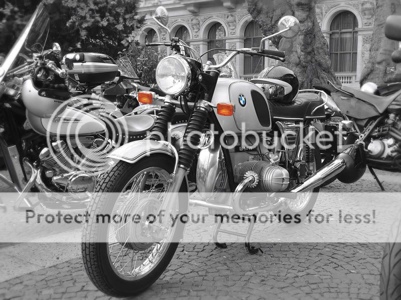
BMW R75 portrait.
- Thread starter Naboo32
- Start date
- Messages
- 5,787
- Name
- Storm Trooper
- Edit My Images
- Yes
I don't mind a bit of colour popping it's there's just a little too much distraction in the background which makes it hard to enjoy the subject.
- Messages
- 423
- Edit My Images
- No
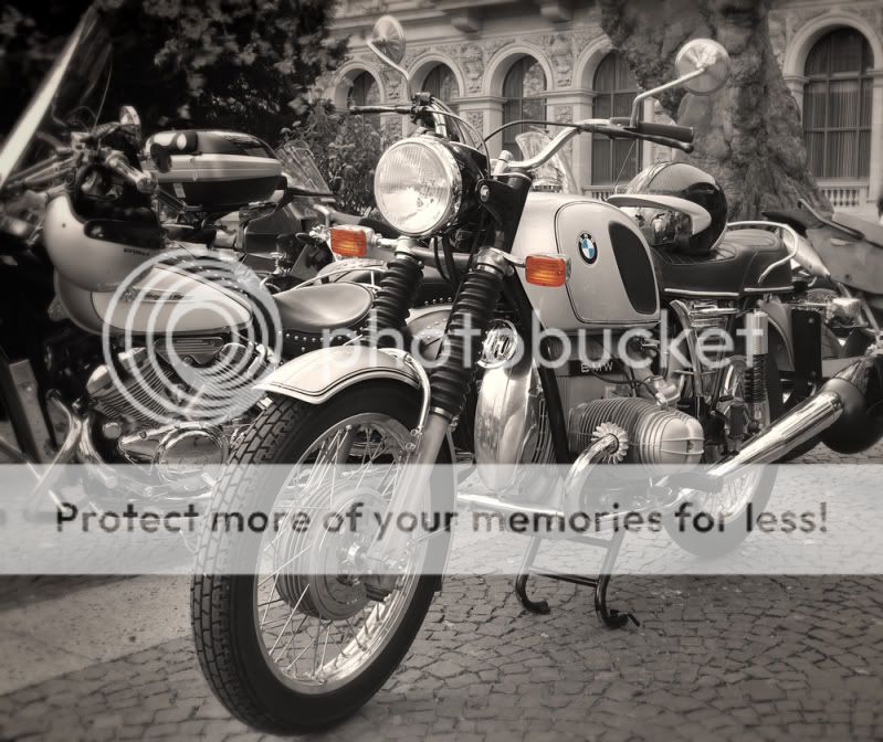
I like it a lot, the selected colours really make it for me.
T
thewol
Guest
 - just the badge with colour,
also would have been nicer with-out the tree behind
+ the stand in the bike behind - makes it look like something is coming out of the front tyre?
Last edited by a moderator:
Matt Sayle
2017MSA Young Photographer of the Year(Motorsport)
- Messages
- 18,976
- Name
- Matt Sayle
- Edit My Images
- Yes
Yeah, the colour badge is agreat idea IMO.
- Messages
- 632
- Name
- Jonny
- Edit My Images
- Yes
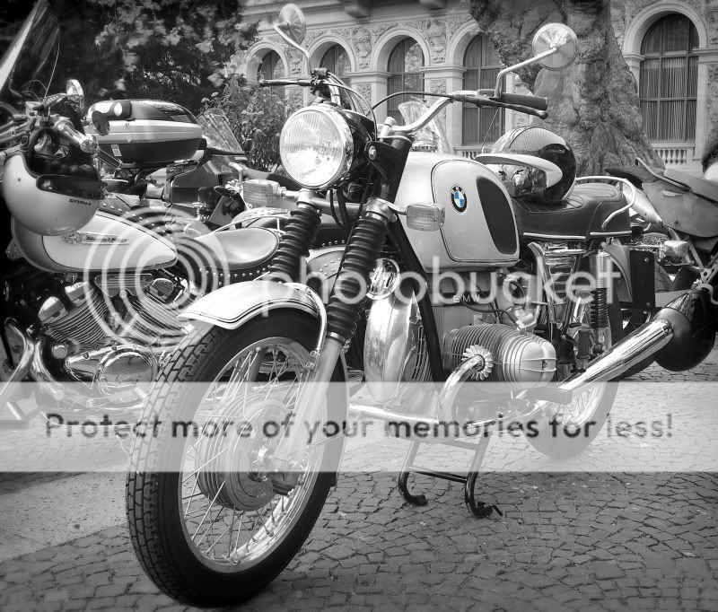
i think it's better...just a thought you could maybe blur the background a little to give the subject a little bit more definition. I may be completely wrong in saying so! But otherwise i like it!
OP
- Messages
- 3,278
- Name
- Andy
- Edit My Images
- Yes
i think it's better...just a thought you could maybe blur the background a little to give the subject a little bit more definition. I may be completely wrong in saying so! But otherwise i like it!
Sorry rasmusrok1
") , I was just editing the picture whilst you were typing this, so the version that you commented on is no longer the one above.
, I was just editing the picture whilst you were typing this, so the version that you commented on is no longer the one above.The version that you see now has had the edges blurred a little and darkened, as well as an even more aggressive crop, to eliminate all of the bike on the right.
OP
- Messages
- 3,278
- Name
- Andy
- Edit My Images
- Yes
I don't really think colour popping works well for this shot. It's drawing my eyes to the indicators, why? The badge is really too small to make a difference and the colour of those indicators overpower it anyway.
Fair enough!
Matt Sayle
2017MSA Young Photographer of the Year(Motorsport)
- Messages
- 18,976
- Name
- Matt Sayle
- Edit My Images
- Yes
love the badge in colour
OP
- Messages
- 3,278
- Name
- Andy
- Edit My Images
- Yes