

- Messages
- 1,406
- Name
- Carol
- Edit My Images
- Yes
Hi please may I have cc on the following photographs, don't normally do black and white, the first 3 have been converted in LR4 and the last one was shot as a black and white straight from the camera.
Thanks for looking.
Carol
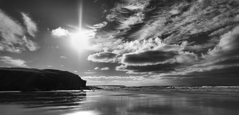
Eoropie Beach by MrsR66, on Flickr
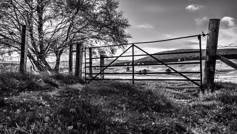
The Gate by MrsR66, on Flickr
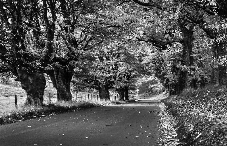
Country Road by MrsR66, on Flickr
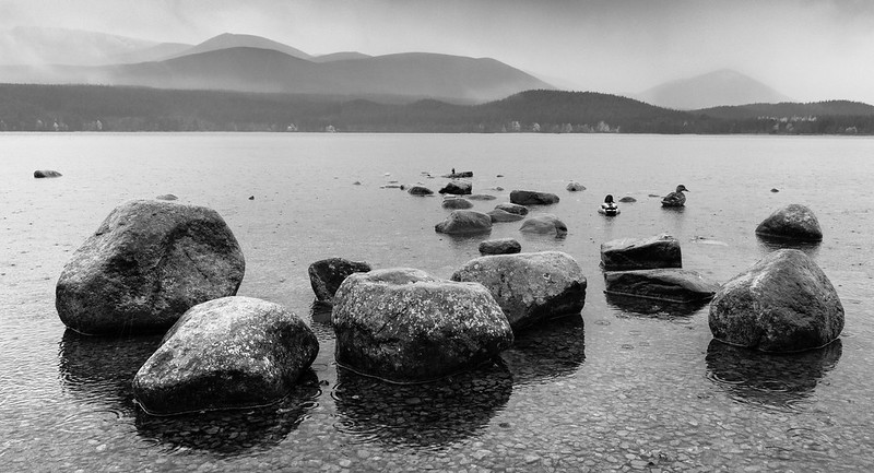
Rain Mist Stones and a few Ducks! by MrsR66, on Flickr
Thanks for looking.
Carol
Eoropie Beach by MrsR66, on Flickr
The Gate by MrsR66, on Flickr
Country Road by MrsR66, on Flickr
Rain Mist Stones and a few Ducks! by MrsR66, on Flickr
") .
.