
- Messages
- 2,079
- Edit My Images
- Yes
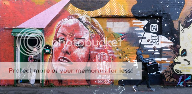
really like the strength of the colours and the graffiti in this, but what makes it for me is the guy coming out of the door, along with his mate walking off with something or other. the original was wider, but chopped it down to this to focus attention more where it should be. Linda like the one below too as it really focusses attention on the people and the story, but maybe the guy on the right is then a little tight to the right edge. there may even be an argument to crop even more of the right to cut the second guy out, but that's a bit severe for me and puts the huge red face a little too central, although it makes more of the main guy. . .
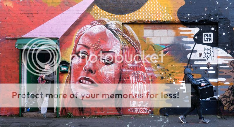
much much better on the large file as the details are so much easier to see
http://www.flickr.com/photos/46180527@N03/8209745811/in/photostream
thanks for looking, as always.
")