- Messages
- 2,185
- Name
- Dave
- Edit My Images
- Yes
Putting this here as it it is more talk than critique (I think  )
)
I was editing this photo and it seemed to raise a lot of points that I hear in these forums and when chatting to other photographers I meet.
Hoping this will spark some discussion - there are no right or wrong answers here.
Here is the image - taken yesterday (hopefully it will show as it is not public on Flickr) I normally let images simmer for quite a while before putting them public. I need to spend time with them to make sure I like them before they see the light of day. This can take quite a long time but I revisit my old unpublished photos quite often as my taste changes and there could be some gems in there.
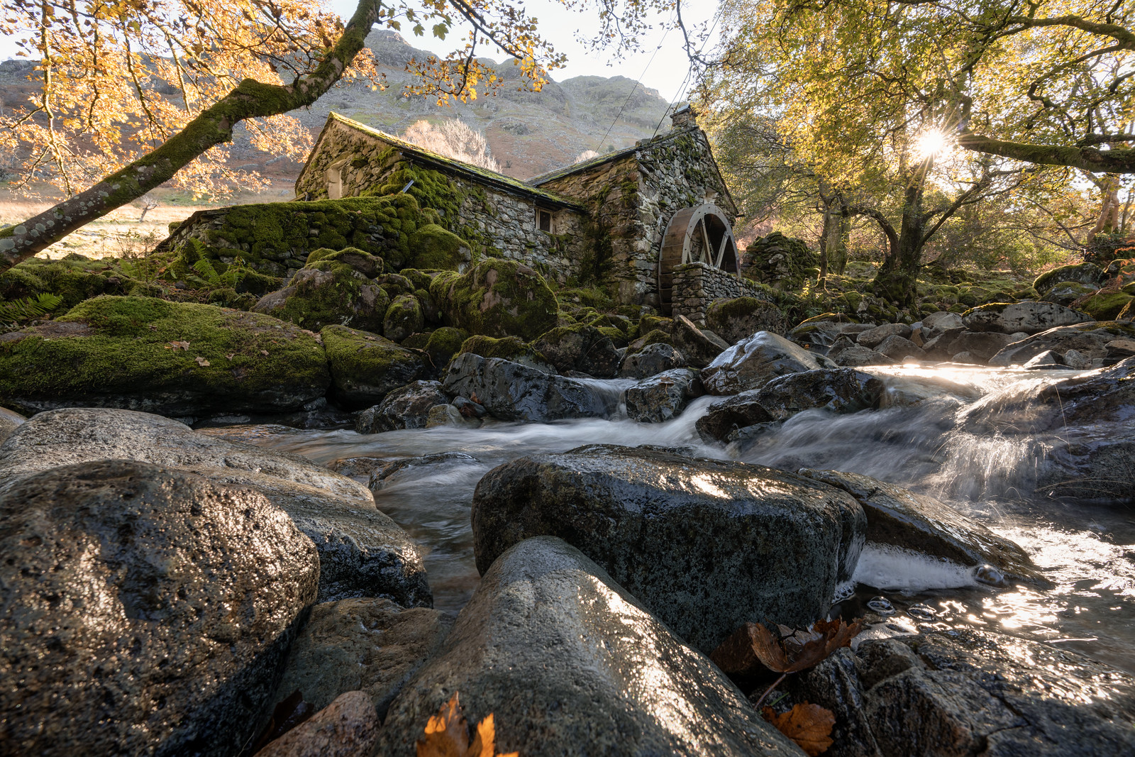
The image is shot at F14, ISO 100 and 1/6th sec
 _DSC2592-Edit-Edit-Edit by Dave Semmens, on Flickr
My thoughts (yours may differ ):
):
Honey pot locations:
This comes up a lot. I am of the mind to visit them but try to be original as well in my photography - a mix of both. Some locations just need to be visited.
I had to queue up to get the shots - there was a group of around 7 German photographers there already and 2 more photographers arrived to join the queue while I was there.
This doesn't give enough creative time unfortunately and has impacted the final image. This was my first visit and I may go back in a few days armed with the knowledge that I need to be there around an hour later than I arrived last time and it needs to be a cloudy day with breaks in the cloud to allow the sun to keep making an appearance. The flow of the river and autumn colours are perfect at the moment.
Blown highlights:
I try to avoid at all costs but it was impossible to avoid here and I actually don't mind them in this image. Only photographers care - everyone else just realises that the highlights were blown even to the human eye. Do they draw the eye from the subject? They don't for me but I know they will for some. Again - I think this is a photographer thing and we don't look at and image and see it as a none photographer does. We are always looking for the stand out fails in an image (I know I am guilty of this)
Positioning objects in the scene:
Should I have moved the leaf centre bottom to the top of the rock? Probably - or removed it altogether. This is down to rushing the shots. I can always clone or crop out.
Cropping the image / subject position:
I prefer the mill to be central but the river to the right adds to the story and placing the mill slightly left gives the sum burst more space and makes it not look like an accident.
Focus:
I have focus stacked the image but the very close areas are still out of focus. Getting the shot was quite difficult as I dumped the tripod and started resting the camera on rocks at close to ground level. So - taking the shot then refocussing was very difficult. Again - apart from that pesky leaf - I think only some photographers care that all the image is in focus - to most it doesn't matter that the very close areas are out.
Shutter speed for water:
This took up a lot of time when shooting as the light was constantly changing by small amounts. I tried to stay around 1/4 of a second to get the right look for the water.
What I like about the image:
The slash of water catching the sun - it may not be obvious at first but it is a little gem and nice to find as I scanned the image.
The reflected light from the autumn leaves on the end of the mill - this is lovely.
Having the sun burst through the trees - in my mind this kind of justifies the blown highlights.
Allowing the top of the hill to show in the shot - not sure why as normally I would try to cut the sky out of this type of shot.
The rocks lead in well - the centre one points into the image and the light on the left rock pushed my eye into the centre. The light on the right runs up from bottom through to the right of the mill. The 2 branches also work well to lead into the centre of the image. Maybe this is why I don't notice the blown highlights as much and my eye rests on the mill when I first look at the image???
What did I learn?
I took around 100 images and 95% of them were useless compositionally. This may be from rushing but I think I may have made the same mistake even if I had time. I looked at the scene and thought more about the leading lines than about the actual subject. I picked a location that gave a good lead in from the flow of the river but on analysing the photos the branch top left was cutting through the building. I hated this as soon as I saw it on the computer screen. I had focussed most of my efforts in that spot so all the images failed for me. I need to learn from this moving forward.
Not all shots need a tripod - this was taken with the camera resting on a rock. I actually used the image stabilisation by pressing the back button on the camera. I have back button focus setup and always manually focus - so all the button does is activate the image stabilisation. This really helped here but made focus stacking the images very hard
Screen protectors are worth the money - when packing up I dropped the camera and luckily the screen protector took the full force of the rock and saved the day.
I will leave it there - I have been typing for a long time and my wife has decided it is time to go out and find some food
Dave.
I was editing this photo and it seemed to raise a lot of points that I hear in these forums and when chatting to other photographers I meet.
Hoping this will spark some discussion - there are no right or wrong answers here.
Here is the image - taken yesterday (hopefully it will show as it is not public on Flickr) I normally let images simmer for quite a while before putting them public. I need to spend time with them to make sure I like them before they see the light of day. This can take quite a long time but I revisit my old unpublished photos quite often as my taste changes and there could be some gems in there.
The image is shot at F14, ISO 100 and 1/6th sec
 _DSC2592-Edit-Edit-Edit by Dave Semmens, on Flickr
My thoughts (yours may differ
Honey pot locations:
This comes up a lot. I am of the mind to visit them but try to be original as well in my photography - a mix of both. Some locations just need to be visited.
I had to queue up to get the shots - there was a group of around 7 German photographers there already and 2 more photographers arrived to join the queue while I was there.
This doesn't give enough creative time unfortunately and has impacted the final image. This was my first visit and I may go back in a few days armed with the knowledge that I need to be there around an hour later than I arrived last time and it needs to be a cloudy day with breaks in the cloud to allow the sun to keep making an appearance. The flow of the river and autumn colours are perfect at the moment.
Blown highlights:
I try to avoid at all costs but it was impossible to avoid here and I actually don't mind them in this image. Only photographers care - everyone else just realises that the highlights were blown even to the human eye. Do they draw the eye from the subject? They don't for me but I know they will for some. Again - I think this is a photographer thing and we don't look at and image and see it as a none photographer does. We are always looking for the stand out fails in an image (I know I am guilty of this)
Positioning objects in the scene:
Should I have moved the leaf centre bottom to the top of the rock? Probably - or removed it altogether. This is down to rushing the shots. I can always clone or crop out.
Cropping the image / subject position:
I prefer the mill to be central but the river to the right adds to the story and placing the mill slightly left gives the sum burst more space and makes it not look like an accident.
Focus:
I have focus stacked the image but the very close areas are still out of focus. Getting the shot was quite difficult as I dumped the tripod and started resting the camera on rocks at close to ground level. So - taking the shot then refocussing was very difficult. Again - apart from that pesky leaf - I think only some photographers care that all the image is in focus - to most it doesn't matter that the very close areas are out.
Shutter speed for water:
This took up a lot of time when shooting as the light was constantly changing by small amounts. I tried to stay around 1/4 of a second to get the right look for the water.
What I like about the image:
The slash of water catching the sun - it may not be obvious at first but it is a little gem and nice to find as I scanned the image.
The reflected light from the autumn leaves on the end of the mill - this is lovely.
Having the sun burst through the trees - in my mind this kind of justifies the blown highlights.
Allowing the top of the hill to show in the shot - not sure why as normally I would try to cut the sky out of this type of shot.
The rocks lead in well - the centre one points into the image and the light on the left rock pushed my eye into the centre. The light on the right runs up from bottom through to the right of the mill. The 2 branches also work well to lead into the centre of the image. Maybe this is why I don't notice the blown highlights as much and my eye rests on the mill when I first look at the image???
What did I learn?
I took around 100 images and 95% of them were useless compositionally. This may be from rushing but I think I may have made the same mistake even if I had time. I looked at the scene and thought more about the leading lines than about the actual subject. I picked a location that gave a good lead in from the flow of the river but on analysing the photos the branch top left was cutting through the building. I hated this as soon as I saw it on the computer screen. I had focussed most of my efforts in that spot so all the images failed for me. I need to learn from this moving forward.
Not all shots need a tripod - this was taken with the camera resting on a rock. I actually used the image stabilisation by pressing the back button on the camera. I have back button focus setup and always manually focus - so all the button does is activate the image stabilisation. This really helped here but made focus stacking the images very hard
Screen protectors are worth the money - when packing up I dropped the camera and luckily the screen protector took the full force of the rock and saved the day.
I will leave it there - I have been typing for a long time and my wife has decided it is time to go out and find some food
Dave.
Last edited:


