
You are using an out of date browser. It may not display this or other websites correctly.
You should upgrade or use an alternative browser.
You should upgrade or use an alternative browser.
Droog
- Thread starter Chris L
- Start date
fraggle101
Not a mermaid
- Messages
- 4,648
- Name
- Tony
- Edit My Images
- Yes
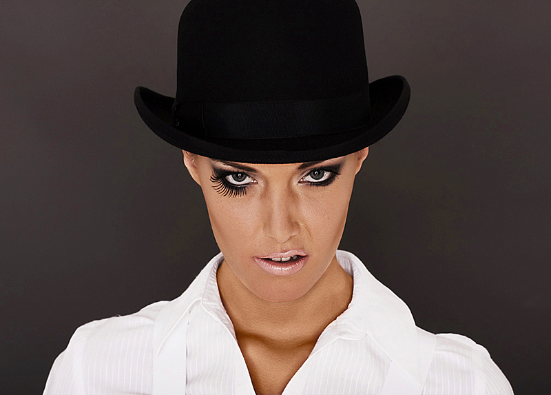
I like the pic.. its just the eye lashes are a little odd, Im not keen on the make up and the snarl.. (is that spelt correctly??) :shrug: sorry..
Anyway, the colour, contrast and lighting are spot on for me.. content aside.. i like the way the Black of the hat stands against the background.. almost like it were painted on!! And i really like the shaape of her eyes, and the catchlights are great..
Its a thumbs up from me..")
Anyway, the colour, contrast and lighting are spot on for me.. content aside.. i like the way the Black of the hat stands against the background.. almost like it were painted on!! And i really like the shaape of her eyes, and the catchlights are great..
Its a thumbs up from me..
- Messages
- 742
- Name
- Chris
- Edit My Images
- Yes
Excellent take on the Clockwork Orange look. Like it a lot. 
moomike
TPer Emeritus
- Messages
- 5,783
- Name
- Mike
- Edit My Images
- Yes
Excellent shot Chris, love it (including the snarl  ) I'm never normally a fan of Clockwork Orange style images but you've handled this subtly & very well.
One very minor niggle is that I think the background contains a bit too much texture & my eyes keep looking for details where there aren't any (IYSWIM).
Nicely done mate
) I'm never normally a fan of Clockwork Orange style images but you've handled this subtly & very well.One very minor niggle is that I think the background contains a bit too much texture & my eyes keep looking for details where there aren't any
(IYSWIM).Nicely done mate
Yv
TPer Emerita
- Messages
- 25,725
- Name
- Yvonne, pronounced Eve...
- Edit My Images
- Yes
yep, have to agree, love it, snarl and all. My gripe would be the colour in her eyes, it might be her natural colour and in keeping with the image but looks too dark, as if they should be lighter and brighter so they really sing at you adding just enough splash of colour if you get my drift.
OP
- Messages
- 931
- Name
- Christian
- Edit My Images
- No
Thanks to you all for taking the time to comment It's very much appreciated.
Thanks very much Mike Sadly my photographic skills (such as they are!) easily outstrip my PS skills. You're spot on with the comment about the background. It's a combination of sharpening and softening (is that a word? One for the pedants ) causing artifacts/colour noise. I suspect that my inexperience of preparing images for the web has also caused some deterioration to the whole image.
Again, that's mostly down to my processing :bonk: Her eyes are a nice blue colour (as can be seen in the Natasha thread) and could indeed give an extra element to the shot.
I really do need to learn how to process my images better.
It's very much appreciated.Excellent shot Chris, love it (including the snarl
One very minor niggle is that I think the background contains a bit too much texture & my eyes keep looking for details where there aren't any
Nicely done mate
Thanks very much Mike
Sadly my photographic skills (such as they are!) easily outstrip my PS skills. You're spot on with the comment about the background. It's a combination of sharpening and softening (is that a word? One for the pedants ) causing artifacts/colour noise. I suspect that my inexperience of preparing images for the web has also caused some deterioration to the whole image.
Again, that's mostly down to my processing :bonk: Her eyes are a nice blue colour (as can be seen in the Natasha thread) and could indeed give an extra element to the shot.
I really do need to learn how to process my images better.
digitalfailure
Staff Bog Cleaner 2015
- Messages
- 12,595
- Name
- Brian
- Edit My Images
- Yes
I love it
Don't change a thing, it works well
Don't change a thing, it works well
D
digitalmaniac
Guest
Knew i had seen this look before-when you all said clockwork orange it clicked.
Very well different-good idea-as said not sure about the lip. I like it in landscape-makes it look like a film preview billboard.
Very well different-good idea-as said not sure about the lip. I like it in landscape-makes it look like a film preview billboard.