

You are using an out of date browser. It may not display this or other websites correctly.
You should upgrade or use an alternative browser.
You should upgrade or use an alternative browser.
'Eat More Food'
- Thread starter Naboo32
- Start date
- Messages
- 3,935
- Name
- Adrian
- Edit My Images
- Yes
Very striking monochrome, it has a vintage feel, I like the strong contrasting the sharp B&W Tones. Works for me. And yes the title is apt! The look and eye contact from the girl in the foreground give it a hint of Meyerowitz and Gilden.
Last edited:
OP
- Messages
- 3,278
- Name
- Andy
- Edit My Images
- Yes
Different and quite subtle
Is that at Fenchurch Street and Tower Hill station areas??
I'm not really sure, Brash :shrug:. That's Tower Bridge in the background, so it must be in that region somewhere.
OP
- Messages
- 3,278
- Name
- Andy
- Edit My Images
- Yes
Very striking monochrome, it has a vintage feel, I like the strong contrasting the sharp B&W Tones. Works for me. And yes the title is apt! The look and eye contact from the girl in the foreground give it a hint of Meyerowitz and Gilden.
Glad you like it, Adrian
") !
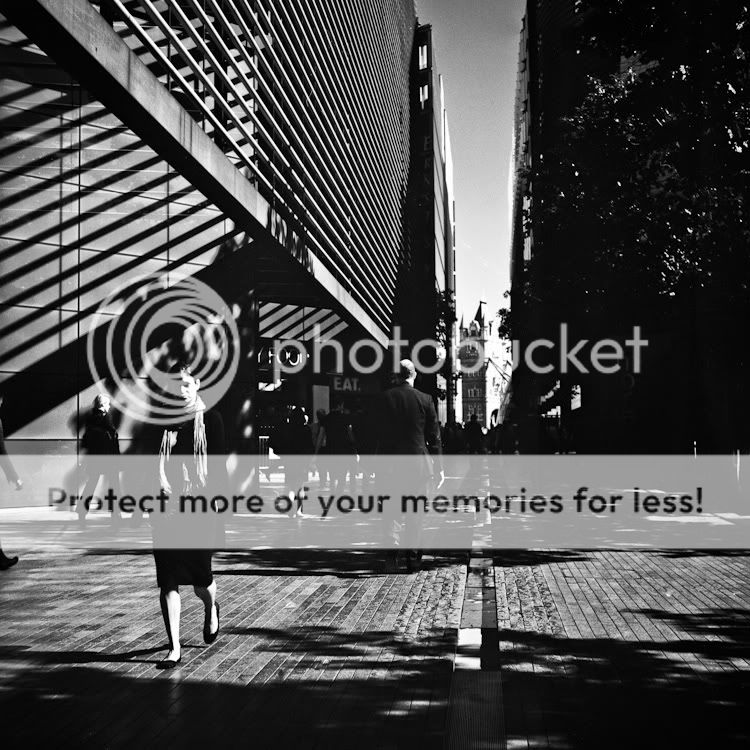
!I was looking, on that day, for scenes with high contrast lighting and added further to the effect by using a red filter on the lens.
The title is actually constructed from the only three words, which are visible in the photo, but could also be construed as a command to the slim girl in the foreground
.I'm not yet sure who 'M&G' are, but I'm off to Google it now
.All the best,
Andy
- Messages
- 125
- Name
- Jamie
- Edit My Images
- Yes
Nice shot Very moody.
It's the More London office development (http://www.morelondon.com/), by London Bridge. My office is visible on the left side of the photo
Very moody.Different and quite subtle
Is that at Fenchurch Street and Tower Hill station areas??
It's the More London office development (http://www.morelondon.com/), by London Bridge. My office is visible on the left side of the photo
- Messages
- 3,134
- Name
- Andy
- Edit My Images
- No
That's a very complex, and absorbing, image. Lots of interest to look at, and I like how the composition makes Tower Bridge, quiet subtly, the focus of attention.
OP
- Messages
- 3,278
- Name
- Andy
- Edit My Images
- Yes
Excellent shot Andy. I'm being drawn inexorably toward a Mamiya TLR.....help.
Andy
Give in Andy, give in
....Wow, there's a huge amount to like in that pic... but the contrast is way too high for me, it almost hurts the eye! Sorry. Composition is brilliant though.
It's very dependant on how the monitor you're viewing is calibrated, as I discovered when viewing this picture at work and on another laptop :|. My lappie is calibrated in a way that gives me access to the detail in the shadows, whereas I don't see that on other monitors :shrug:.
Here's a lighter version, which on most monitors, will probably appear much like the original version looks on my laptop ...
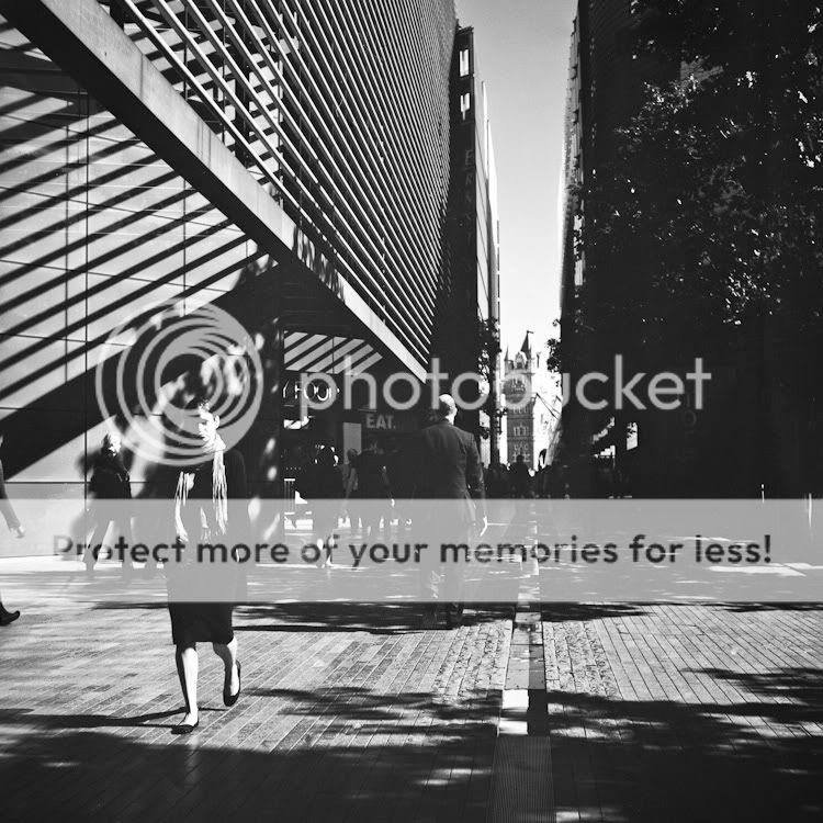
In this one, you can probably see the words "FOOD" and "EAT" on the left and maybe even the word "more" on the right hand side :shrug: - this is where the title came from
.Luckily, next weekend I'm upgrading to a Macbook (with retina display
), so my monitor calibration issues are soon to be over (I hope).ChrisR
I'm a well known grump...
- Messages
- 11,034
- Name
- Chris
- Edit My Images
- Yes
Ah, I can now see FOOD and EAT and... m? The lighter one is certainly easier to see, but it's lost the drama, especially the distant tower which rather fades. Of the two, I think I'd say "Ow, but I prefer the first!". Sorry to be a haverer!