

You are using an out of date browser. It may not display this or other websites correctly.
You should upgrade or use an alternative browser.
You should upgrade or use an alternative browser.
Enniskillen
- Thread starter mole2k
- Start date
- Messages
- 4,379
- Edit My Images
- Yes
Damn it people reply!!
Very nice shots , you should be pleased with these
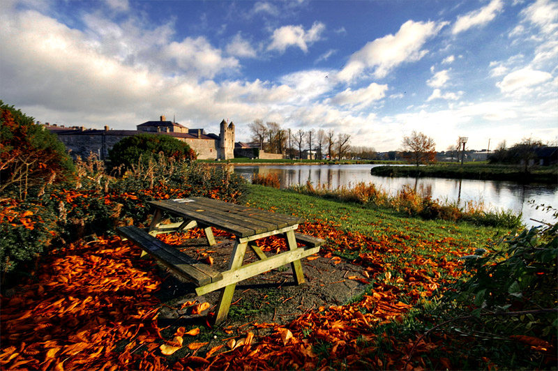
I'd clone out the birds though in shot one , they look like black dots
Very nice shots , you should be pleased with these
I'd clone out the birds though in shot one , they look like black dots
- Messages
- 7,621
- Name
- Jonathan
- Edit My Images
- Yes
Lo Moley
I like your shots mate! I agree, cloning out the birds in the first shot might help.
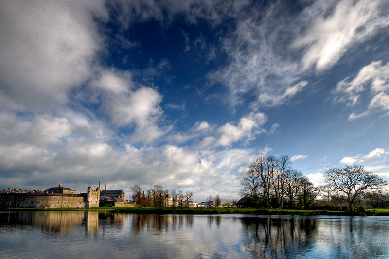
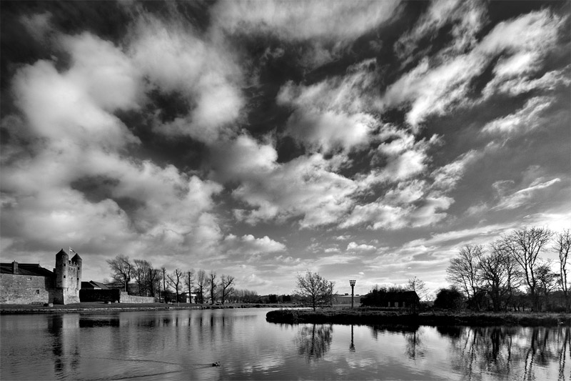
I cant help but think that composing to thirds on the 2nd and 3rd shot would help, only there is alot of sky and not enough foreground for me.
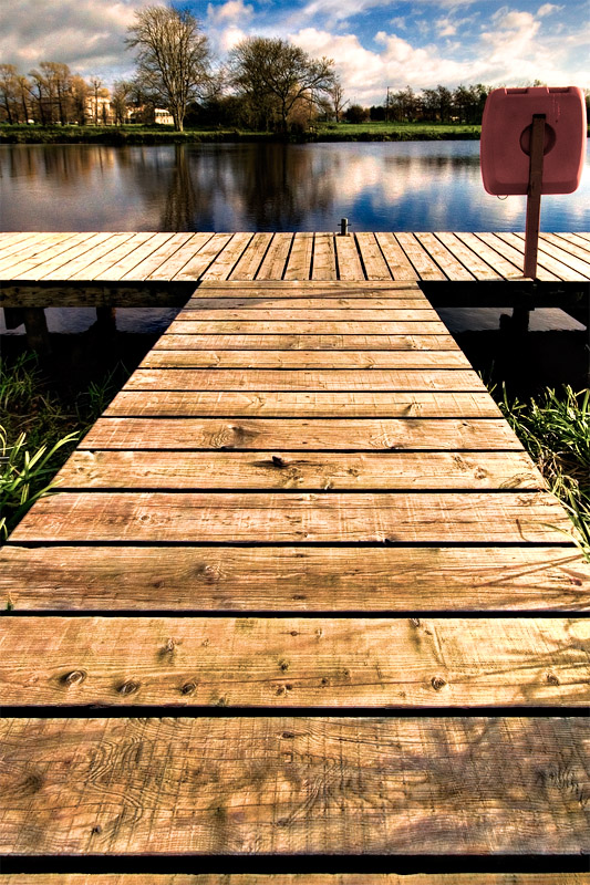
Also on the last, putting the top of the decking on the top thirds line might have helped here as well. Only there is alot of wood, and could do with just a swidgen more sky that's all
I know thirds rule isn't the be all and end all, but imho, in these shots it would help the framing
I like your shots mate! I agree, cloning out the birds in the first shot might help.
I cant help but think that composing to thirds on the 2nd and 3rd shot would help, only there is alot of sky and not enough foreground for me.
Also on the last, putting the top of the decking on the top thirds line might have helped here as well. Only there is alot of wood, and could do with just a swidgen more sky that's all
I know thirds rule isn't the be all and end all, but imho, in these shots it would help the framing
- Messages
- 1,048
- Edit My Images
- Yes
Nice set, I really like the colours in No.1, agree with the comments about the birds tho.
Enniskillen is a lovely place, been there a few times!
Enniskillen is a lovely place, been there a few times!
- Messages
- 206
- Name
- Ken
- Edit My Images
- Yes
really like no 3.
- Messages
- 101
- Edit My Images
- Yes
The symmetry of #4 looks ever so slightly off. If you could re-crop to get verticle symmetry, especially by moving the rescue ring slightly away from the edge of the frame, then it'd be magic.
Well, it's actually pretty cose to magic anyhow. Nice one.
Prefer the colour version between 2 and 3.
I can't decide whether the leaves in #1 are over-saturated, or perfectly saturated. Either way a lovely image.
Well, it's actually pretty cose to magic anyhow. Nice one.
Prefer the colour version between 2 and 3.
I can't decide whether the leaves in #1 are over-saturated, or perfectly saturated. Either way a lovely image.
- Messages
- 101
- Edit My Images
- Yes
I agree with Woodsy on the fourth. Perhaps if you took out the decking remenant and the next plank up the top of it should fall roughly on a third and will clean up the bottom of the image. It'll also give you a bit more lassitude to get the verticle symmetry spot on by cropping the left.
This is one my favourite shots I've seen on the forum so far, actually. I know I'm a newbie relatively so haven't seen that much,, but good job!
This is one my favourite shots I've seen on the forum so far, actually. I know I'm a newbie relatively so haven't seen that much,, but good job!