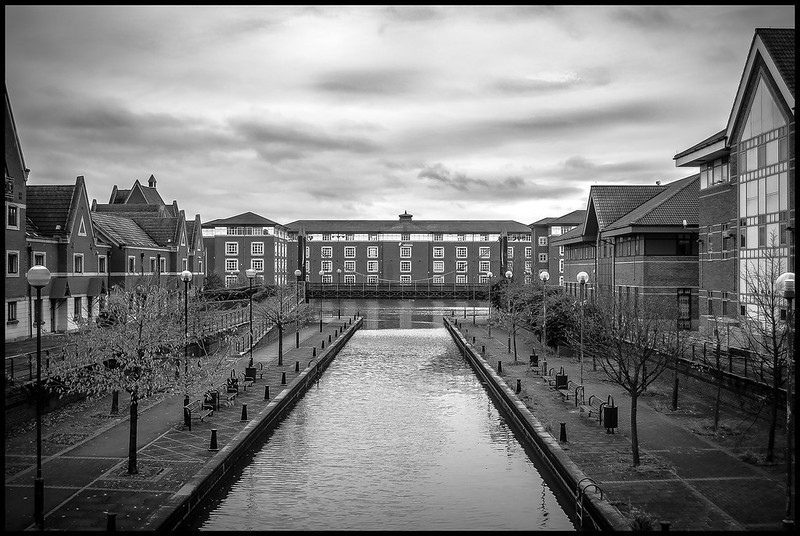
Nice lines and as the first guy said, it draws the eye into that middle building. You picked a great picture to convert.
The beauty of b+w conversions is they let your eye focus on the shapes and textures. If you go through the last 50 shots you've taken I would bet that 50% have shapes and/or textures in which are more interesting than the colours they're painted with. It really helps to think when you're processing the images 'is colour important'. Because we see with it, we think we always want our pics in colour but the more you enter the mindset of 'colour' vs. 'shapes/texture' the more powerful the images will become.
That's not to say you can't have both, but often the colour only serves to distract.

")