That sounds like an exam question

.
Well, it sort of was in a way. I know how the C&G courses work (or at least I
used and figured there would be more to the images that merely meets the eye.
One of the subject we had learn't about this year was product photography, it was also one of the subjects you could chose for the submission.
So what course/module are you currently doing?
As for the photos themselves, I'm somewhat torn between liking them and not. I'll explain.
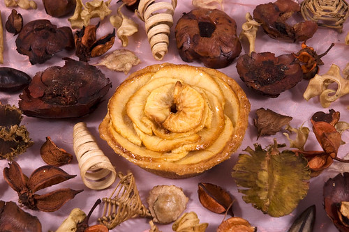
#1: I have to say this shot doesn't work for me at all, and it's for a number of reasons. Firstly, I wouldn't know it was a food shot unless you'd specifically told me. I might hazard a guess that the object in the middle was an apple pie of some sorts, but it could equally be a large piece of potpourri or a decorative object. Couple that with the rest of the potpourri and the slightly staid composition and this doesn't feel appetising in the slightest. Food and inedible objects (that aren't a natural part of the presentation or serving of the food item) don't really mix.
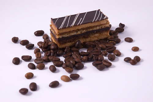
#2: Ah, now we're talking. This is more like it. A classic, if slightly clichéd composition, but it works well and it explains more about the food than a simple shot of the cake itself would. We instantly know it's a coffee cream slice and we can gaze longingly at the cake, wondering what it tastes like. There are however a couple of niggles with this one. Mainly it's down to the beans and how you've scattered them. It needs to look more stylishly random than it doe snow, as it feels a little cramped and bunched up in places. And you probably want to avoid having any of the beans actually touching or propped up against the pastry, unless you're covering the whole surface with them.
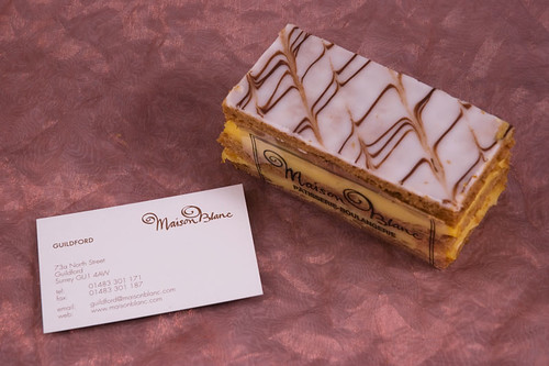
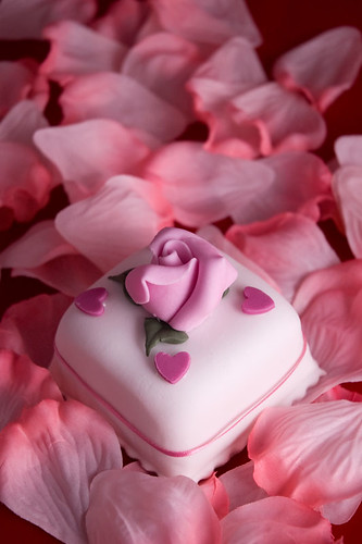
#3: A nice little advert for Raymond's patisserie, but I'm not convinced with the setting. Putting it on something that looks somewhere between a fabric and a piece of wallpaper doesn't work for me, as it's not its natural home. You would never serve a cake like this so to see it sat there makes me (and maybe it's just me) think something is wrong and it detracts from the subject matter itself. I'd much prefer to see this on a serving plate or a completely neutral background like in #2.
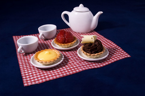
#4: I really like this one but the longer I look at it the more I find my sense of scale drifting. Either the cakes are massive (and that's a GM strawberry) or the teacups and teapot are tiny. However it's a nice little composition and a pleasing photo. Very tasty indeed. My only real thought for improvement would be to have placed the arrangement on the grass for that 'picnic' feel.
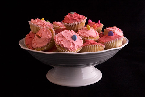
#5: I think this is a case of 'right idea, wrong execution' as there's an excellent shot in here waiting to get out. You've got a nice little arrangement of cakes, nicely iced and dressed, but what I'm seeing more of is the cake stand and I really ought to be seeing a lot more of the cakes themselves. It's fine to include the stand in the shot as the cakes need it to be there, but I'd like to see a more overhead view than what we have here and possibly a slightly lighter, more airy setting.
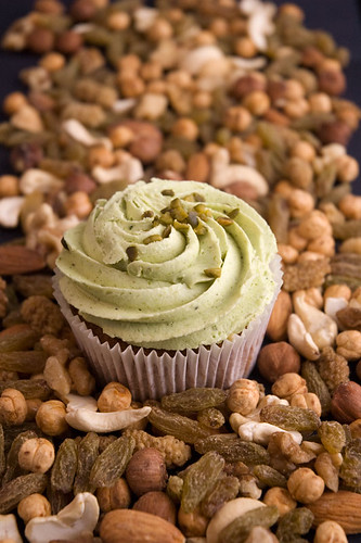
#6: Now this looks like a pistachio cupcake. Yummy. Everything looks good here apart from the unfortunate gaps in the fruit and nut mixture that you've used as your setting. If the whole frame was covered equally this would be virtually perfect.
#7: Pretty much the same comments as before. Although if you're going to submit them both you'd be advised to mix up the composition and focusing a little bit as they're effectively the same shot.
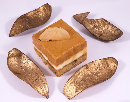
#8: This doesn't work at all for me. The lighting is too harsh and the gold 'things' are an unnecessary distraction from a rather tasty looking square of patisserie. I'm not seeing the correlation between them and the cake, unless you're trying to emulate the shape of the fruit slice on top? Ultimately this would work a lot better if the cake was on something more befitting it rather than in a somewhat abstract arrangement. The photography is also a bit staid as it's just an 'everything in focus' moment without your previous attention to detail and shallow-ish DoF.
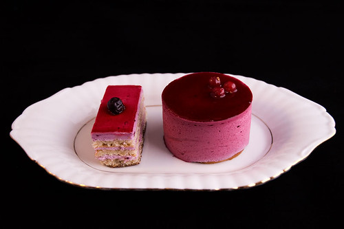
#9: I'm not overly keen on the choice of plate, although it does look vaguely French and therefore fits the patisserie theme quite well, but this is more like what you should be doing. The cakes seems so much more at home on a serving plate that you just gloss over that detail and start to concentrate on the cakes themselves. All this needs is a nicer setting, ideally something a lot more airy and flattering, to give it the real food photography sheen it deserves.


") !
!

 ). We have to submit a minimum of 10 mounted images. I am very behind on the coursework though
  . I got a distinction for my images and a credit for my course work last year.