Ghosts in the Archive

Messages
11,756
Name
David
Edit My Images
No
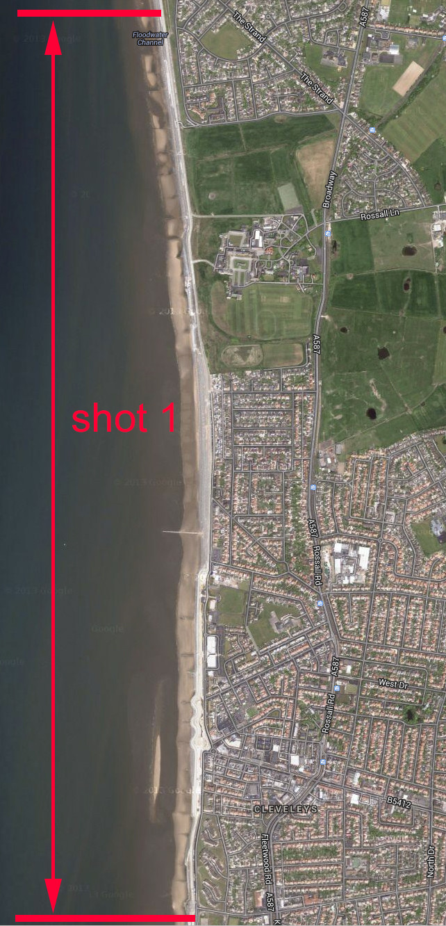
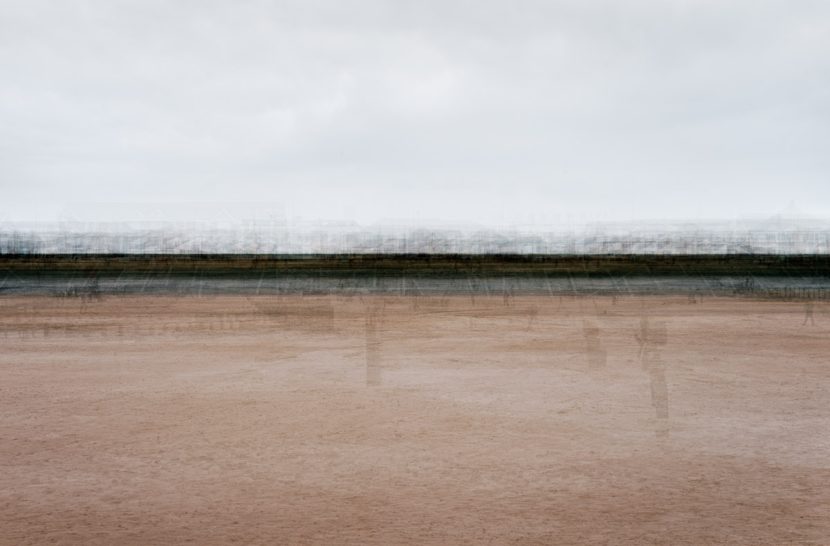
Blackpool was built on the need for the industrial North’s workforce to relax and indulge in the rich atmosphere of carnival, and “wakes” week holidays, and this tradition, which continues to this day, has left indelible marks on the development of this famous coastline to the extent that the 8 mile stretch of coastline forming the blunt edge of the Fylde peninsula is in effect its own archive; Trapped in a temporal bubble, striving to develop, but always castrated by its own inability to let go of its past.
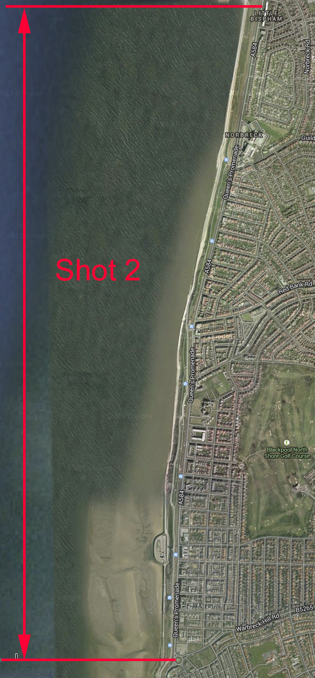
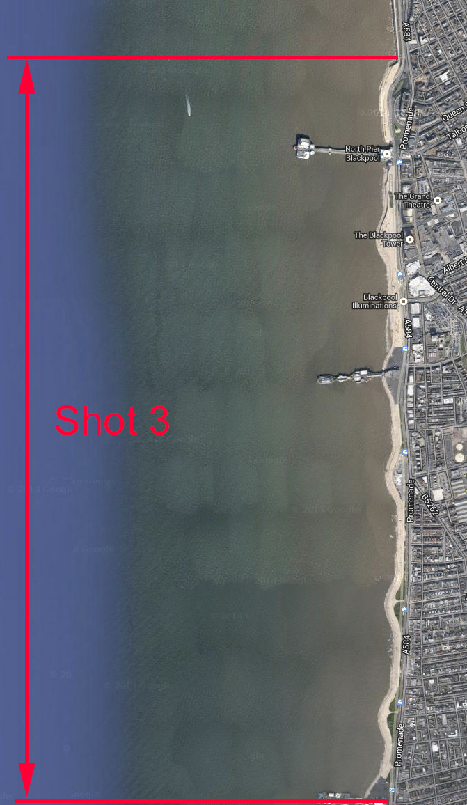
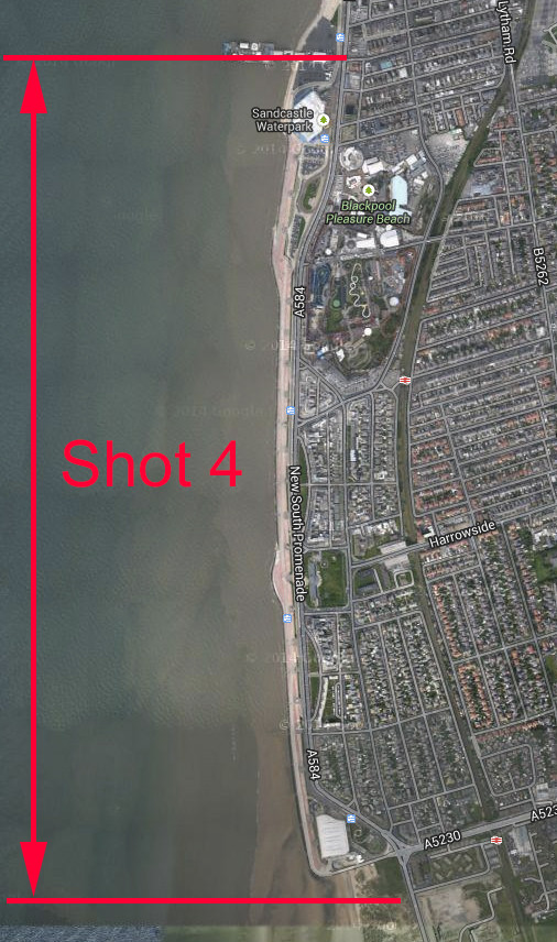
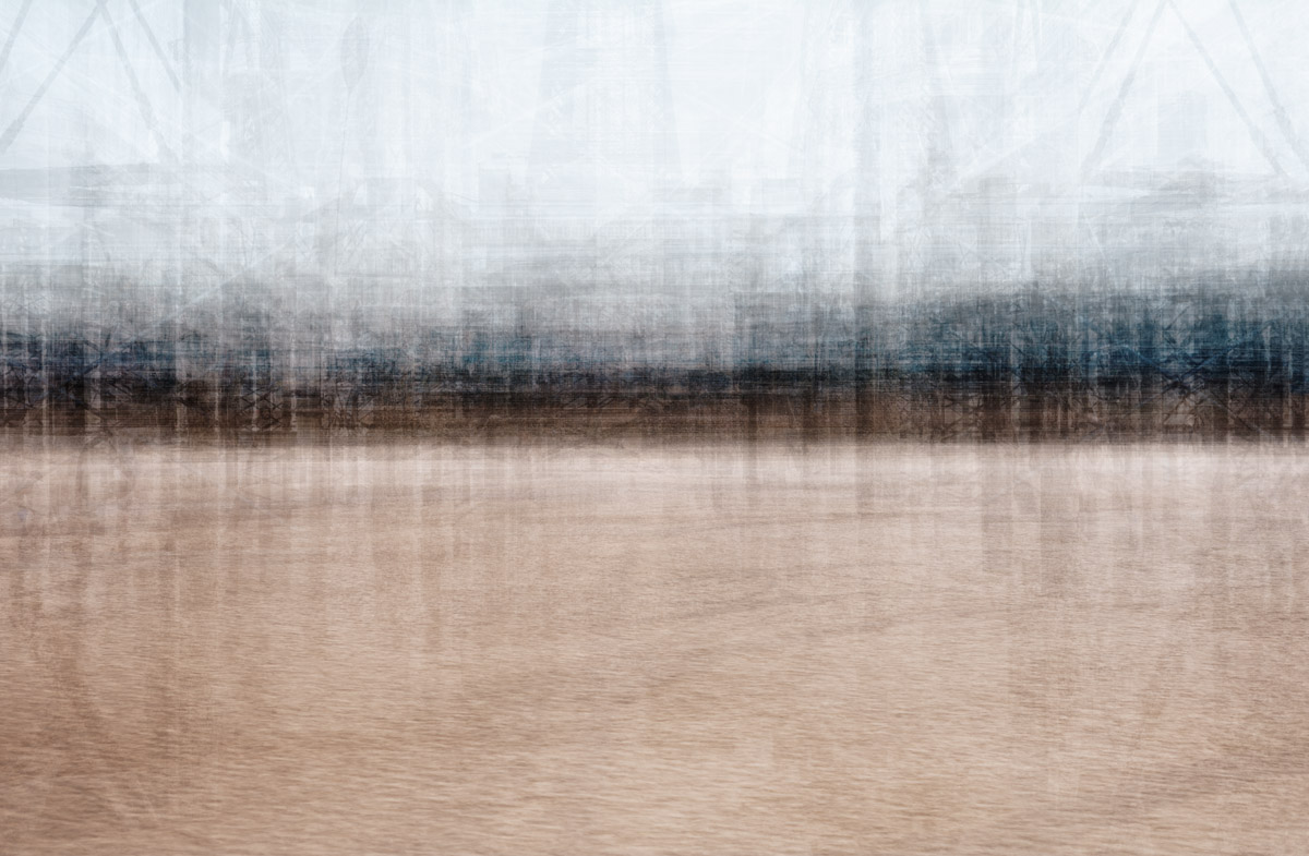
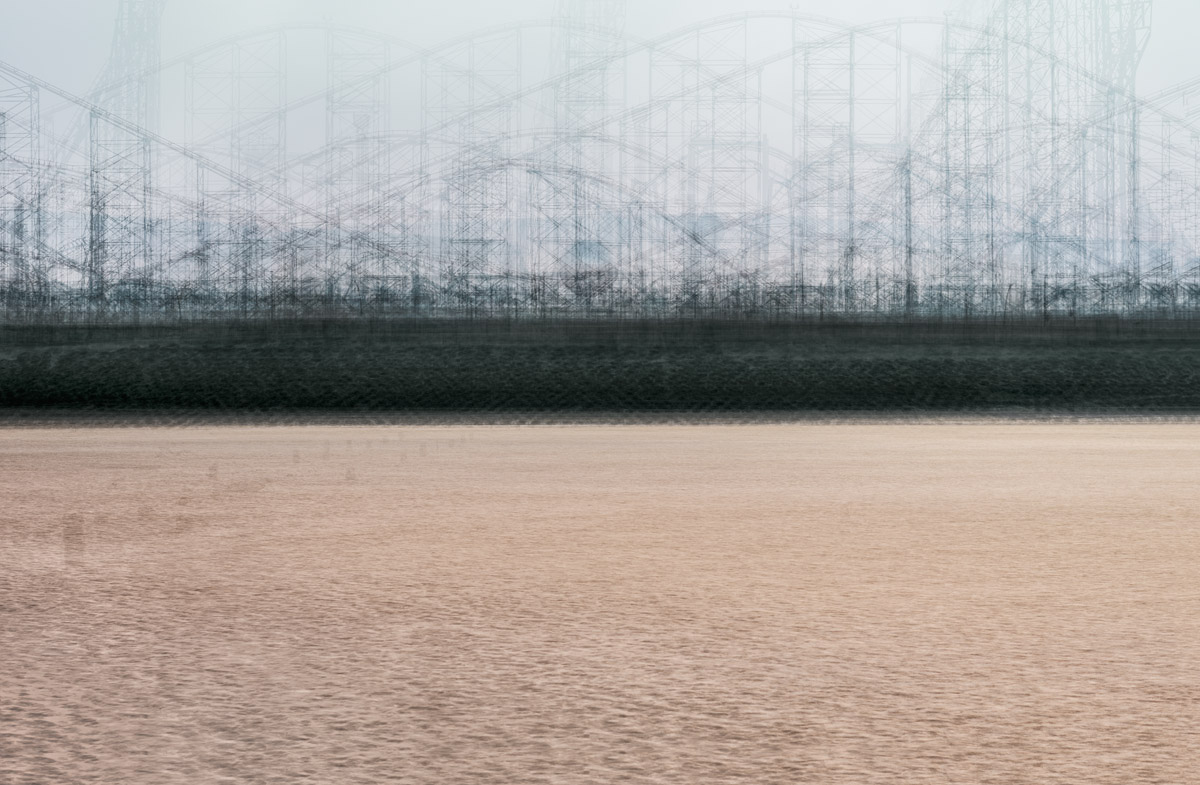
This series of images turns the whole of the Fylde coast into its own archive, by literally containing everything from Rossall, just south of Fleetwood, to Starr Gate in the south to show the changing character of this famous coastline by examining the minutia of architectural and sea defence structures as a whole: The slowly changing character of this most famous seaside town is revealed – from the gentle and reserved coastline of Rossall and Cleveleys, through to the frenetic cacophony of the Golden Mile.


Rossall to Anchorsholme
8vOzHdh.jpg


Anchorsholme to Gynn Square
Zgy28rM.jpg


North Pier to South Pier
IfLSkkG.jpg


South Pier to Starr Gate
8mfCjIk.jpg
 
Last edited:
I am pretty sure as I type this, that these will be 'marmite' but unlike that disgusting stuff, I really do like these. On the surface I like the apparently simple abstract quality and colour/texture tones. Viewed across a room as a quartet on a wall they would look very modern and easy on the eye [quite an irony for something representing history and a past] However what is really appealing is to keep looking at them closely [not easy at this size, I really want to view them big] and picking out details, the textures come to life at close range and of course, especially in that last one where the roller coaster is a structure anyone from oop north would instantly recognize. Spent many a day out on that coast line as a child.
If I had to offer critique it would be that North Pier to South Pier is almost too busy, too much going on that it jars slightly against the others, although I do like that you can pick out pier structures and of course, the Tower - but I suppose that is exactly whet the Golden Mile does, it jars against the more gentile areas around it. I wonder if 4 images could have been 5 or even 6. The photographer in me wants to know the techniques used to create them [yes, I can hazard a guess and probably be in the ball park], but the other part of me would rather just enjoy them for what they are.
Anyway, I like them, glad you shared David and frankly, if I could keep these as a memory of Blackpool instead of the reality, that would suit me just fine ;)
 
They've all been printed at A0... they really need to be viewed that kind of size really.. you can stare at them for ages and keep finding things in there.

The number has been set by the coastline, not me. I suspected what the outcome would be based on 4 stretches of the coastline. There is definitely 4 different "moods" to it. Fleetwood to Cleveleys is essentially just beach and sea wall.. not much else... very calm and peaceful. Cleveleys to Gynn Square is all rocky cliffs and grass. Between the piers is essentially the "Golden Mile" so that had to be an image on it's own, and then all you have left is south pier to Starr Gate... after that you're in St Annes. I was going to include St Annes... but the thought better of it - It's St Annes... not Blackpool, and really the beginning of the Ribble estuary rather than the Fylde coastline. I'm not entirely happy with the last one actually. It's too identifiable compared to the rest. The Big One utterly dominates that stretch of coast. However... the idea was, the coastline essentially makes itself in these... I'm merely a facilitator :) ...so it is what it is :) I could change it, but that feels like I'm defeating the object of the project a little. As for number 3 jarring... I rather suspected it would. The Golden Mile does jarr... literally.. as you say. That's it's character.

They were created by walking the 8 mile stretch of coast 50 metres out from the sea defences, stopping every 30-50 metres ( I was guessing), pointing the camera inland, and taking a shot. Each section is between 50 and 80 images depending on the length of the section walked (see the graphic from my research log below) all layered with a variety of methods to abstract and blend the coastline's features together as much as possible. The idea was that anything that is a persistent feature, such as the sea wall, will be rendered darkest, and anything transient is lightest. That way, as I said, the coast creates itself, and what's there is what's there. It was interesting to create and I felt a unique way of showing the changing character of the coastline.

Thanks for the feedback and crit. It kind of agree with everything you're saying. It was tempting to change things, but I genuinely wanted the coast to create itself.

vFjIB0p.jpg


P6FS7J2.jpg


jRRJc6e.jpg


f91dgzS.jpg


The fact that shot 4 is the shortest section, resulted in fewer layers, and less abstraction.
 
  • Like
Reactions: Yv
I've never been to Blackpool so have no idea what it looks like normally.... I agree with Yv that they would look great bigger....
Your further explanation helped to understand the idea behind the set though....
I can't really say 'why' I like the images, but they have an appeal about them.....the third image was the most interesting, and my favourite.
 
I really like these and I would love to see these printed large. There's something ethereal about the transparency of the layers. I think my favourite is Anchorsholme to Gynn Square, the minimalism of this one is less hectic than some of the others. With North Pier to South Pier the frame is a little busier, but it's very well balanced.

I now need to have a go at something similar.

Idris Khan did something similar overlaying the typology series that Bernd and Hilla Becher produced, the Saatchi have examples (link). THank you forposting this and reminding me of these, I'd forgotten how much I liked them when I first came across them.
 
Very gursky, I think these would have to be seen large to appreciate them fully. Definitely more interesting than a lot of stuff posted on here.
Are they displayed anywhere?
 
Very gursky, I think these would have to be seen large to appreciate them fully. Definitely more interesting than a lot of stuff posted on here.
Are they displayed anywhere?


Not yet, no. They're going into an exhibition a collective I'm part of are holding in Manchester, but that's in June. They'll be published in a few zines, and as with every art project I embark upon, has been submitted to the usual places... Foam, Source etc.
 
I really like these and I would love to see these printed large. There's something ethereal about the transparency of the layers. I think my favourite is Anchorsholme to Gynn Square, the minimalism of this one is less hectic than some of the others. With North Pier to South Pier the frame is a little busier, but it's very well balanced.

I now need to have a go at something similar.

Idris Khan did something similar overlaying the typology series that Bernd and Hilla Becher produced, the Saatchi have examples (link). THank you forposting this and reminding me of these, I'd forgotten how much I liked them when I first came across them.


Idris Khan is in my research logbook, yes. :) It was the idea of Kahn's layering similar objects that got me thinking about what would happen if only a few features were repeated and everything else transient... fleeting.
 
Dreamy, ethereal and like a fine art etching. Love them.
 
It may be a result of the size, but my eyes can't find enough in 1-3 to make sense of. I looked at the images enlarged on screen, read your description, then re-examined. To me, they could be paintings or computer-generated images (which in a sense they are too) but there's not enough 'photography' remaining to see them as such. Number 4 has hints of photographs in the background, but still doesn't resolve in my mind.

As images they are pleasant, in that the colours sit comfortably together and the textures remove monotony, but I would struggle to get a sense of the coastline and locale in the way that is described. I've kept going back to look repeatedly while writing this, and features begin to come through, so maybe living with the pieces for a significant period of time would change what I saw in them. I'd disagree with Yv about them being marmite - more likely that some will see something (especially if given major clues) while others will see nothing and walk past.
 
They really need to be big. There's lots of little details you don't take in at first glance.. I found myself looking at them as abstract landscape paintings at first, then went closer, and there's people, cars, windows... all manner of details. I've also tried viewing the ones in here larger... and that detail is lost. I'll post up some hi-res links later when I have time. They were never meant to be photographic in the conventional sense though.

Thanks for the feedback.
 
I've finally found this after seeing it mentioned in the other thread. I agree with Toni that this is more art using photography than photography, but that's by the by. I like the idea of defining a system and letting it dictate its own outcome. The way this has been done shares a similarity with some of Eno's ambient music in that respect and similarly the most successful and pleasing results, for me, are the most ethereal - the first two. But that's the trouble with systems, you have no control over the outcome.

As has already been said, the pictures will undoubtedly benefit from being viewed as large prints - as I expect that was the original conception for the images. In that respect they also have echoes of Rothko's large paintings where the colour fields appear to float in and out as you stand before them taking up your full field of view.

It also strikes me, given the description of the process, the four pictures could also be read as documents of a journey - or four journeys .

If I have a criticism it's not of the aesthetics, but the slightly random nature of the system itself. Ideally, to my way of thinking, distances should have been more accurately measured and the same number of shots used to create each composite image. Each stretch of coastline divided into an equal number of subdivisions rather than at a set number of paces, perhaps. Or maybe that's just me being picky?

Certainly not the usual TP fare. Please let us know when it's published/exhibited.
 
The distance thing was something I thought about a lot. I was going to have a very rigid system, similar to the excellent work by my good friend Yan Preston's "Mother River"... which if you've not seen, you're in for a treat when it's published later this year.... if you can't wait, then Yen's work can currently be seen at the Touchstone Gallery in Rochdale until June, for those of you "oop north". However, I settled on this due to local knowledge trumping a rigid system. There are definitely 4 characters to the Fylde coast, and anyone who lives here will recognise them, and ultimately, the four sections chosen were based on that. It wasn't completely successful, merely because the last two contained fewer layers. You're right, and right to point it out. However, there's an honesty to sticking to the 4 sections that I feel, despite compromising the work technically, has given a truer reading of those 4 distinct characters. I genuinely appreciate the feedback though, as it affirms my own misgivings, but the coast made these images as much as I did :)

It will be published first in a limited run 'zine as part of a collective called "Agoraphobia" which are local artists/lecturers and practitioners based in the NW. If funding can be raised, then Agoraphobia will also be exhibited. I'll keep you posted if interested.

Thanks for the comments.
 
Last edited:
I've been back to these several times.

I like them a lot, my first thought was on Mark Rothko, who I am a big fan.

I could sit an look at them for a long time and I almost feel like I'm falling into them.

Cheers.
 
Yen Preston's "Mother River"... which if you've not seen, you're in for a treat when it's published later this year.... if you can't wait, then Yen's work can currently be seen at the Touchstone Gallery in Rochdale until June, for those of you "oop north".

Thanks for that. When I eventually found my way to some photos on the website they were worth the trouble. Not sure I fancy a trip to Rochdale though!
 
Thanks for that. When I eventually found my way to some photos on the website they were worth the trouble. Not sure I fancy a trip to Rochdale though!

I don't think there's much of "mother River" on there yet, as it's not published yet. She's trying to get Steidl to publish it later this year.


Here are the print resolution versions of Ghosts....

Rossall to Anchorsholme
Anchorsholme to Gynn Square
North Pier to South Pier
South Pier to Starr Gate

Flickr as added some rather unpleasant JPEG artefacts, but not much I can do. The print files are 205MB each, so can't post them.

Thanks for the comments :)
 
Last edited:
:wideyed: I just opened Rossall to Anchorsholme and started looking. The amount of detail, things, people you can pick out is incredible and I have aonly looked at the centre section and left half. I can highly recommend large viewing folks, they are totally different to the small jpgs that opened this thread...and now, I may be gone sometime....
 
The larger versions are, indeed, more revealing. Thanks.
 
These are excellent David. I've always loved the idea of taking something typically ugly and making it great, which you've done here - it just goes to show you don't need a stunning location to produce great work, you just need to think outside the box. I don't even really care about critiquing the individual photos as that's not what it's about for me.

Nice to see stuff like this on TP compared to the norm.
 
Glad you appreciated them. Thanks :)
 
A bump for the new (cleaned) forum as it was on page god-knows-what
 
Back
Top