Grrrr! Arghh! Ewwww! Hmpfff!

Messages
5,450
Name
April 2008
Edit My Images
No
with some PS work it could look VERY good, but looks great as it is... it's a good set Lee, but you need to bring the best out of them yet

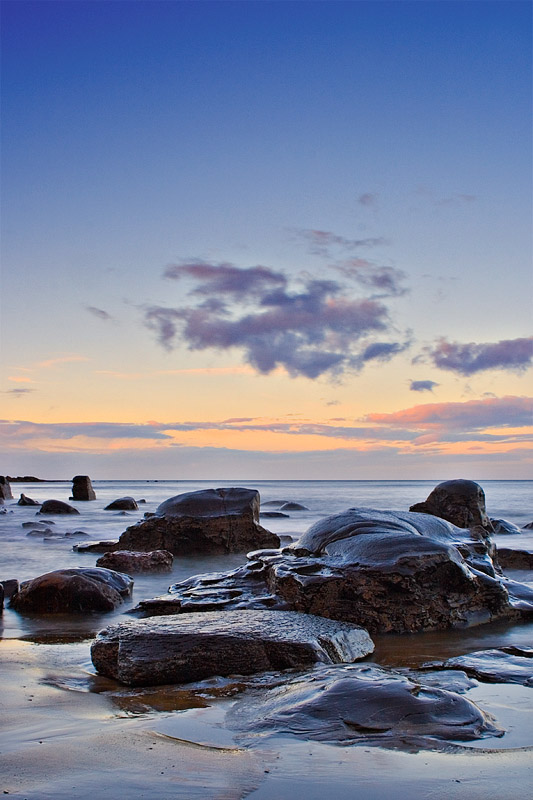
Ok, I am at the point of giving in with the *******, and need some help! I've spent about an hour now farting with this, faffing with that, dodging, burning, sponging, playing with curves, adjusting levels... pretty much every everything I know how to use, I have used. And I've just deleted it all because it looks crap!

I just don't know what I am supposed to be doing to it. What I should be hoping to achieve. I can't for the life of me SEE what needs to be done to the image.

HELP! :bang:
3013719740_1c53d2df3f_o.jpg
 
Can you please upload the raw for us to see? BTW, I really like it as is.
 
Clone out the dust bunnies, maybe increase the red saturation slightly, thats it as far as I can see, I really like it and don't see any need for more than the teeniest bit of pp - remember, its all subjective, all about personal taste. :shrug:
 
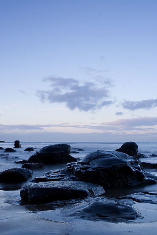
I just didn't think the colour fitted the mood of the picture. This is my take on it, but maaybe it's not what you were aiming for. Just an idea, used orange to burgundy gradient, masked out parts, dodged and burned, adjusted levels.

3013719740_1c53d2df3f_o.jpg
 
Both colour versions are nice but I prefer the blue cast if you can burn more out of those clouds.
 
Both colour versions are nice but I prefer the blue cast if you can burn more out of those clouds.

Are you thinking of the lower clouds, or the big floaty bit in the middle and on the right of the frame?
 
Another go for your consideration:

3013719740_1c53d2df3f_o-edit.jpg


ND grad and tonal contrast plugin on the sky.
 
Interestingly, Mr Photon, that's the sort of thing I normally do... new layer set to linear burn, graduation, move and adjust opacity until happy with the sky.

This tonal contrast plugin sounds interesting, if that's what has been used to improve the contrast in the sky/clouds. Might have to google that one :)
 
A quick blast of the raw file to bring out some detail then some selective contrast. probably a bit overdone but it's 7.30am and I havnt went to bed yet.

3021760066_7a0dacb036_o.jpg
 
Or a completely different take on it, this took 5 seconds (as you can prob see) from the jpeg so forgive the crude edit just think of the idea

3013719740_1c53d2df3f_o.jpg
 
Thanks for all the effort that's been put in here. It's interesting to see everyone's take, and how different the image can look with the different processing techniques.

I think, in hindsight, I have to agree with Gary and Jay. I do like Shutterman's treatment on the foreground with the differing colours, but also have a strong dislike of the shadow detail that has been revealed.

I think what I have learned here (and keep forgetting!) is how subjective things can be. And I must learn to have a little faith in what I see. I am going to have a go at keeping my original, clean up the dust bunny, see if I can do a toned down mole2k on the sky/clouds, and then post that. Will try and get it done tonite :)
 
My crit of the original is that the sky drags the eye upwards. This is solved (for me, anyway) by an ND grad effect or cropping just above the clouds, which draws the eye to the horizon and then allows exploration from there.
 
Back
Top