- Messages
- 20,926
- Name
- Steve
- Edit My Images
- Yes
Colour
 _DSC3019 by SFTPhotography, on Flickr
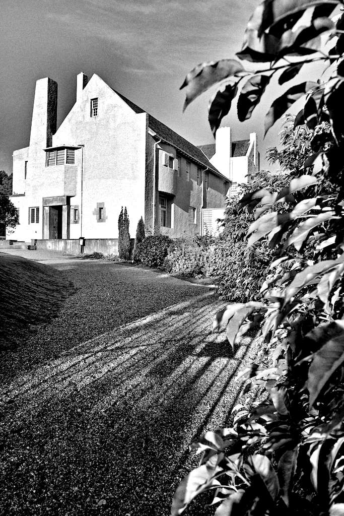
B/W Golden evening
 _DSC3019 (1) by SFTPhotography, on Flickr
Tighter crop
Colour
 _DSC3039 by SFTPhotography, on Flickr
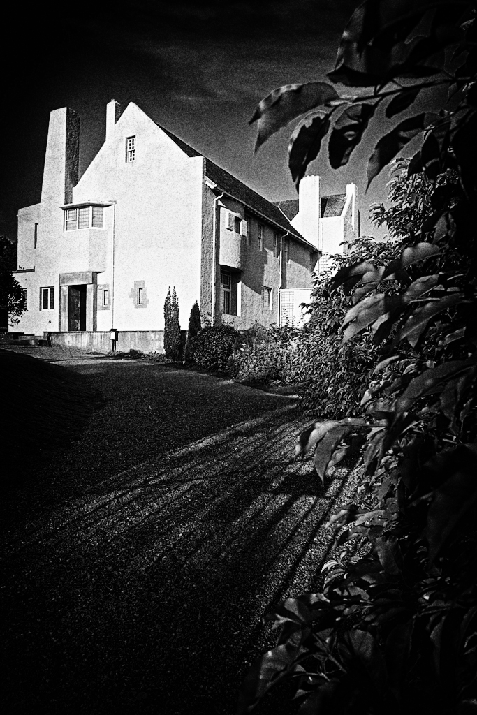
B/W
 _DSC3039 (1) by SFTPhotography, on Flickr
_DSC3019 by SFTPhotography, on FlickrB/W Golden evening
_DSC3019 (1) by SFTPhotography, on FlickrTighter crop
Colour
_DSC3039 by SFTPhotography, on FlickrB/W
_DSC3039 (1) by SFTPhotography, on Flickr