Image contrast levels on different devices - Can I have your opinion please ?

Messages
440
Name
Dean
Edit My Images
No
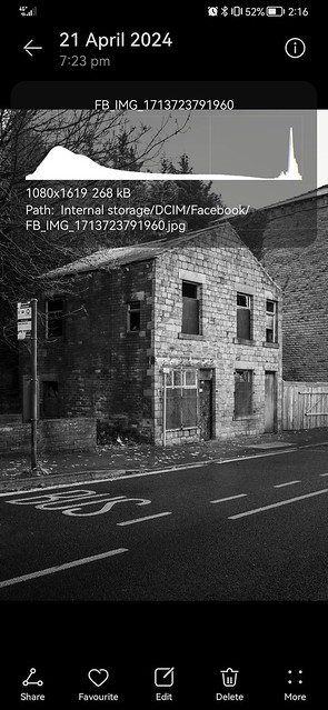
Hi... I have been having some problems lately when post processing images so would just like to get other people's perspective, using the photo below as a specific example.

Please could you give your opinion specifically regarding contrast / shadows / highlights etc.

A bit of background to why I'm asking is that up until the last year or two I used a (non-calibrated) monitor for editing with lightroom and found that I was fairly happy with the output (online and prints).
I then found myself editing on my phone more and more but again was still fairly happy with the output (online).
Late last year I bought an ipad pro (11 inch) and started doing my post processing on that but find that I often get an image that I'm happy with on the ipad but then when I view on my phone or either of two non-calibrated monitors the images appear quite flat and grey. I get that the first thought would be that as the monitors are not calibrated I can't rely on them but I used the monitors for years and was happy with them but maybe that's just because they had been processed on there but maybe they would have appeared overly contrasty if viewed on a better screen at the time.

It's left me feeling a bit in no mans land because my images seem to now only look ok on one device and poor on three, whereas it was once that they looked ok on three devices.

So, as stated above, I would really appreciate if a few people could try to tell me what this image appears like on their device, specifically the front wall relative to the rest of the image
i.e.
1....a bit too flat / grey ?
2....a reasonable contrast ?
3....a good level of contrast ?)

or

4.... a bit underexposed overall ?


Thanks, here is the example photo....

Dereliction by NPUK, on Flickr
 
It looks fine on my monitor. Obviously different people have different ideas of contrast but I'd be happy with the front wall. Overall the pic looks a little dark but has plenty of contrast. The sky is there, just on my display.
 
It looks fine on my monitor. Obviously different people have different ideas of contrast but I'd be happy with the front wall. Overall the pic looks a little dark but has plenty of contrast. The sky is there, just on my display.
Thanks Wayne
 
It looks OK on my monitor. What does the histogram say?
 
It looks OK on my monitor. What does the histogram say?
This is a screenshot of the image downloaded to my phone with the histogram information, but unless I'm missing something (which is entirely possible) I'm not sure if the histogram will tell me how much contrast the subject part of the image has.

Histogram by NPUK, on Flickr
 
It looks fine here to but we don't know what you were going for. Perhaps it should be more contrasty or even less.

The best thing you can do is buy or borrow a screen calibration device and calibrate your displays.

Screen brightness also plays a big role in how images look and IMHO apple iDevices often have screens that are way too bright.
 
Last edited:
For me, maybe 1/2 to 2/3 stop under exposed, (looks like it has been averaged with the sky included) contrast fine.

Can you calibrate the screen on the iPad?
 
Screen brightness also plays a big role in how images look and IMHO apple iDevices often have screens that are way too bright.
Thanks for the reply... And yes I'm coming to the conclusion that the ipad screen is almost too good/bright/contrasty etc. I've tried different brightness settings and now leaning towards setting it at 50 percent. I find it confusing because so many photographers now seem to really rate the ipad but I feel it's led to a drop in standards for my images.
 
From what I've read online it appears that the ipad pro screen is supposed to be pretty accurate straight out of the box.
Certainly my iPhone and iPad (non pro) are pretty accurate and my images (processed on a calibrated screen) look as they should but my brightness levels are usually way down at around 25-40% depending on the ambient light.
 
I find it confusing because so many photographers now seem to really rate the ipad but I feel it's led to a drop in standards for my images
iPads also squeeze a lot of pixels into their screens giving the impression that are better simply because they are higher definition than (for example) a standard PC monitor. (Where definition = pixels per inch of screen real estate). Add the overpowering backlight and they really do appear to stand out.

It really depends on who matters as far as how your image looks. If you're the "main audience", then calibrating all your screens so they look the same is a great first step. It's a waste of time doing it for other people though as you have no control over their chosen device when they look at your images. My screen is calibrated to my printer which means what I see on the screen will look good to me as a print. That's good enough for me and it gives me reasonable confidence that if someone else complains at an online version, it's unlikely to be up my end.

From what I've read online it appears that the ipad pro screen is supposed to be pretty accurate straight out of the box.
I wonder if that relates to colour accuracy rather than brightness?

As to the image you showed. It looks fine to me. The dark shadows behind the building are dark. The white on the bus stop is white. It's an overcast day, so I'd expect little overall contrast in the image. Subjectively, I think it's realistic and not over processed. The question is - do you have a contrasty 'style' for black & white that you're trying to achieve but not seeing? And that's one we can't really answer.
 
As to the image you showed. It looks fine to me. The dark shadows behind the building are dark. The white on the bus stop is white. It's an overcast day, so I'd expect little overall contrast in the image. Subjectively, I think it's realistic and not over processed. The question is - do you have a contrasty 'style' for black & white that you're trying to achieve but not seeing? And that's one we can't really answer.
Thanks for the response... I don't have an "ultra contrasty" style that I'm trying to achieve but I do want a certain amount of contrast and in this instance so that the subject stands out a little bit from the background.
This wasn't actually an overcast day, it was a clear and slightly frosty morning but I tried to tone down the bright sky, but that often seems to not have the desired effect.
I'm also experimenting with highlight metering which I think is leading to me underexposing and not bringing up enough in post.
 
Certainly my iPhone and iPad (non pro) are pretty accurate and my images (processed on a calibrated screen) look as they should but my brightness levels are usually way down at around 25-40% depending on the ambient light.
Thanks... That's an interesting measure between a calibrated screen and ipad brightness. I read suggestions online as high as 80% but started myself at 70% but lately have gone down to 55% and 50%. I'll give 40% a try and see how I get on.
 
I'm guessing something about it bother's you. Looks great to me! I think a lot of people expect to much of themselves always believing they could do better. I am one of those people but my saving grace is I just don't care. If it's off a bit but I like it, then I like it! Like I said, looks great to me!
 
I'm guessing something about it bother's you. Looks great to me! I think a lot of people expect to much of themselves always believing they could do better. I am one of those people but my saving grace is I just don't care. If it's off a bit but I like it, then I like it! Like I said, looks great to me!
Thanks Don.... Photography is purely a hobby to me and I get satisfaction and enjoyment from the whole process from start to finish, but only if I feel like I've done a good enough job, so the problem can be that if I'm seeing significantly differing end results depending where I view it, that puts doubt in my mind as to whether I'm doing something wrong that I could improve.
 
Simply put if you want more contrast and texture you probably want to shoot on a sunny day

You always want to edit on a properly calibrated display. If someone is using junk display or vivid profile that's their problem
 
Back
Top