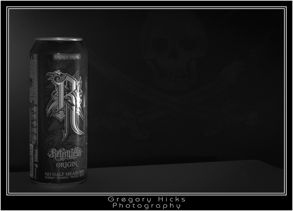
I think that a "Biohazard" sign in the background might have been more appropriate...
Overall, I like the idea, though personally, I'd have tried to avoid the "busy" section of the can, with the barcode, nutritional information and other blurb showing quite so much, maybe a 10/15' turn clockwise of the can, and a bit less light to the rear of can. While we're on the can, I find the slight flare on the RHS of the "R" just a Tad overblown - I think I get what you were shooting for - the light "ping" flare on the spot, but it again, to my taste, it's a little overblown. I'd also, and again it's personal taste, like to see the can "sweating" a bit... just to emphasise the fact that it's got a cold drink in it (even if it hasn't, and you've actually just drunk the contents )
This site uses cookies to help personalise content, tailor your experience and to keep you logged in if you register.
By continuing to use this site, you are consenting to our use of cookies.


 )
)") many thanks buddy.
many thanks buddy.