Keills Chapel

Messages
655
Edit My Images
Yes
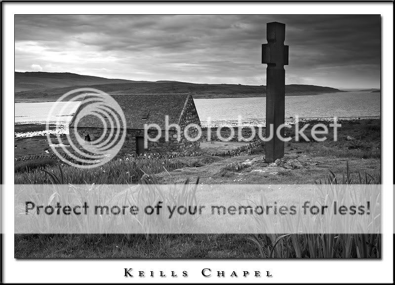
A 13th century West Highland Chapel.
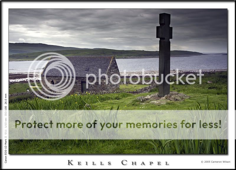
The building is well known to those interested in the religious history of the area. Since the building is simple,even austere, I tried to keep the image in a similar vein ( no colourful sunsets etc ) but still keep the image interesting.
How did I fair and, more to the point, how could I improve it.

Cameron
Keills-Chapel.jpg
 
Very proffesional looking shot :) I love the brightness of the green against the grey of the sky. Did you catch the light just right, or do a bit of manipulation of the shot ?
 
A work of art as always Garnock ;)

This would also make a good b&w conversion...the lighting on the ground and the detail you could pull out of the sky would make it special.

The grey sky against the vivid green foreground grates a little on me, but I guess we have to get used to that up here!
 
i think its great, though i keep looking at the front rather than the whole scene, however my wife likes it a lot, so its all fine
 
EosD said:
i think its great, though i keep looking at the front rather than the whole scene, however my wife likes it a lot, so its all fine

ah,the wonderful pink stamp of approval!

I like the shot a lot. I would level a couple of criticisms at it though.

Firstly the grave stone on the right is too dark I think and doesn't balance well with the overall tone of the shot.

Secondly, I'm with EosD as to the wandering eye thing. I'm not sure what it is, but my eye keeps wandering around the scene without fixing on anything. Personaly I would've tried a lower view point and maybe a few steps to the left ;)


Still better thanme though x
 
Great shot Cameron, and beautifully processed. If I had to fault it, I'd say the cross and the cottage compete too much as points of interest, but that's being really picky. ;)
 
Hmmm, the cross seems very dark compared to the rest of the image which tends to draw the eye.

Also, it is difficult to determine what you are looking at as there are so many busy things in the shot, chapel, cross, sky, daffs etc.
 
How about a closer crop like this:

Keills_Chapel_BW.jpg


Personally I'd like less foreground but didn't have the image available to me! :)
 
SammyC said:
Hmmm, the cross seems very dark compared to the rest of the image which tends to draw the eye.

Also, it is difficult to determine what you are looking at as there are so many busy things in the shot, chapel, cross, sky, daffs etc.


Thanks for the crit Sammy.

I'm glad you said the cross tends to draw your eye. That was my original intention.
The building, on it's own, would never be taken as a chapel/church. ( Although this is typical of a medieval West Highland chapel )
So to emphasize this I made the cross a dominant feature. I take your point, I may have darkened the cross too much.

The daffs aside, I don't see this as a busy image.
The plain cross compliments the church and is a necessary inclusion as explained.
The sky is grey and nothing special, which reflects the austerity of the chapel and cross.

I agree on the daffs, though. :banana:

Cameron
 
I like this shot a great deal and have been trying to work out what it is that is causing people and myself "issues". The composition is fine the processing is fine and the presentation is also top notch, however what I think the real issue is that the sky is the same or maybe even a little less bright than the foreground which for this type of landscape photograph is not the normal thing to do. I personally find it more pleasing and try to allow at least one stop more light from the sky than the ground in general landscapes, this then allows the viewer to see in a picture roughly what they would expect to see (if not consciously) when looking at the real scene.

Obviously take this in perspective, the picture is excellent but we are always trying to find ways to improve. ;)

Just my 2p's worth :)
 
Glad it helped, I look forward to seeing the adjusted version :)
 
Yeah, you could be right there Cameron (and Steve). I think busy when I see this picture because I struggle to take it all in as a whole, my eyes jump from one significant part to the next.

I personally prefer with landscapes to have an image that slowly sinks in with subtle details.

Lets have a look at the new version when it's ready and see how that works. :)
 
Forget the Black & White.. :flipoff:

Forget the crop.. :flipoff:

This shot is perfect in my eyes and I love it mate.. Good work.. :thumb:
 
busterboy said:
Forget the Black & White.. :flipoff:

Forget the crop.. :flipoff:

This shot is perfect in my eyes and I love it mate.. Good work.. :thumb:

I have to pretty much agree... maybe a slight bit to much forground attraction but it's still a great shot!! :thumb:
 
Busterboy, Sonsey,
Thanks for that.
To paraphrase Mr Lincoln " You can please some of the people all of the time and all of the people some of the time..........." you know the rest.

The point being we all see an image in a different way.
I have never posted an image for sharing or critique without getting a reply that in some way improves the way I take and process images.
This thread is another example.

Thanks to all. :thumb:

Cameron
 
I think this thread in an example of the kind of people we get on here, if you put something up for critique you accept it as that. It's not a personal attack as it seems to be on other forums but a personal opinion.

Myself and others offered an opinion to Cameron and he's taken it on board and may or may not change things. It's his picture and that's the end of it. :)

How nice!
 
Back
Top