
- Messages
- 326
- Name
- Fraser
- Edit My Images
- Yes
Views & Opinions on the attached please - taken using a Polarizing filter and ND 6 stop:
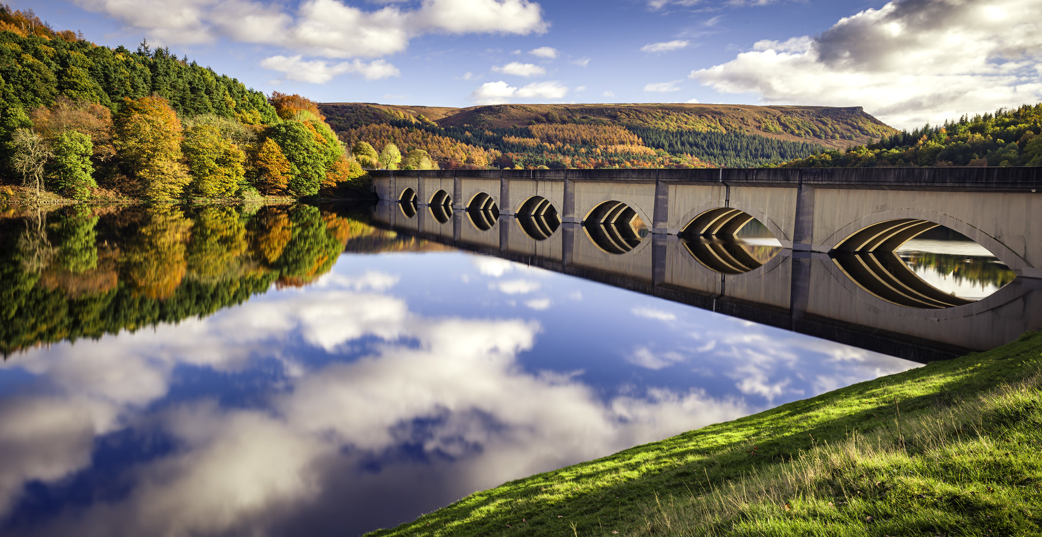 Ladybower Resevoir by Fraser White, on Flickr
Ladybower Resevoir by Fraser White, on Flickr
Last edited:
")

