- Messages
- 1,523
- Name
- chris
- Edit My Images
- Yes
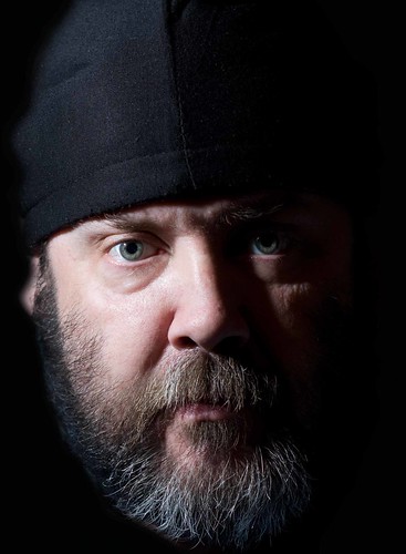
hard light poss
c+c please
c+c please

 is that it looks like your head is just floating.. i am sure it's not but it could be a cut and paste.