Hi danny - as I mentioned in the other thread, thought I'd give you my £0.02 worth - bearing in mind I'm not really a people-shooter - but hey, everyone's entitled to an opinion I guess...
I've taken the liberty of adding no's to the shots - just for clarity.
okay - here goes...
1) - like the semi-silhouette look, I'm looking at this shot on the TP Black theme, and you can just pick out a little of the models face - I'd like to see maybe just a touch more - maybe it could be dug out of the neg by a bit of D&B action...
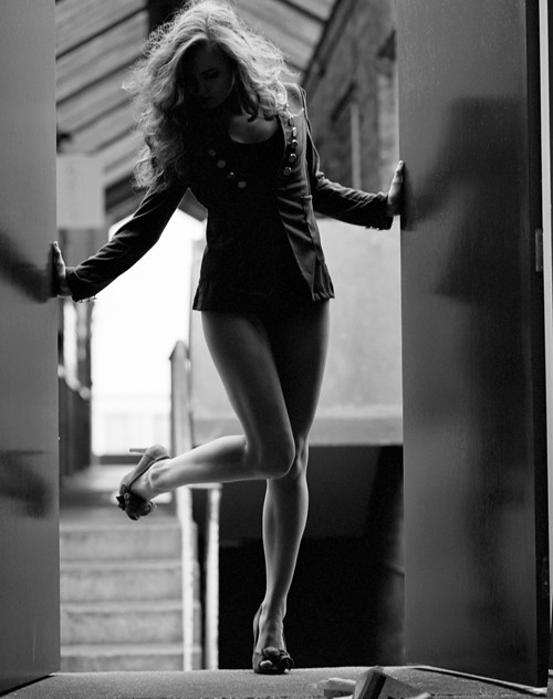
Good use of the soft reflections in the gloss doors, interesting pose - though my first reaction was "has she stepped in some dogmuck or something" - probably because of the rest of the litter on the floor before her... Background OOF effect could be stronger - though I understand it's probably as OOF as the kit on hand would allow in the situation. I'd also have been tempted to darken out the stairwell where it met the RH door - a hard black to shiny door line would just define the door area a little IMO. All round, not my favourite from the set but certainly interesting.
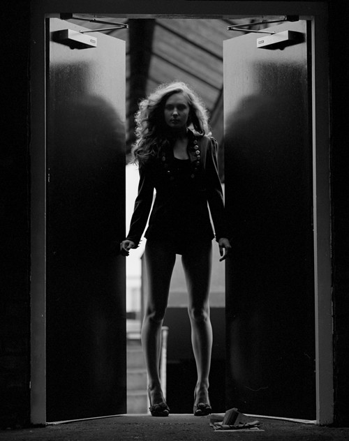
2) I like the reduced backlighting from the doors being half closed, again, the pose works quite well for me, though the banister rail of the stairs apears to slightly confuse the shape of her outer thigh, while the newel post by her calf being so bright draws the eyes away from the models legs... A little more light on the girls face works well for me, though again I'm not sure about the stuff on the floor - was it positioned there to produce the effect of - say - opening the doors to collect a post-drop, or was it just random crap that you left there?? If it's supposed to be saying something, then it needs to shout a little louder.
3) I really, really like this one - perhaps not as "challenging" a shot as the first two, It's well lit, well seen, well composed and well exposed. It also uses the leading lines of the stairs, rails and bannisters to great effect - try as you may, your eyes are led right to the model. The one thing I'm not 100% on, and this may or may not be a valid criticism, is that I'm not quite sold on the "straight up the nostrils" camera angle
4) IMO it's a brave composition that slices your model in half diagonally... even heavily OOF, it distracts me a little too much. I also think that the degree of blur in areas of the shot is just too heavy for my tastes. Sorry, but it's not really for me.
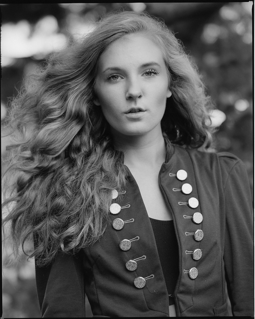
5) Another corker - a wonderful portrait of a striking young lady - bends or breaks a few compositional rules, and possibly the better for it. Putting her face top RH quarter and allowing her hair to occupy almost all the other half of the frame works well - it's a striking (theres that word again

) feature, and deserves to be given some airtime
")
From a technical viewpoint, they're well exposed (for the effects you were going for) and the dev/scan part of things seems to have worked well. Far and away better than I could ever hope to produce TBH, and so far out of my own shooting comfort zone that I feel a little strange commenting on them, but what the hell... It's got to be better than "I like #3 best", surely ??