

You are using an out of date browser. It may not display this or other websites correctly.
You should upgrade or use an alternative browser.
You should upgrade or use an alternative browser.
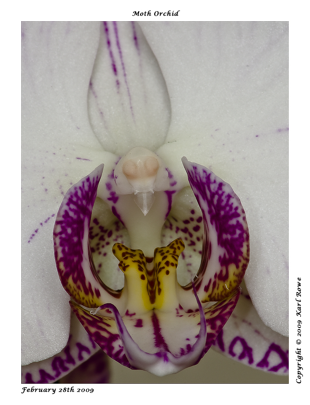
Moth Orchid
- Thread starter Keenbfb
- Start date
OP
Keenbfb
Suspended / Banned
- Messages
- 904
- Name
- Karl
- Edit My Images
- Yes
Very nice photo. Love how the yellow is in focus and fading out of focus towards the edges.
Much better photos than what I took when I had the lens
Your not getting it back I'm having to much fun with it:nuts:
Thanks for the comments though
Dark Star
TPer Emeritus
- Messages
- 12,829
- Name
- John
- Edit My Images
- Yes
Karl, great composition but a little 'grey' perhaps - have you tried tweaking the levels and just having a general play at post processing? My one, although lit by flash, also had a tiny tweak to bring out the colours fully ")
Fantastic plants aren't they
Fantastic plants aren't they
OP
Keenbfb
Suspended / Banned
- Messages
- 904
- Name
- Karl
- Edit My Images
- Yes
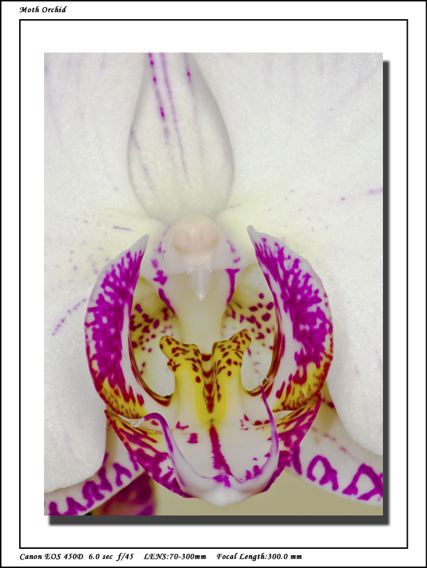
John many thanks for the advice had a play as you said and came up with this, I was more concerned about losing the background details and making the whites appear blown to give it ago before hand but your right to my eye it looks better like this.
 ]
]
It's a great little plant the wife loves it and no face turned up when I buy her something like this just so I can photograph it
It's a great little plant the wife loves it and no face turned up when I buy her something like this just so I can photograph it
OP
Keenbfb
Suspended / Banned
- Messages
- 904
- Name
- Karl
- Edit My Images
- Yes
Thanks for the praise mbscad.
Had to laugh at the comment about the whole flower not in shot though some people are just so hard to please
I'm not sure it would add anything to the overall image to include the whole of the flower in this instance as to me anyway it would detract from the main focus of the moths head which is what I was trying to capture, the centre wouldnt contain as much detail if I zoomed out to include the whole flower.
D
Deleted member 3428
Guest
I prefer colour and pp of the first but it looks over sharpened, the halo effect is quite pronounced which it isn't on the second shot. Great attempt though. Oh and I trust you haven't shown her this thread as you can still type
OP
Keenbfb
Suspended / Banned
- Messages
- 904
- Name
- Karl
- Edit My Images
- Yes
Thanks for all the kind comments guys.
I agree the second edit has more oomph in the colour and I prefer the brighter colours but do feel this has come at the expense of the background petals which now appear blown.
Guess Im going to have to improve my pp skills as well.
I agree the second edit has more oomph in the colour and I prefer the brighter colours but do feel this has come at the expense of the background petals which now appear blown.
Guess Im going to have to improve my pp skills as well.