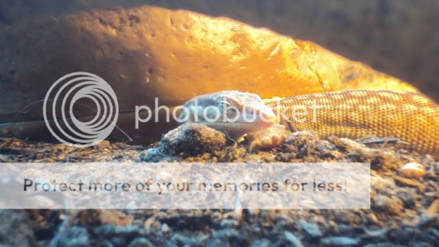
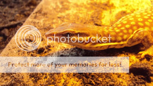
My ackie monitor

Messages
119
Name
Liam
Edit My Images
Yes
Hello, these photos were taken on a normal digital camera.. hope you like them:

DSC02049.jpg

DSC01742.jpg

DSC01200.jpg

DSC00731.jpg

DSC00706.jpg

DSC01676.jpg


Can't wait till I get my DSLR! :D
 
Hello, these photos were taken on a normal digital camera.. hope you like them:
1/
DSC02049.jpg

2/
DSC01742.jpg

3/
DSC01200.jpg

4/
DSC00731.jpg

5/
DSC00706.jpg

6/
DSC01676.jpg


Can't wait till I get my DSLR! :D

not bad for a point and shoot, :D ive separated and numbered them for you, makes it easier for people to comment. (y)
 
1st is definitely the pick from me in terms of exposure, sharpness, focus etc.

The expression in the 2nd is awesome though :LOL:

Yeah, that one is pretty good. Thanks. & haha, yeah. It always makes me smile :D

like the first on as well (y)

Cheers :D

not bad for a point and shoot, :D ive separated and numbered them for you, makes it easier for people to comment. (y)

Thanks :)
& yeah, thanks for numbering them. (y)
 
nice set especially from a P+S.
No. 1 has to be the pick of the bunch as its nice and sharp, well saturated and exposed very well.
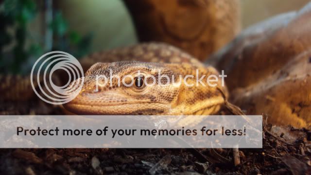
I have however tweeked the levels and saturation on number 3, so that now is a nice contender....hope you don't mind. This is how I did it:
In CS5, the histogram showed the bulk of the chart was over to the left, showing it was a bit too dark, so I moved the slider from the right hand side of the graph towards the left which lightened the pic, then moved the middle over to the left ever so slightly to try to get the mid tones back in range.
I then open up the Hue/Saturation settings and again ever so slightly tweeked them as the above process seemed to wash out some of the colour.
Here's the finished product...

DSC01200 copy

Unfortunately numbers 5 & 6 have picked up the fluorescent lighting a bit too much :(
Thanks. (y)

I actually like how dark the 3rd pic is. :LOL:
But, I do also like the edited version you did for me. However, it does show how bad quality the picture actually is. Thanks though! :notworthy::notworthy:

I like how the lighting has effected pics 5&6, tbh. Haha. I think they look really good. But thanks for your input. (y)
 
Last edited:
it just looks like if you put him into a dark room, he'd glow... as you can tell I'm finding it hard to explain in a different way lol

don't get me wrong, I think he's lovely :)
 
Last edited:
Back
Top