

You are using an out of date browser. It may not display this or other websites correctly.
You should upgrade or use an alternative browser.
You should upgrade or use an alternative browser.
**MY Very Best** from Barton on SEA
- Thread starter DinoS
- Start date
D
Dappa44
Guest
I like them, very nice indeed.
I love water shot over long exposures.
I love water shot over long exposures.
- Messages
- 1,778
- Name
- James
- Edit My Images
- Yes
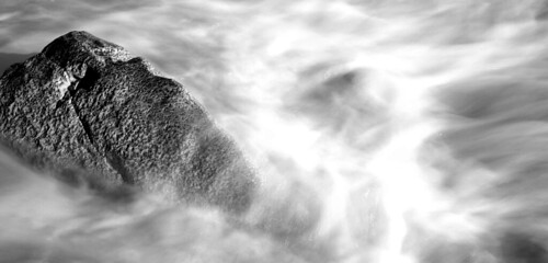
The first shot looks like a space collision,
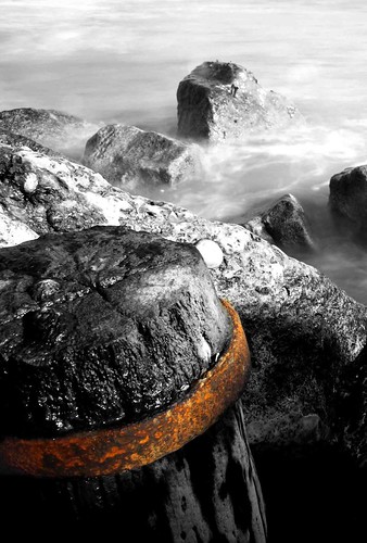
Second is a cracker
Second is a cracker
shrimperblue
Suspended / Banned
- Messages
- 625
- Name
- Dave
- Edit My Images
- No
Hi,
Number 1 looks a bit blown out in places. Maybe the WB could be adjusted if it was RAW?
Number 2 is nice although I would keep it all mono.
Nice shots though")
SB
Number 1 looks a bit blown out in places. Maybe the WB could be adjusted if it was RAW?
Number 2 is nice although I would keep it all mono.
Nice shots though
SB
- Messages
- 7,621
- Name
- Jonathan
- Edit My Images
- Yes
Well, I love number one, and infact I love number 2 as well. Usually, I pick out little things with images, and am quite honest if I don't like an image as well. So here goes
The problem in number one lies not in the B&W conversion, as I think this works quite well, but instead in the composition. It appears as though it has been cropped quite a lot? If so, I would keep the aspect ratio the same as it is, and expend the image to allow for the left hand side of the rock to be seen. Thus, by keeping the aspect ratio the same, you see slightly more water at the top and bottom, as well as the whole rock itself. This will help ease any possible frustration in not seeing the whole of the main subject matter, but also allow for more of that nice textured water to be visible.
The exposure however is good, and the highlights, though a little too apparent, work quite well also. Perhaps a levels tweak to bring out some contrast in the water itself? Here is what I mean... It's only subtle...

Number two is a really nice shot. I would however agree with shrimperblue that the whole shot would look better fully mono. selective colouring works well in more abstract shots imho as it lends itself to the genre. Compositionaly, I wouldn't change anything. Really good work on this one
Understand that I'm no expert, and I offer only my opinion. Some might totally dissagree with what im saying, but hey! That's life
hth
The problem in number one lies not in the B&W conversion, as I think this works quite well, but instead in the composition. It appears as though it has been cropped quite a lot? If so, I would keep the aspect ratio the same as it is, and expend the image to allow for the left hand side of the rock to be seen. Thus, by keeping the aspect ratio the same, you see slightly more water at the top and bottom, as well as the whole rock itself. This will help ease any possible frustration in not seeing the whole of the main subject matter, but also allow for more of that nice textured water to be visible.
The exposure however is good, and the highlights, though a little too apparent, work quite well also. Perhaps a levels tweak to bring out some contrast in the water itself? Here is what I mean... It's only subtle...
Number two is a really nice shot. I would however agree with shrimperblue that the whole shot would look better fully mono. selective colouring works well in more abstract shots imho as it lends itself to the genre. Compositionaly, I wouldn't change anything. Really good work on this one
Understand that I'm no expert, and I offer only my opinion. Some might totally dissagree with what im saying, but hey! That's life
hth

- Messages
- 7,621
- Name
- Jonathan
- Edit My Images
- Yes
sort of... the second looks miles better imo, but the first is half there. the extra space at the top and bottom helps, but I think being able to see the left hand side of the rock as well would be good. If that was originally the edge of the frame at the time of taking however, ignor that bit. Either way, the extra space at the top and bottom works in the shots favour I think
- Messages
- 632
- Name
- Jonny
- Edit My Images
- Yes
i love the second. I like the selective coulouring well done!!!