

- Messages
- 19
- Edit My Images
- No
Some B&W shots from Paris:

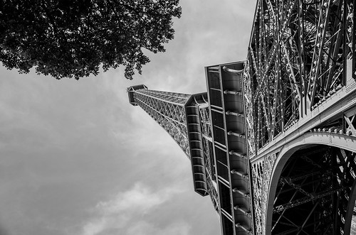
DSC_4898-2 by J_Bednarski Photo, on Flickr
DSC_4895-2 by J_Bednarski Photo, on Flickr
comments and critique welcome")
DSC_4898-2 by J_Bednarski Photo, on Flickr
DSC_4895-2 by J_Bednarski Photo, on Flickr
comments and critique welcome
Last edited: