PS - Better Blend Required?

Messages
2,784
Name
Derek
Edit My Images
Yes
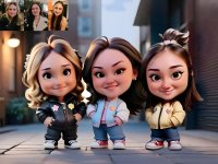
So, I've done this of my friend's three daughters for printing (not with the orignal photos inset as shown) - I had to cut out and paste Misha (on the right) into the image, but to me, she still looks pasted in, especially her legs/shoes - how do I better 'blend' her in? Maybe she's just a bit too sharp, but I've tried playing with that and didn't have any joy? Happy to link the PSD if anyone wants it, but for reasons unknown, although it's only two layers, it's 450mb! I don't use PS very much, so maybe that's normal?
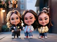
12x16-Girlz-Inlay.jpg
 
It's more about the lighting around her and the shadows she creates... A quick edit, to do it well will be quite a bit fussier.

That's def better - what exactly did you do? Struggling to see properly as out just now so on the phone....
 
Lightened the stones behind/around her and gave her more of a distinct shadow.

The other thing that's a little disjointed is that the DOF on her is a bit off... the hair on her right side is a little more OOF than on her left which it is behind, but also more OOF than the girl's hair next to her which it is in front of... same for her right arm/foot. I think it would be easier if you didn't go for as shallow a DOF effect/look.
Thanks.... unfortunately the AI decides the DOF and I have no control over where or how much. I'll have a crack at it tonight.
 
Back
Top