Sail By The Rocks and Moss

Messages
43
Edit My Images
Yes
Recently came back from a visit to North Wales, possibly the most beautiful place in the UK, certainly the most picturesque place i have visited. Im losing my edge with photography and i cant seem to help it. This trip was partly to get me back on track though im still not entirely happy.

Simple shot, nothing to spectacular but pretty original i think. The boat is from another image, but lends its self quite well here.

MossontheRocks.jpg


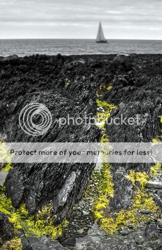
Im going to share a couple more images on another thread which are less dramatic.

Crits and comments always welcome.
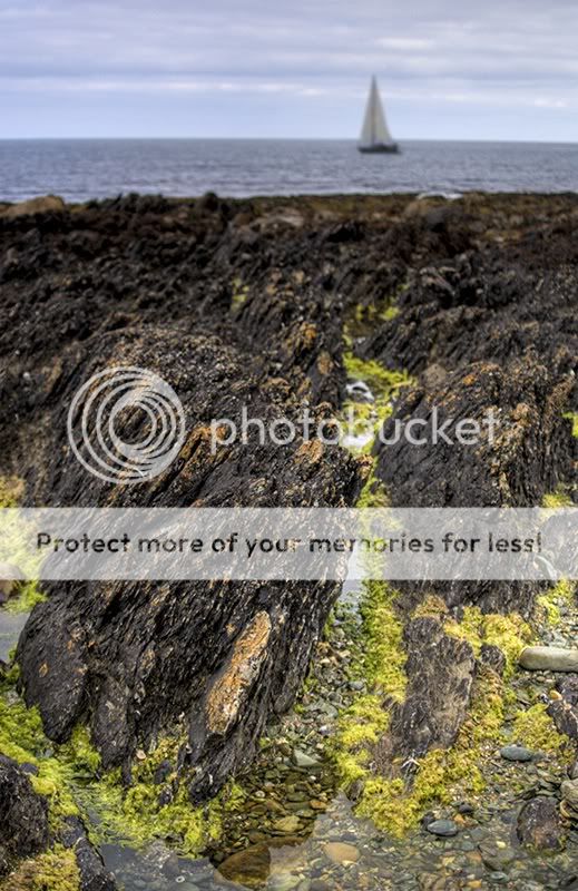
 
I like the concept and the composition works well but I'm not sure if the b&w conversion works for me.
 
I'm not sure what you're attempting here, the stone is in focus, but the seaweed is selectively coloured and the boat in the distance is out of focus.
 
I hate selective colouring at the best of times so I'm not going to like this. Ignoring the odd colouring I think the boat (added or not) makes the composition. The foreground does look a bit over lit like fill flash was used. So composition and use of depth of field look OK to me. Shame you turned it into a novelty image with the colouring.
 
OKay chaps, i listened to your cirtiques and have taken on board your suggestions. So i have 2 more examples of the same shot, one pure black and white and one original colour. To me these images do not pop in the way that the first does..... What do you think? One for the scrap book?

MossontheRocksCOL.jpg


MossontheRocksBW.jpg
 
Without the distraction of the selective colouring the shallow depth of field becomes more obvious and it is starting to look wrong. Still like the way the green stuff leads you to the boat but it is starting to look like the camera was accidentally focussed too close. Toning down that foreground brightness might help or maybe it should be marked down as a nearly shot :)
 
Back
Top