
You are using an out of date browser. It may not display this or other websites correctly.
You should upgrade or use an alternative browser.
You should upgrade or use an alternative browser.
Some film from Glasgow
- Thread starter Brad0612
- Start date


- Messages
- 435
- Name
- Justin
- Edit My Images
- Yes
Some nice variety, but overall a little bit lacking imho.
What film did you use out of interest? I haven't found many colour negative films I like the look of. Fuji Pro 160S is the closest I've found to usable so far and maybe Velvia (but costly and unforgiving).
The composition for most of the pictures is good, I can see the rule of 3rds at play. They just feel like they lack impact for the most part for me. Maybe a tad overexposed in general as well.
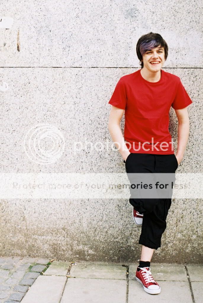
I do like number 8 though. A nice panning shot, some blurring to background and his feet to indicate movement, plus a little DoF. Plus the quirky diagonal alignment makes it interesting for me personally. Also seems well exposed. Good work.
I would say (advice given too me as well - as a regular culprit) it is better to post fewer shots at a time. I'd give more detailed feedback if it wasn't for 9 pictures each requiring different comments.
Another minor point (and for the most part you have it right) I've often read that like people read left-to-right, they do the same with photos. So 6 and 4 are good examples of this. 3 might look better if it was flipped horizontally (obviously the signs would be backwards though).
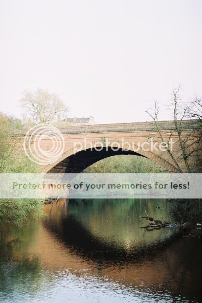
Also a final note, for 7 I'd reconsider how you framed the shot, either focus on a specific part of the bridge/the bridge and it's reflection, or try and fit it all in, in context. A graduated filter to help the blown sky would have been ideal in this case as well. Bringing the viewpoint back, might have made the bridge the feature of the image, but allowed the river to lead the viewer's eyes into the image towards the bridge.
But overall keep up the good work.")
What film did you use out of interest? I haven't found many colour negative films I like the look of. Fuji Pro 160S is the closest I've found to usable so far and maybe Velvia (but costly and unforgiving).
The composition for most of the pictures is good, I can see the rule of 3rds at play. They just feel like they lack impact for the most part for me. Maybe a tad overexposed in general as well.
I do like number 8 though. A nice panning shot, some blurring to background and his feet to indicate movement, plus a little DoF. Plus the quirky diagonal alignment makes it interesting for me personally. Also seems well exposed. Good work.
I would say (advice given too me as well - as a regular culprit) it is better to post fewer shots at a time. I'd give more detailed feedback if it wasn't for 9 pictures each requiring different comments.
Another minor point (and for the most part you have it right) I've often read that like people read left-to-right, they do the same with photos. So 6 and 4 are good examples of this. 3 might look better if it was flipped horizontally (obviously the signs would be backwards though).
Also a final note, for 7 I'd reconsider how you framed the shot, either focus on a specific part of the bridge/the bridge and it's reflection, or try and fit it all in, in context. A graduated filter to help the blown sky would have been ideal in this case as well. Bringing the viewpoint back, might have made the bridge the feature of the image, but allowed the river to lead the viewer's eyes into the image towards the bridge.
But overall keep up the good work.
Last edited:
OP
- Messages
- 92
- Name
- Bradley
- Edit My Images
- No
Thanks for the superb feedback there!
To be honest, I cannot remember which film I used. But either the cheap Fujicolour C200 stuff Jessop's gives out for free, or some 20 year old Tudor stuff I decided to shoot, equally cheap haha. I havent really shot anything else other than Ilford HP5.
I take note of the things you said Justin about the left-to-right and not posting too many at a time, thanks.
- Messages
- 435
- Name
- Justin
- Edit My Images
- Yes
Bear in mind every rule is made to be broken as well!
The left to right thing, like the rule of thirds is only a rule of thumb.
Also it's so much easier to critique the work of others than it is to take a photo yourself that is actually good and requires no critique. Again a field I am an expert in. The criticizing part I mean....
The left to right thing, like the rule of thirds is only a rule of thumb.
Also it's so much easier to critique the work of others than it is to take a photo yourself that is actually good and requires no critique. Again a field I am an expert in. The criticizing part I mean....
Last edited:
TheBigYin
Moderator
- Messages
- 16,669
- Name
- Mark
- Edit My Images
- No
One bit of advice from Justin that I hope you DO take to heart is if you want proper critique, post one or two shots tops. If you want to share other pictures as well, by all means either drop them in after getting some crit, or add a few links later.
Maybe i'm a bit slow, but it takes me a good 10 minutes per shot to come up with a decent critique. Posting 9 shots is asking people like me to spend a hour and a half of their free time to give you advice. Now, I'm not saying I won't give a little crit, but it may well be in a few episodes over the next week or so... I'm guessing that most people will just give you "flickr feedback" - i.e. a nice ego boost but no bloody use if you want to improve as a photographer...
Maybe i'm a bit slow, but it takes me a good 10 minutes per shot to come up with a decent critique. Posting 9 shots is asking people like me to spend a hour and a half of their free time to give you advice. Now, I'm not saying I won't give a little crit, but it may well be in a few episodes over the next week or so... I'm guessing that most people will just give you "flickr feedback" - i.e. a nice ego boost but no bloody use if you want to improve as a photographer...
- Messages
- 435
- Name
- Justin
- Edit My Images
- Yes
LOL think it was Mark above who first told me not to post so many at once
Just sharing his worldly wisdom!
Just sharing his worldly wisdom!

- Messages
- 435
- Name
- Justin
- Edit My Images
- Yes
I see what you did there...
- Messages
- 584
- Name
- Joe
- Edit My Images
- Yes
you look smaller whiter and furrier in photo 8 than your forum picture shows...
Amazing what a quick shower & a haircut can do