- Messages
- 8,261
- Name
- Carl
- Edit My Images
- Yes
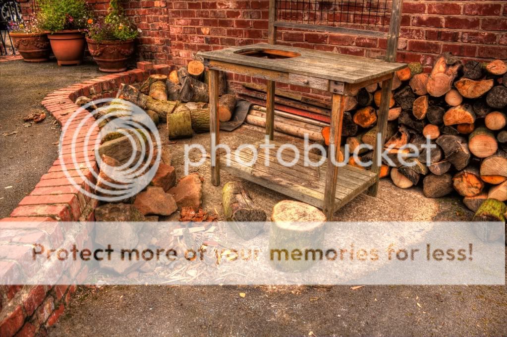
While visiting the father-in-law, I run around his garden, taking pics of whatever objects he has (his garden is a treasure of objects lol).
I thought I would switch back to the kit lens so I didnt have to move so much around his garden.
Hope they are interesting...sort of.")
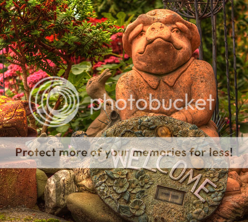
Thought id start with a "welcome bit"
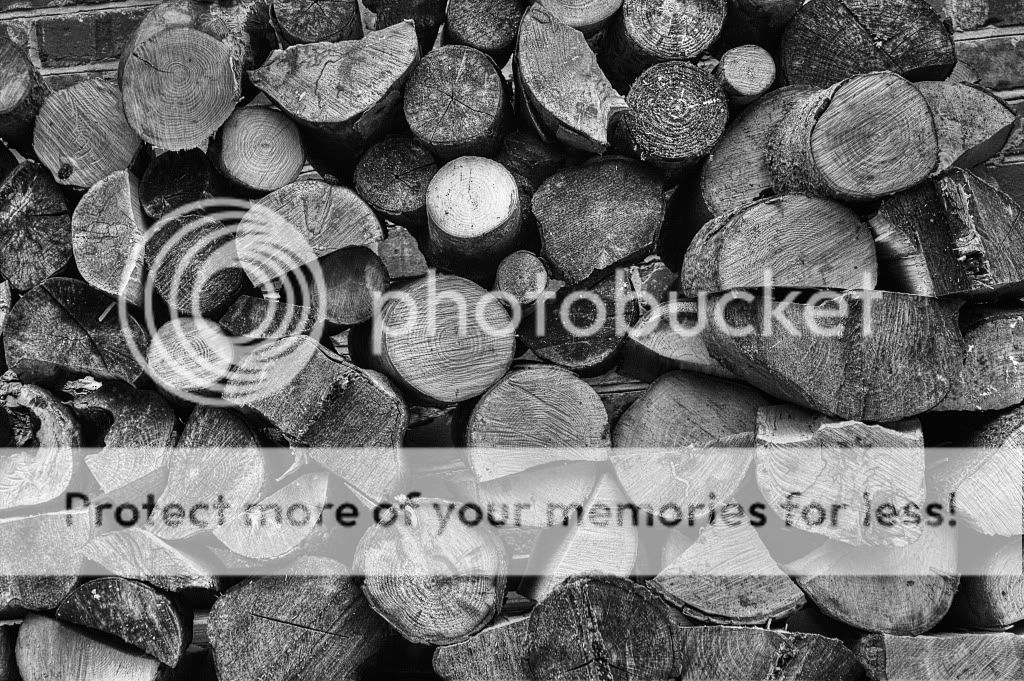
1..
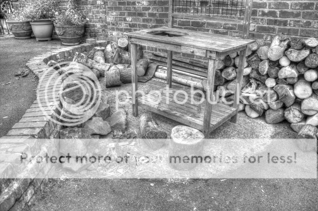
2..
3..

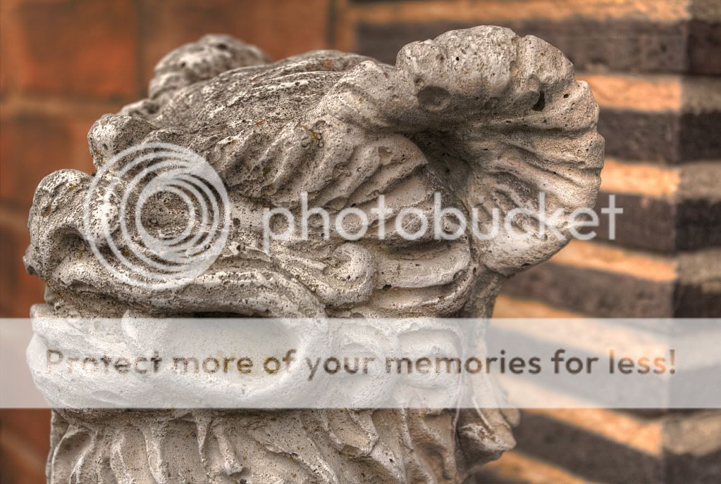
4..
5..
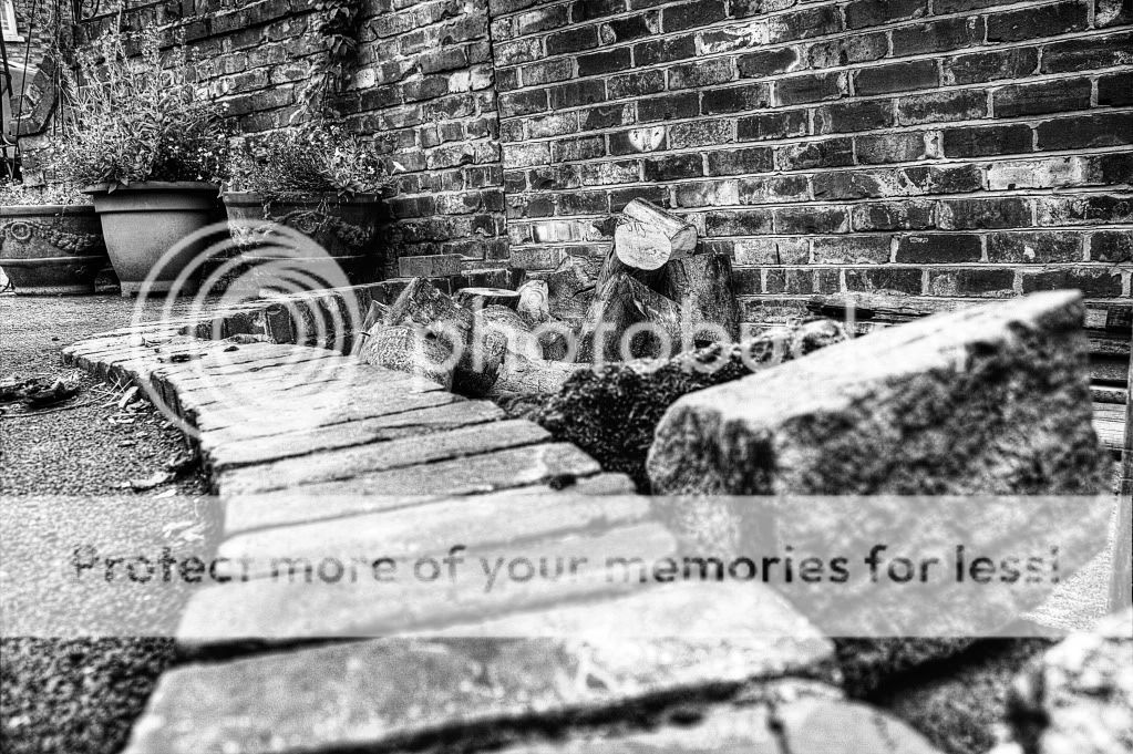
The wall is on a camber, hence the pic looks a bit lop-sided but I thought the lines were interesting.
All shot with the Canon EOS 18-55 kit lens.
Thanks for looking
I thought I would switch back to the kit lens so I didnt have to move so much around his garden.
Hope they are interesting...sort of.
Thought id start with a "welcome bit"
1..
2..
3..
4..
5..
The wall is on a camber, hence the pic looks a bit lop-sided but I thought the lines were interesting.
All shot with the Canon EOS 18-55 kit lens.
Thanks for looking