

- Messages
- 905
- Name
- Scott
- Edit My Images
- Yes
Some Shots as I havent put any up here for a while
1

Mountain Road by [Scott], on Flickr
Nikon F100 and Neopan 400
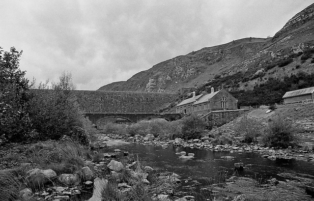
Caban Coch by [Scott], on Flickr
Nikon F100 and Neopan 400
3

The Hills by [Scott], on Flickr
Bronica ETRS and Rollei RPX 400
4

Over the Hills by [Scott], on Flickr
Bronica ETRS and Rollei RPX 400
1
Mountain Road by [Scott], on Flickr
Nikon F100 and Neopan 400
Caban Coch by [Scott], on Flickr
Nikon F100 and Neopan 400
3
The Hills by [Scott], on Flickr
Bronica ETRS and Rollei RPX 400
4
Over the Hills by [Scott], on Flickr
Bronica ETRS and Rollei RPX 400

")
