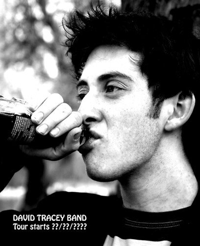
Looks a bit mean and moody.
Have looked at this a couple of times and am still trying to make up my mind whether I like it or not, I think it works as a promo, not sure whether it would entice me to see the band though :shrug:
Think I'm inclined to agree with Birdy, the image is nicely taken & the high contrast conversion suits the subject (aside from the little finger blending into the background) but I'm still not 100% sold (think I'd like to see what it is he's drinking )
Think that a more urban theme may have worked well - may not be suitable obviously as you know the band & I don't but think something a bit more gritty & punk may have looked good imo
This site uses cookies to help personalise content, tailor your experience and to keep you logged in if you register.
By continuing to use this site, you are consenting to our use of cookies.


")