

- Messages
- 5,079
- Name
- Simon
- Edit My Images
- No
I'm slightly hesitant about posting this - I know there are flaws. When other humans are involved there's always a compromise somewhere!
But here it is anyway - hope it's useful to someone, at least for the thought process if not the results.
The brief was to update a model's commercial portfolio. The results needed to showcase a few different products but not be too showy or overly creative; neither the model nor the lighting should dominate, but they should show her look & skills.
The third set of the day was some sunglasses.
1.
The first decision was how I wanted the lenses to appear. Did I want to see the eyes through them? Or maybe strong opaque specular highlights? Ideally I would have put a graduated highlight on the glass but these sunglasses are unusual in that they're almost completely flat so I settled for a gentle shine. The light - a shoot through umbrella firing through a large diffuser very close to the model, camera right - is obviously lighting the rest of the model too but that's not the main job. Note this pic has been brightened in post so you can see what the single light is doing but nothing else has been altered.
.jpg")
2.
I also wanted to convey the impression of direct sunshine. That meant a small light source somewhere - ideally in line with the first light so it looks coherent. I had a small dish just in front of the diffuser from the first shot. This is what the second light did on it's own (again, brightened a little)
.jpg")
At this point I spent a little while balancing those two lights to get the look I was after. Sadly I don't have a pic of just those two together. At this point I also considered whether the background was appearing as I wanted. I could have added a light to it, or moved the model further away to get it darker. I didn't.
3.
The next job was to add a light to pick out the logo on the sunglasses arm. The logo was very highly reflective so only reflected light into the lens from a small range of angles. Consequently I opted for a gridded white beauty dish to camera left. I could have done something more precise but I wanted to allow Sin - the model - some room to do her thing. She still needed to pose & emote a little if the result wasn't going to look completely dead. Again, image brightened in post.
.jpg")
Here I realised that light #3 was hitting the hair too - as well as casting a shadow from it. I liked the hair light so left it with the plan of reviewing the shadow later.
4.
I don't have a pic using just the 3 lights but it felt a little flat to me - so I added an accent light to rear right. This largish gridded octa provides background separation but more importantly it gives a sense of volume. See how it also puts a nice highlight on the glasses. I'm not keen on the nose highlight but I can live with it.
.jpg")
All 4 lights together, unretouched:
There are a couple of issues here. The shine on the arm of the sunglasses isn't perfect. The shadow of Sin's hair is unwelcome; it's a second set of shadows. Sin's hair could do with some tidying. And her jacket is a little rumpled.
However - time was getting away from us I did what I could to address these but accepted that some of the work would be done in post. Hair work is tedious but I don't mind for only a couple of images.

Lastly: retouched, cropped & lightly colour graded
.jpg")
.jpg")
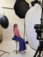
And here's the lighting setup - you can see all 4 in this pic. As well as my FrankenGimbal (tm).

But here it is anyway - hope it's useful to someone, at least for the thought process if not the results.
The brief was to update a model's commercial portfolio. The results needed to showcase a few different products but not be too showy or overly creative; neither the model nor the lighting should dominate, but they should show her look & skills.
The third set of the day was some sunglasses.
1.
The first decision was how I wanted the lenses to appear. Did I want to see the eyes through them? Or maybe strong opaque specular highlights? Ideally I would have put a graduated highlight on the glass but these sunglasses are unusual in that they're almost completely flat so I settled for a gentle shine. The light - a shoot through umbrella firing through a large diffuser very close to the model, camera right - is obviously lighting the rest of the model too but that's not the main job. Note this pic has been brightened in post so you can see what the single light is doing but nothing else has been altered.
2.
I also wanted to convey the impression of direct sunshine. That meant a small light source somewhere - ideally in line with the first light so it looks coherent. I had a small dish just in front of the diffuser from the first shot. This is what the second light did on it's own (again, brightened a little)
At this point I spent a little while balancing those two lights to get the look I was after. Sadly I don't have a pic of just those two together. At this point I also considered whether the background was appearing as I wanted. I could have added a light to it, or moved the model further away to get it darker. I didn't.
3.
The next job was to add a light to pick out the logo on the sunglasses arm. The logo was very highly reflective so only reflected light into the lens from a small range of angles. Consequently I opted for a gridded white beauty dish to camera left. I could have done something more precise but I wanted to allow Sin - the model - some room to do her thing. She still needed to pose & emote a little if the result wasn't going to look completely dead. Again, image brightened in post.
Here I realised that light #3 was hitting the hair too - as well as casting a shadow from it. I liked the hair light so left it with the plan of reviewing the shadow later.
4.
I don't have a pic using just the 3 lights but it felt a little flat to me - so I added an accent light to rear right. This largish gridded octa provides background separation but more importantly it gives a sense of volume. See how it also puts a nice highlight on the glasses. I'm not keen on the nose highlight but I can live with it.
All 4 lights together, unretouched:
There are a couple of issues here. The shine on the arm of the sunglasses isn't perfect. The shadow of Sin's hair is unwelcome; it's a second set of shadows. Sin's hair could do with some tidying. And her jacket is a little rumpled.
However - time was getting away from us I did what I could to address these but accepted that some of the work would be done in post. Hair work is tedious but I don't mind for only a couple of images.
Lastly: retouched, cropped & lightly colour graded
And here's the lighting setup - you can see all 4 in this pic. As well as my FrankenGimbal (tm).
Attachments
Last edited: