The Shard - London

Messages
488
Name
George
Edit My Images
Yes
I was just wondering which one people prefer & any feedback.

6982796769_8887649f83_c.jpg


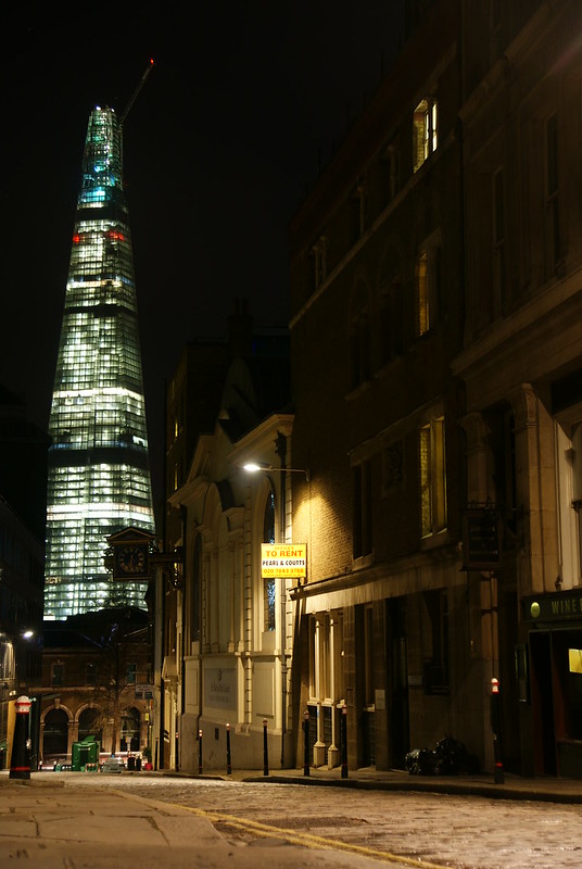
http://www.flickr.com/photos/7978334@N03/6982796769/in/photostream

6982806571_c7beee732a_c.jpg


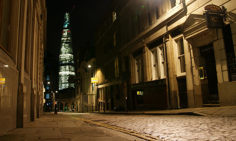
http://www.flickr.com/photos/7978334@N03/6982806571/in/photostream
 
The second one for me. The road leads you in nicely and you can see more of the old buildings in the foreground.
 
I too would say the second, I like the first but wonder if some buildings on the left would be better to provide some framing or edge to the picture.
 
Just to make this difficult, the first one for me. There is more room for the top of the Shard in the first one (there's a very small gap between the frame and the top in the second), and since you have titled the photo as such it is much more prominent in the first photo.

Additionally, the yellow "To Rent" sign is less blown out in the first compared to the second, and the centre of the picture only has a single light source. In the second one, there is evidently a light source in the top right which is causing some flare and those green spots. However, the sharpness at the very edges of the photo (see the yellow lines) is significantly better in the second.
 
i prefer the 2nd pic.... just the way theres more illumination of the building, and having less secondary subjects isnt always best
 
I'm a vote for the second one too, with the road being a better lead for the eye I also like the comparative scales between the shard and the foreground buildings
 
Personally I feel the composition is a little stronger in the first image, but I also feel that it'd work better as a daytime shot, and in mono.
 
The second one for me. Would love to go up inside that building.
 
Thanks for the feedback :)

I personally preferred the first one when I first looked at the pictures on my computer, but after cropping the second one, that slowly overtook the first as my favourite. I think this is because the 'For Sale' sign is less of a focal point. However, looking at them now, I really can't decide! It seems the general consensus is the 2nd one though, thanks again for feedback :)
 
Second for me. The lighting contrast is good and the first one the to rent sign is too much the focus of the image.
 
onona said:
Personally I feel the composition is a little stronger in the first image, but I also feel that it'd work better as a daytime shot, and in mono.

Yes, I prefer the composition of the first one too.

Unless you go the HDR route, it's a tricky daytime shot as you're facing directly south down St Mary-at-Hill, so in most circumstances the light is directly behind the Shard.

There's better modelling toward sunset, but then the right hand side of the street is in shadow. Early morning in summer, you get light on the north side of the Shard, but there's an 8-storey building out of shot to the left which would shade the right hand side of the street.

I suspect you'd get the best result around the 'golden hour' just after sunset.
 
King of Groove said:
The second one for me. Would love to go up inside that building.

The view is pretty good from the top ;)

The public observation gallery is opening in Feb 2013.
 
#2 is the one for me, like something alien dropped in the middle of a bygone London.
 
Hi
Definitely the first for me.
The Shard is better framed and is much more imposing, as it is meant to be.
The detail in the buildings to the right is more defined
The 3 vertical windows on the right give a nice balance and indicate human occupation in an otherwise deserted scene.
The building on the right in #2 is overwhelmingly lit
There is still foreground detail in #1 as the sett paving falls away
The tonal balance in #1 is better
The portrait layout is better suited to the subject.
 
I can't wait for the shard to open. I shall be first in the queue for a night in the Shangri la hotel. It's a pity the hotel is not right at the top though.

Maybe we should have a tp meet, hire a hotel room and take pics! :)

I like your first pic too.
 
#1 for me. Better framed, the street looks nice and the building looks much more menacing.
 
Back
Top